
Nicolas Kruchten
is a data visualization specialist
based in Montreal, Canada.
Data Visualization
Data visualization is a passion and hobby of mine, and many of my personal projects revolve around using visualization techniques to explore data.
Metrics for Reasoning About the Usability of Visualization Notations
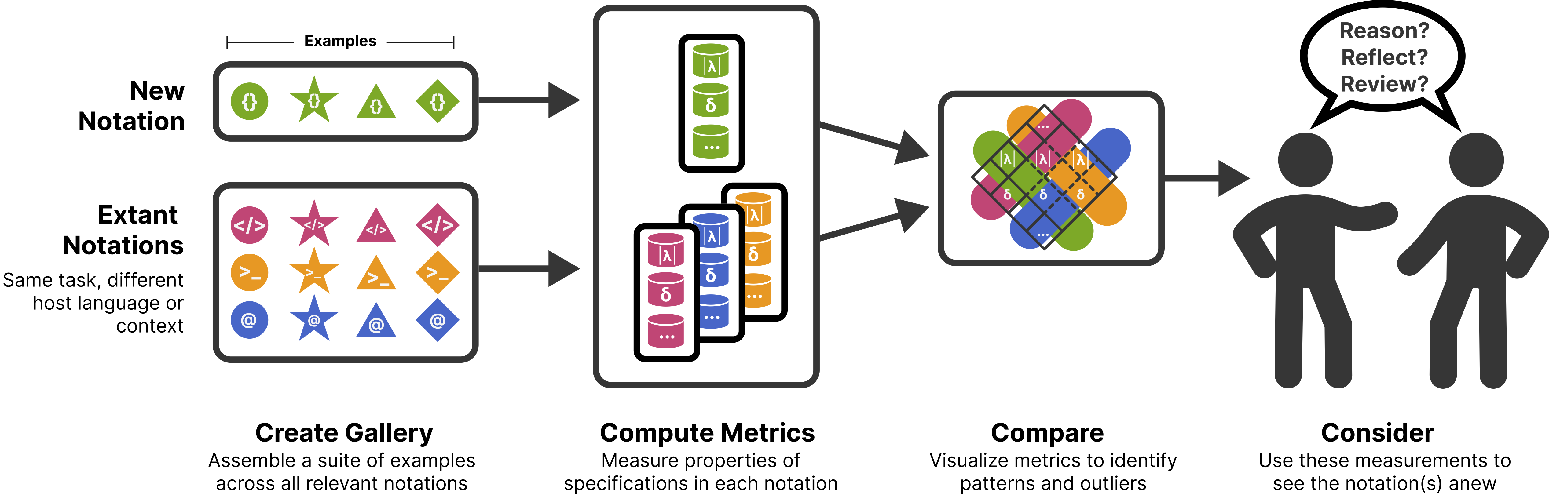
How can we evaluate and compare the usability of ggplot2, Vega-Lite, matplotlib and friends? Here is a summary of the research I’ve been working on and which will be presented at VIS 2023.
How Apple Names Things
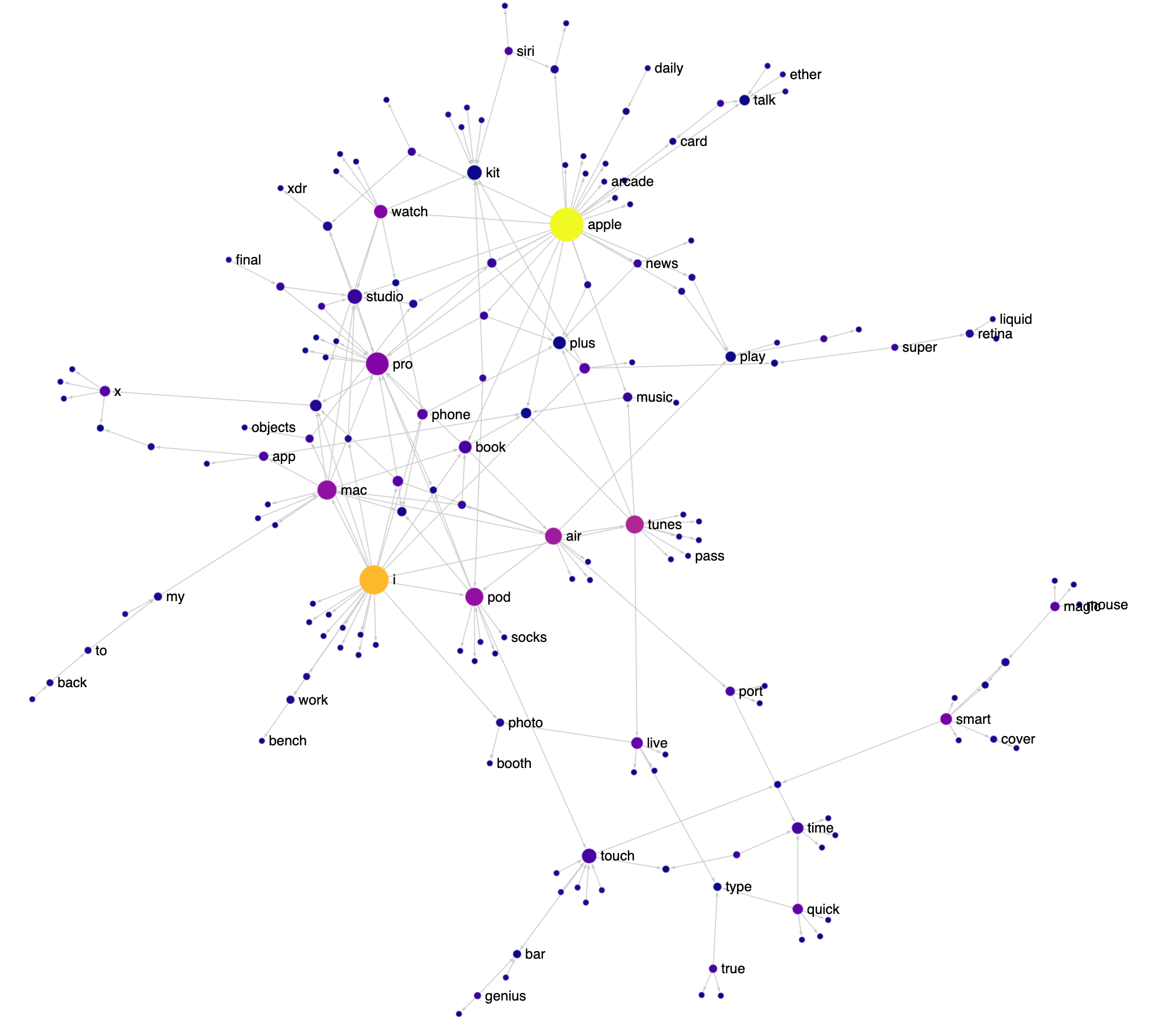
I love the way Apple names things: FireWire, App Nap, iPhone, iPod, EarPod, AirPod, AirPlay, FairPlay etc. It’s playful and there’s a lot of reuse of words and sounds. Having just finished reading the biography of Steve Jobs, I decided to visualize various Apple product and feature names as a network to see this reuse in action. Check out the interactive version here (it works best on a desktop). I got the names from Apple’s public list of trademarks.
IEEE VIS 2022 Highlights

IEEE VIS 2022 was last week in Oklahoma City and I was really happy to have been able to attend in person. The very-earnest motto of the conference was “VIS ’22 is about the people you meet” and for me at least, it really was! I’ll note that my strategy of writing a blog post describing my research and interests and tweeting it ahead of time and posting it to the Discord really helped with meeting people, so I will definitely be doing that again. That said, the personal connections I made aren’t that interesting to read about, so here is my list of highlights from the conference content. If you prefer a longer recap with more photos, Tamara Munzner’s traditional epic yearly VIS twitter thread is also available.
NotaScope: my data visualization research-in-progress
Three years ago I had a great time attending IEEE VIS 2019 as a bit of an outsider, eager to learn about what the cutting edge of data visualization research looked like. I “attended” the next two editions remotely like everyone else, and even participated in a panel at the VisInPractice workshop last year. This year, I’m attending VIS (next week!) in person in Oklahoma City as a bona fide graduate student, as I’ve decided to take a break from working in the tool-making industry and pursue a research-focused masters degree, advised by Michael McGuffin at the École de technologie supérieure here in Montreal. At VIS, I’ll be presenting a paper I co-wrote about VegaFusion, but that’s actually not the primary focus of my research. I’ve decided to write up a little mid-masters progress report, both as a personal check on my progress and to increase the likelihood that I’ll have interesting conversations at VIS next week with folks who have related interests!
Deliver Advanced Analytics Faster with Dashboard Engine
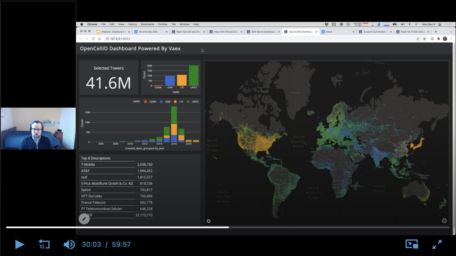
I gave a full-length webinar (name & email required to access, sorry!) about Dashboard Engine, the product my team and I have been working on for 2 years.
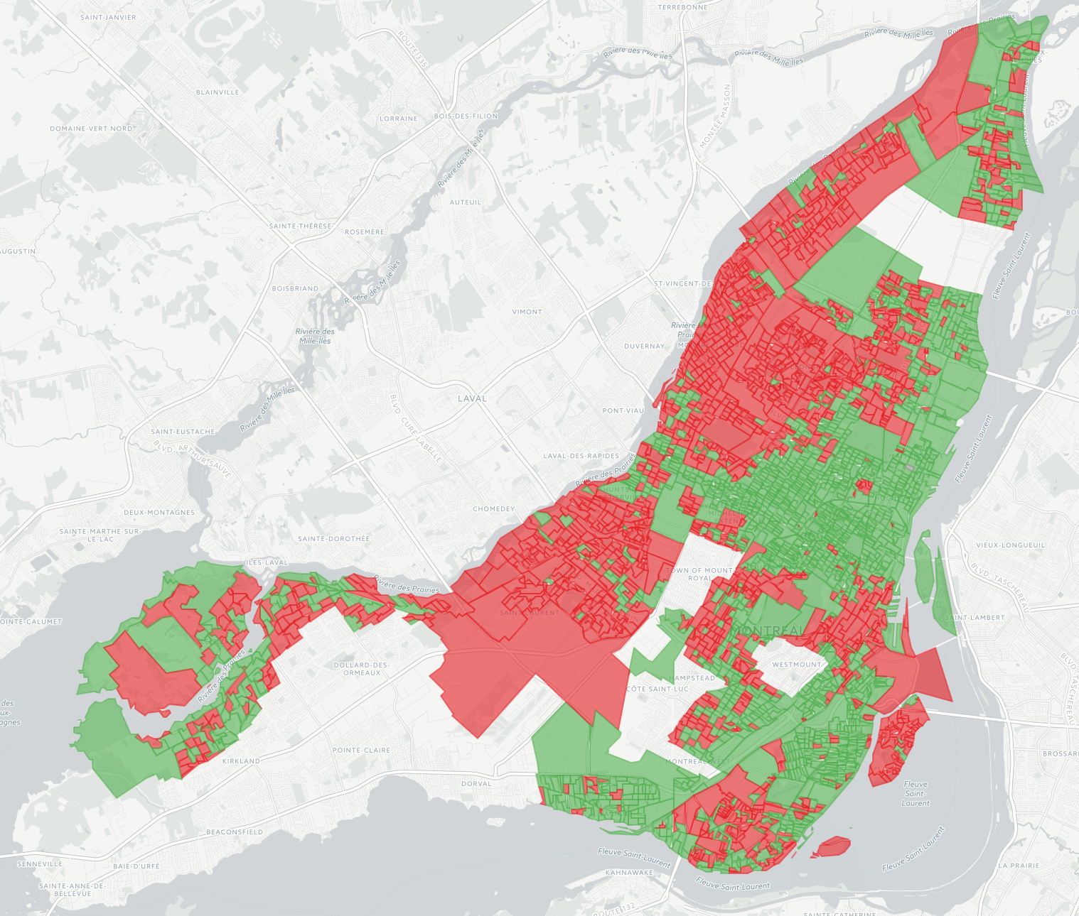
Montreal Election Map, 2021 Edition
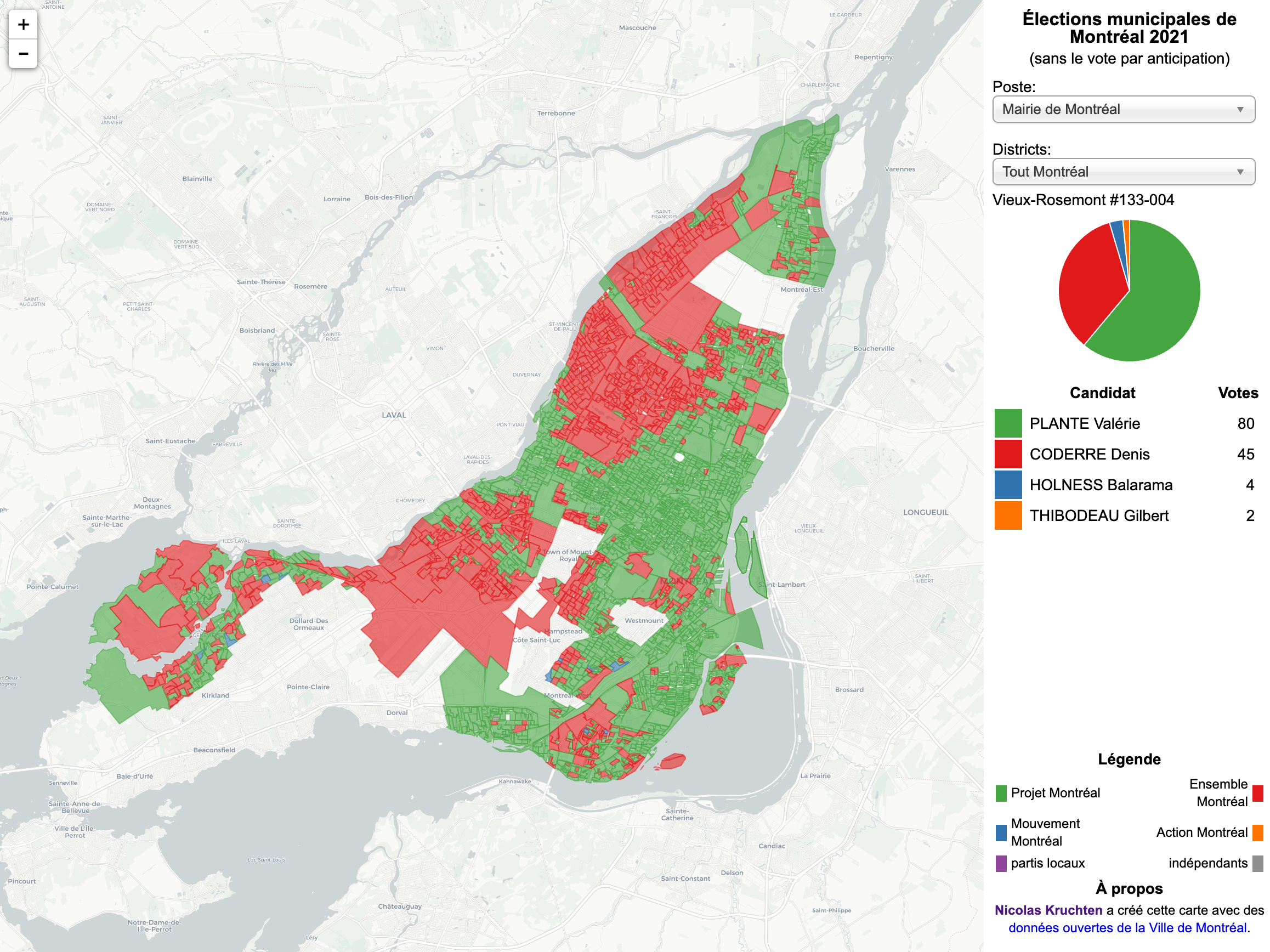
Another four-year cycle, another interactive Montreal municipal election map (see also the 2013 and 2017 editions).
Introducing Dashboard Engine
I was very proud to introduce Dashboard Engine to the world, as part of the Dash Enterprise 5.0 announcement webinar. I’ve been the product manager and team leader for this project for 18 months and it’s really gratifying to see it come to fruition.
SciPy 2021: Data Visualization as the First and Last Mile of Data Science
I was proud to be able to give a talk at SciPy 2021 this year, about Plotly Express and Dash!
Remaking Figures from Bertin's Semiology of Graphics
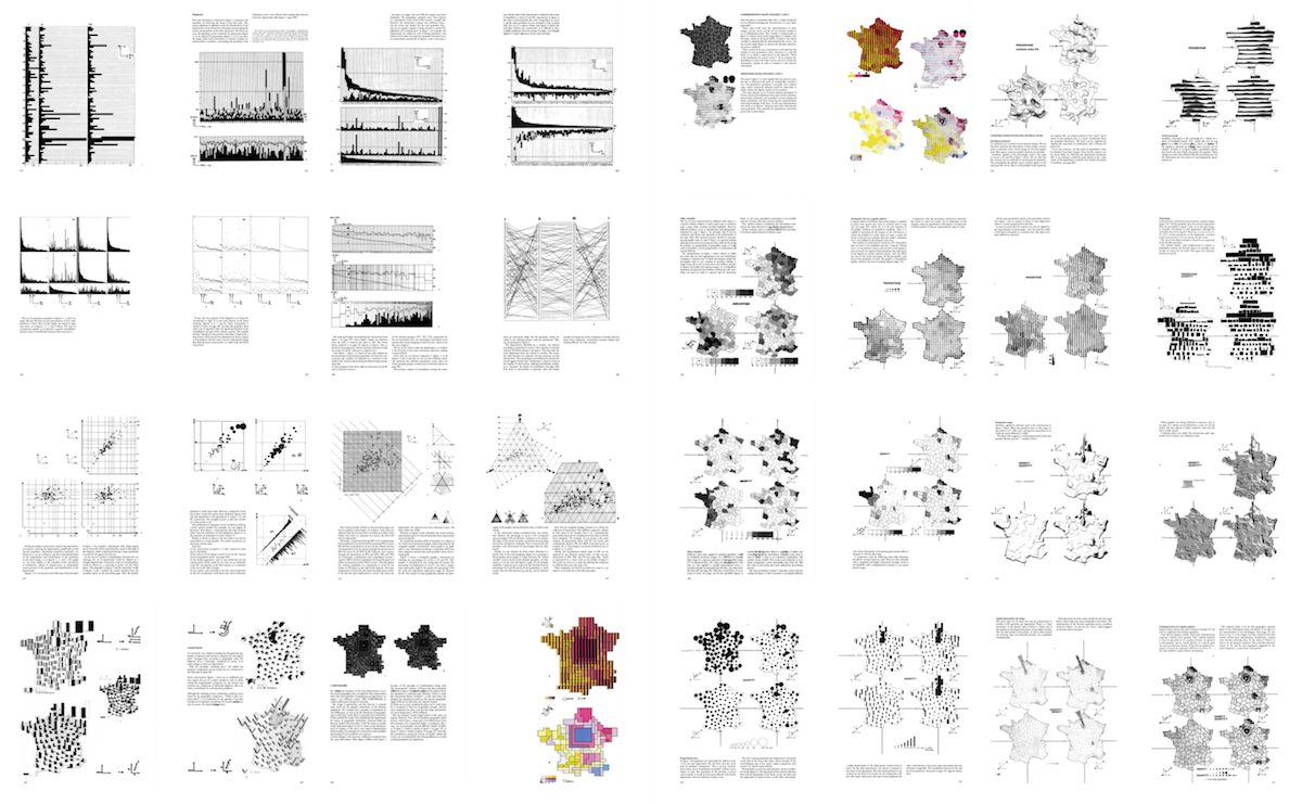
I’ve just published a personal project I’ve been thinking about doing for a few years now: revisiting figures from a 1967 book which has had a big influence on how I (and others!) think about data visualization, Jacques Bertin’s Semiology of Graphics.
Interview on IQT Podcast
I was recently interviewed on the IQT Podcast about Visualizing Data During a Pandemic, and how Plotly is contributing to COVID-19 response.
Beyond “tidy”: Plotly Express now accepts wide-form and mixed-form data
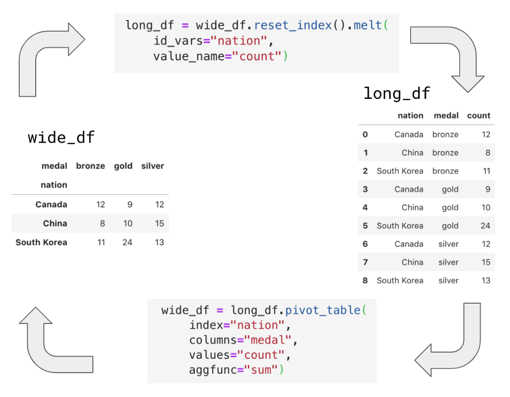
Plotly Express is the built-in high-level data visualization interface for Plotly.py, a leading interactive data visualization library for Python. With today’s release of Plotly.py 4.8, Plotly Express now gracefully operates on wide-form and mixed-form data – not just “tidy” long-form data. These new capabilities dramatically expand Plotly Express’ promise of ‘interactive data visualization in a single Python statement’, by removing the need to wrangle your data into a particular form before plotting.
Introducing Plotly Express
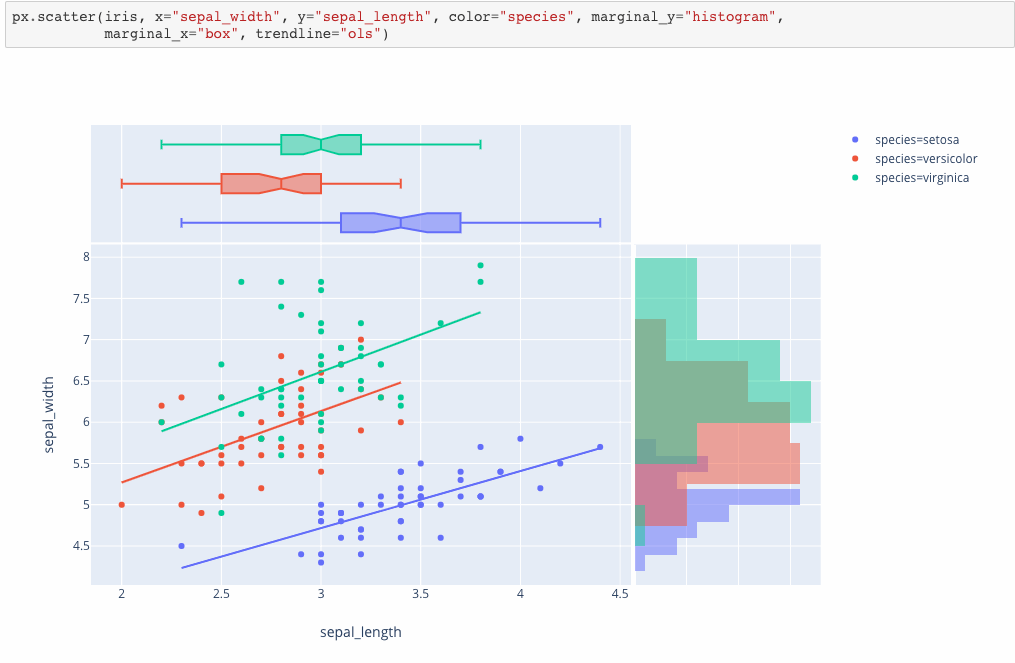
Plotly Express is a new high-level Python visualization library: it’s a wrapper for Plotly.py that exposes a simple syntax for complex charts. Inspired by Seaborn and ggplot2, it was specifically designed to have a terse, consistent and easy-to-learn API: with just a single import, you can make richly interactive plots in just a single function call, including faceting, maps, animations, and trendlines. It comes with on-board datasets, color scales and themes, and just like Plotly.py, Plotly Express is totally free: with its permissive open-source MIT license, you can use it however you like (yes, even in commercial products!). Best of all, Plotly Express is fully compatible with the rest of Plotly ecosystem: use it in your Dash apps, export your figures to almost any file format using Orca, or edit them in a GUI with the JupyterLab Chart Editor!
Data Visualization for Artificial Intelligence, and Vice Versa
Data visualization uses algorithms to create images from data so humans can understand and respond to that data more effectively. Artificial intelligence development is the quest for algorithms that can “understand” and respond to data the same was as a human can – or better. It might be tempting to think that the relationship between the two is that to the extent that AI development succeeds, datavis will become irrelevant. After all, will we need a speedometer to visualize how fast a car is going when it’s driving itself? Perhaps in some distant future, it might be the case that we delegate so much to AI systems that we lose the desire to understand the world for ourselves, but we are far from that dystopia today. As it stands, despite the name, AI development is still very much a human endeavour and AI developers make heavy use of data visualization, and on the other hand, AI techniques have the potential to transform how data visualization is done.
Make Patterns Pop Out of Heatmaps with Seriation
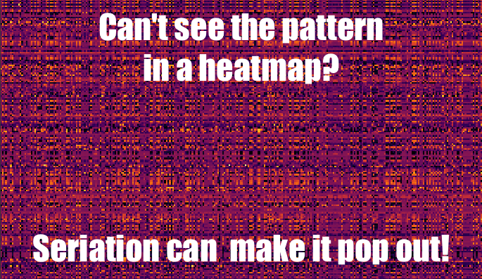
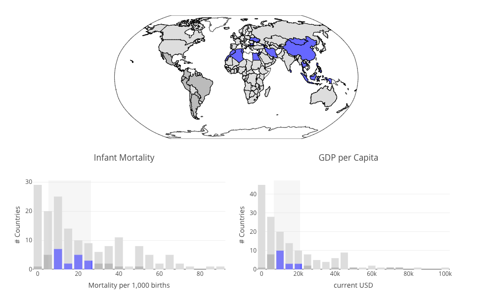
One of the easiest ways to start visualizing data is to turn a table into a heatmap: every cell gets a colour, the higher the number the brighter the colour. Unfortunately, this is often a fairly unrewarding exercise, yielding graphics that look like plaid or tartan fabric. Part of the problem is that the rows and columns of a dataset often have no natural ordering, such as time, and are instead shown in alphabetical order, or else the dataset is sorted by one of the rows or columns, rather than in an order which makes patterns pop out visually. My goal in this article is to clearly demonstrate this problem and show that there exist neat solutions to this problem using a set of techniques collectively called seriation. I’ll do this by automatically reordering the rows and columns in the following noisy-looking heatmap to make the underlying pattern very clear.
Straightening Great Circles
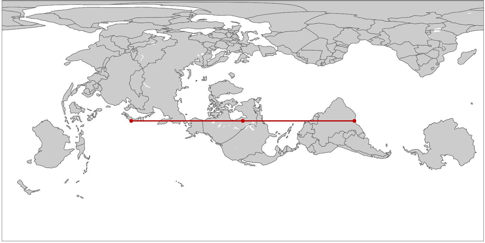
Many a bored long-haul flight passenger has asked themselves why the flight path on the map is curved, and if it wouldn’t be faster to just fly straight there. In fact, airlines try very hard to keep their flight paths as straight as possible. It’s just that the rectangular world maps we are accustomed to looking at project the 3-dimensional earth onto a 2-dimensional surface such that any long straight line not directly along the equator or perpendicular to it will appear curved. Making the equator special in this way makes some sense as a default way to draw maps, because of the way the earth spins on its axis, but we can just as easily choose any other straight line path for this treatment, and doing so gives us an interesting perspective on the world and on maps.
Data Visualization: it's a lot like Photography
I have recently read some though-provoking articles that discussed data visualization by analogy to photography. I really like this analogy, both from a process perspective – photography and data visualization – and a people perspective – photographers and data visualizers. Anyone who takes a picture with a camera is a photographer in that moment, and anyone who makes a chart, diagram or map based on data is a data visualizer while they’re doing that. Both photographers and data visualizers produce images of information emanating from their subjects, to make a point, to record, to inform, to delight. Photographers choose the lighting of their subject and framing of their shots, then use cameras to capture their image. Data visualizers choose the data they use about their subject and the mapping of data attributes to visual attributes, then use algorithms to produce graphics. Both can post-process their images to exert even finer control over their products.
Introducing react-pivottable
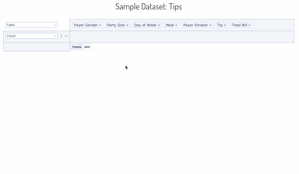
Pivot tables are interactive data exploration and summarization tools which have been a critical part of data analysts’ toolkits for the past 25 years, especially in spreadsheets like Excel. Five years ago I built PivotTable.js, which has since become one of the most popular Javascript pivot table implementations. I initially wrote it in CoffeeScript and packaged it up as a jQuery plugin, but the front-end world has evolved a lot since then so today I’m excited to announce a new-and-improved version of PivotTable.js for the modern web: react-pivottable.
Plotly.js and Crossfilter.js
I recently put together a simple example of Plotly.js and Crossfilter.js working together to produce a set of linked data visualizations.
Map of All 2017 Montreal Election Results
The 2017 edition of my interactive map of Montreal election results is now available, and I’m so pleased about the results it shows! In 2013 I made a map a couple of months after the election and it was considered so unusual it was talked about on the radio. But times have changed: this time the data was available within days, and within hours of that, news outlets had similar maps on their websites. I still like mine better though because it shows data from all 103 races, rather than just the mayoralty. The 2013 map is still around, for reference.
Interview on Using Reflection Podcast
My friend Mark Weiss recently started a podcast called Using Reflection and I was pleased to be interviewed as a guest on his 6th episode. We had a great chat about datavis and engineering ethics, among other topics.
Université de Montréal: Introduction to Data Visualization
I recently did a guest lecture (in French!) at the Université de Montréal in the context of the École d’été en Architecture de l’information (Summer program for Information Architecture).
VisMtl: Graph Visualization vs Dimensionality Reduction
Visualizing datasets as circle-and-arrow networks or graphs is a popular and easy way to make attention-grabbing graphics. As the number of data points grows, however, these graphics become crowded and marginally useful. Dimensionality-reduction algorithms such as t-SNE represent a different approach to visualizing the relationships between large numbers of data points, which in certain cases can produce graphics which do not suffer from the same types of problems as graph-visualization approaches. In this talk I compare and contrast the two approaches and give pointers to those who wish to try them out.
JS Open Day Mtl: JavaScript for Data Visualization
I was excited to be invited to give a talk at the JavaScript Open Day Montreal about data visualization in JavaScript.
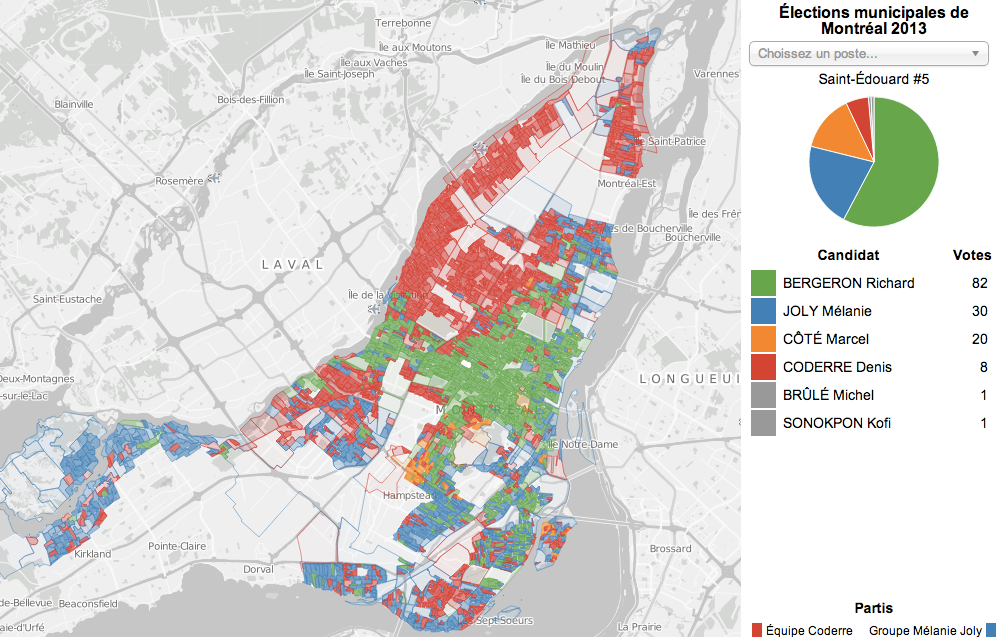
Election Pies
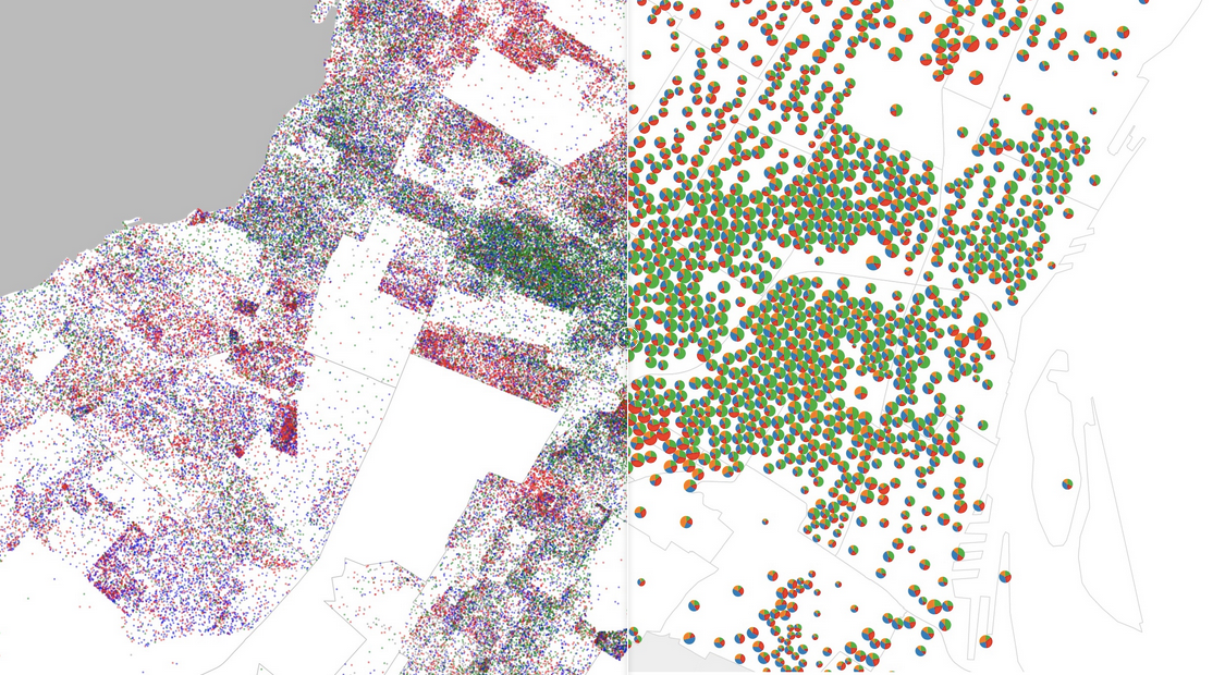
For the latest in my series of maps of the results of the 2013 Montreal municipal election, I’ve produced a pair of graduated symbol maps, representing the results as a pie charts overlaid on a base map. It’s interesting to compare this type of visualization to my previous efforts: the dot map, the choropleth, and the ternary plot.
Visualizing Family Trees
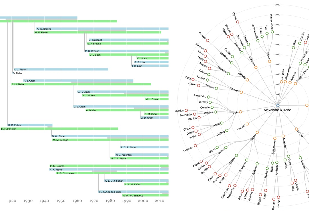
I had the pleasure of visiting with many members of my wife’s family this summer, some of whom are genealogy enthusiasts. I made a pair of visualizations of the data they had collected: one in the run-up to a family reunion and one to find my way around the large family we visited in Saskatchewan.
House Numbers on the Island of Montreal
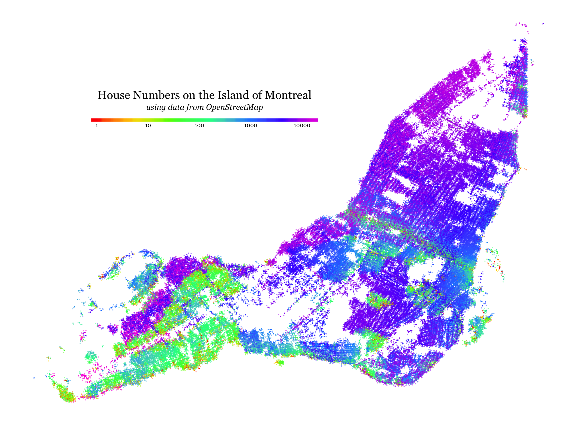
I’ve always been curious to see what kinds of patterns would be visible if one tried to visualize the distribution of house numbers (the number in a street address) across a city like Montreal. This week I took some time to learn enough about the OpenStreetMap system to gather and plot the data.
VisMtl #5 Roundup

I recently organized and MC’ed the fifth Visualization Montreal meetup, and I think it was a great success! The concept was to have a series of 7-minutes-max flash presentations from Montrealers where each one would show off a single visualization project. The rules were: no slides, no tools, just one publicly available data visualization. We had 12 presenters including me, with a good mix of types of data and visualizations. Below is the list of visualizations that were presented, and you can find photos of the event here.
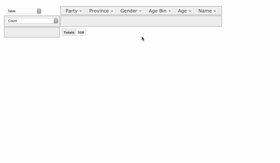
VisMtl: Canadian MPs 2012 Visualization
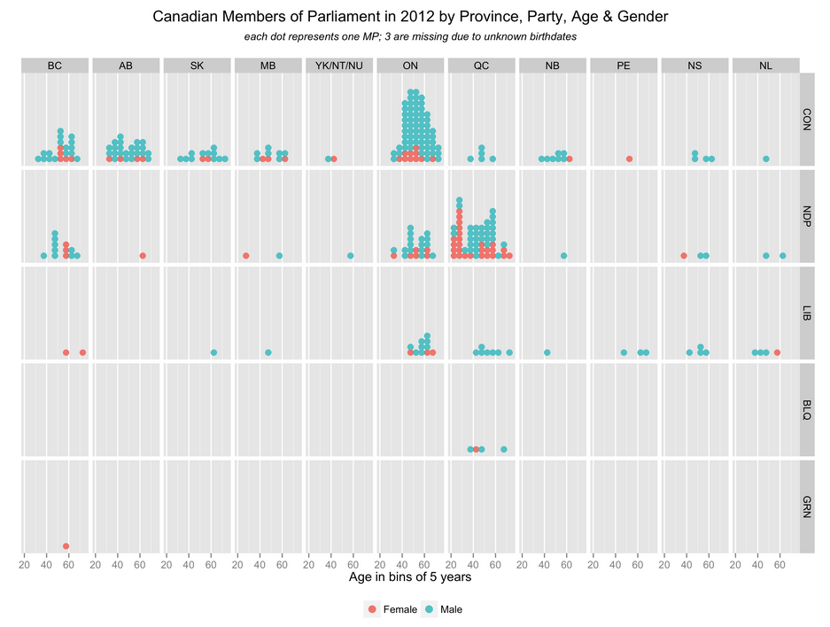
The visualization I presented at VisMtl 5 was entitled “Canadian Members of Parliament in 2012 by Province, Party, Age & Gender” and is shown above.
Interactive Subreddit Map with t-SNE
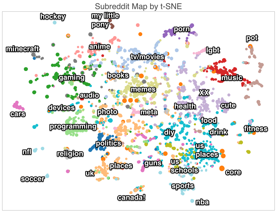
For part of my presentation at Montreal Python, I made an interactive map of the various sub-sections of the website Reddit (called subreddits). You can take a look at the interactive version or see a static annotated one above. The interactive one includes basic info on how I made it and full details are in the presentation. I got some nice comments in the /r/DataIsBeautiful subreddit post
VisMtl: Maps, Tools, Stories
I gave a talk at Visualization Montréal entitled Maps, Tools, Stories. Check out the synced slides and video!
Visualizing High-Dimensional Data in the Browser with SVD, t-SNE and Three.js
Data visualization, by definition, involves making a two- or three-dimensional picture of data, so when the data being visualized inherently has many more dimensions than two or three, a big component of data visualization is dimensionality reduction. Dimensionality reduction is also often the first step in a big-data machine-learning pipeline, because most machine-learning algorithms suffer from the Curse of Dimensionality: more dimensions in the input means you need exponentially more training data to create a good model. Datacratic’s products operate on billions of data points (big data) in tens of thousands of dimensions (big problem), and in this post, we show off a proof of concept for interactively visualizing this kind of data in a browser, in 3D (of course, the images on the screen are two-dimensional but we use interactivity, motion and perspective to evoke a third dimension).
Early Voting in the 2013 Montreal Election
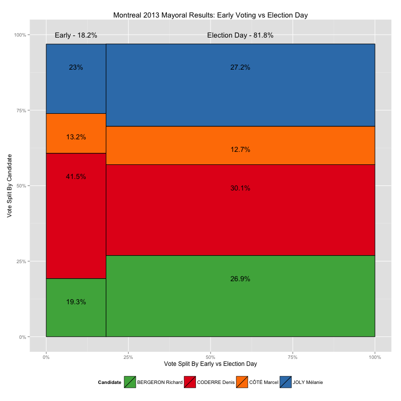
Recently I made some maps of the 2013 Montreal municipal elections, showing voting results down to the ballot-box level, using data from the Montreal Open Data Portal. It turns out, however, that not all of the ballot boxes in that data set are associated with a small geographical area like the ones shown in my by-ballot-box map, and furthermore, those ballot boxes have very different numbering schemes than the ones that do match up with small block-sized areas, numbers like 901 and 601 and 001A instead of small numbers from 1 to 100ish, like the others.
So what gives? These results appear to be from the early-voting polls, which, given that there are fewer of them, cover a larger area per ballot box. In this post I take a look at how leaving this data out of my maps skews the results I present.
Zoomable Map for Montreal Election Results
The Montreal municipal elections were just over two months ago but I played with the election results dataset over the holidays anyways as an excuse to play with a type of data I don’t normally have much to do with: geographical data. Without further ado, here is the map I made, and this post explains a bit about the process.
Ternary Plots for Election Results
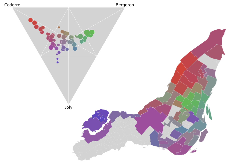
In the Montreal mayoral election last November, nearly 85% of the vote went to one of the top three candidates. A pie chart is a simple way to show the breakdown of votes between candidates for the whole election, say, but what if you wanted to look at the vote breakdown for each of the 52 electoral districts? 52 pie charts is kind of hard to look at and discern any sort of pattern. It turns out that if you only want to look at the top three candidates, you can use a ternary plot to good effect, like I did in the image above. There’s an interactive version as well which helps make the link between the ternary plot and the map via mouse-overs.
Dot Map of 2013 Montreal Election Results
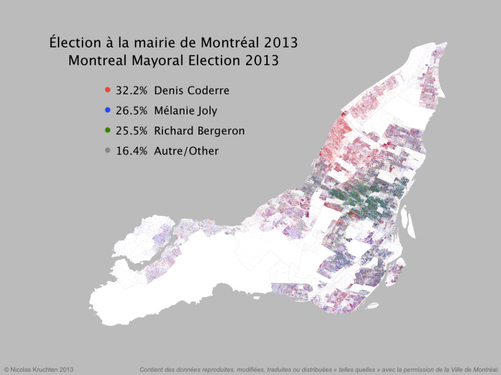
I was inspired by some cool "dot map" visualization projects around the internet (North American Census Dotmap, Toronto Visible Minorities Dot Map) to create a similar visualization of the results for the recent Montreal municipal election. I leveraged data from the Montreal Open Data portal to create the map above. There are coloured dots for (almost) each vote for the mayoralty for the top three candidates, randomly located within the catchment area for the polling booth it came from. What I like about this map is that it shows the results in all their messiness rather than neatly colour-coding entire neighbourhoods like a choropleth map would. People live and vote in arbitrary-looking clusters, not in neat blocks!
Near-Real-Time Election Results Dashboard
There was a municipal election here in Montreal on November 3, and I had the opportunity to help build an election results dashboard to be projected on the big screen at the election-night party for the political party I support: Projet Montréal. The dashboard is still up with final results. I worked with Nicolas Marchildon, who had put together a similar system for the 2009 election.
PivotTable.js
When I wear my 'data scientist hat', one of the tools I reach for most often is a pivot table. When I wanted to build a web-based tool that included a pivot table, I didn't find any Javascript implementations that made sense or didn't have crazy assumptions built-in, so I rolled my own in CoffeeScript, as a jQuery plugin.
It's now up on GitHub under an MIT license with some nice examples. I hope people find it useful!
If you work with data and you don't know what a pivot table is, I encourage you to learn about them, because they are very useful for quick'n'dirty data analysis. My web-based implementation is a decent learning tool but there are other, much-better implementations, such as in Microsoft Excel (although since Office 2003 they've made some changes that were not for the better) and AquaDataStudio.
I posted this on Hacker News and got some nice comments!

Datacratic's Dataviz System
At Datacratic, working with data often means data visualization (or dataviz): making pretty pictures with data. This is usually more like making fully machine-generated images than carefully laying out "infographics" of the Information Is Beautiful school but I find they usually end up looking pretty good. There are lots of good tools for graphing data, like matplotlib or R or just plain old Excel-clone spreadsheets but what we use most often is Protovis, the Javascript library for generating SVG, coupled with CoffeeScript, which is a concise and expressive language that compiles down to Javascript.
hackMTL Inbox Social Network Visualization
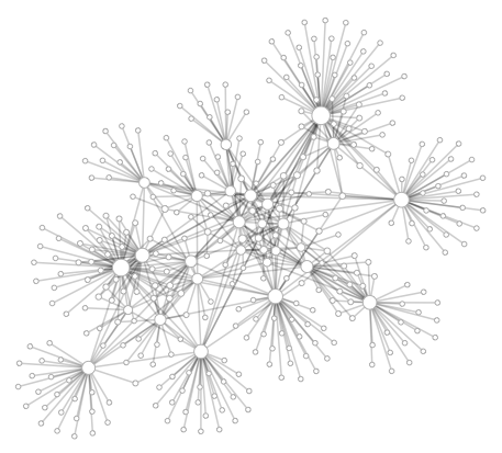
On Saturday I attended hackMTL, a one-day hackfest/competition. The ground rules called for creating an app using at least one of a list of API's. The one that caught my eye was the DokDok API (now Context.io), which basically gives you programatic read access to your GMail inbox via HTTP/JSON. Since June or so I've been doing more and more visualization of data that I work with (first at Bell then at Recoset) so I figured I'd see if I could make an app that could make a neat picture of my social network, as it's represented in my inbox. I didn't quite finish an "app" per se during hackMTL but I did manage to make a pretty picture (above). The code is up on GitHub, and basically it's a Python script that creates a JSON file which is rendered using Protovis. The circles/graph nodes represent email addresses (aka people) and the links between nodes indicate that the two parties were on the same GMail thread.
Context
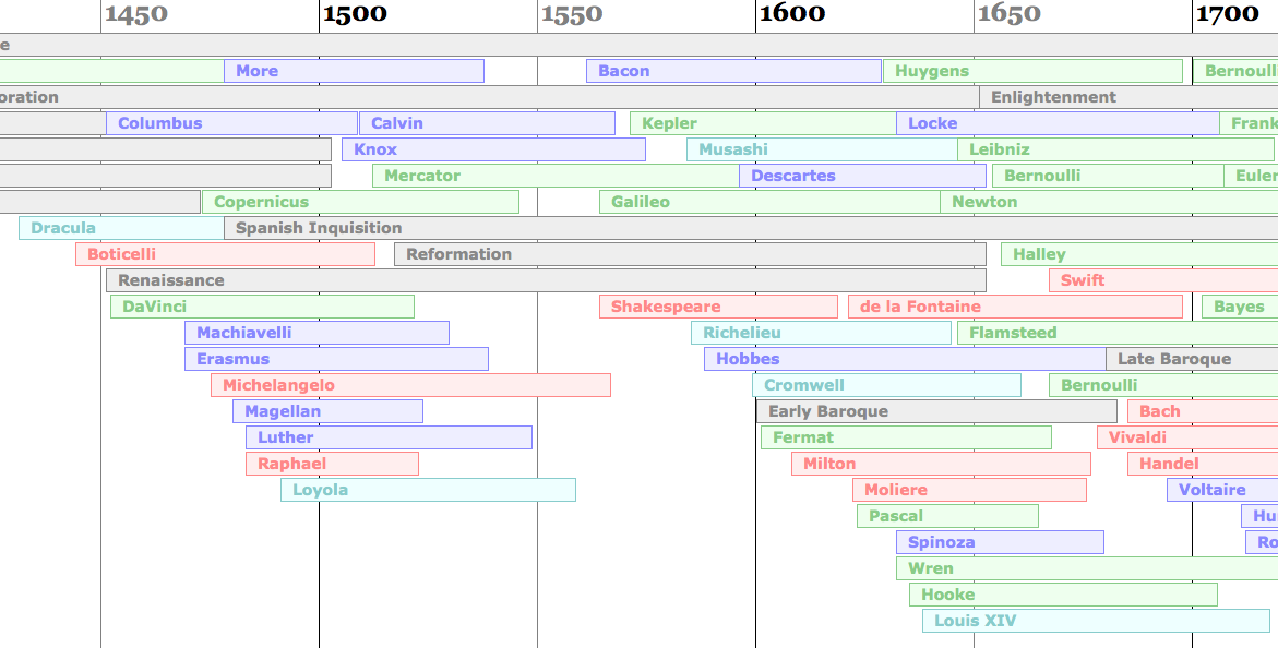
I always have trouble remembering what famous people were alive when,and more importantly, who was alive during, before or after who’s life.It’s easy enough to remember which philosopher came before which otherphilosopher or which scientist came after which scientist, but oftenharder to remember which scientist came before which philosopher etc. SoI built a PHP script to automatically lay out an HTML timeline to helpkeep all this stuff in context. I then decided to learn how to use XSLand rebuilt my little experiment using that. Click here with a modern browser to open the timeline.