Mapping Car2Go Vehicle Availability in Montreal
As part of my second collaboration with data journalist Roberto Rocha, I made an interactive map for his recent piece on where and when Car2Go vehicles park in Montreal (shorter english version). Earlier in the year, Roberto told me about people in certain neighbourhoods complaining about Car2Go vehicles causing parking problems. He and I hit upon the idea of querying Car2Go’s API every few minutes to find out where all their available cars were parked in Montreal, to take a look at some real data on this issue. I’m a huge fan and user of car-sharing services and in my neighbourhood of Rosemont I feel they prevent parking problems by enabling lower car ownership. As my map makes clear, however, this is not the case in areas like the Mile End. In any case, the CBC articles do a great job of reporting on the situation, and I wanted to share some of the thinking and code that went into making the map.
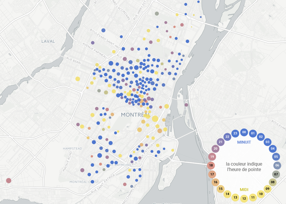
Roberto’s API queries gave us a few million observations to work with, each of which contained a timestamp, and latitude and longitude. I wanted to make a map which showed not only the spatial density of Car2Go vehicles, but also the spatial differences in the repeating daily usage pattern. The data shows that like the vehicles of car-owners, Car2Go vehicles follow their users: they park in residential areas at night and near workplaces during the day. I settled upon the idea of making a proportional symbol map: a map with circles representing cars parked in a given zone, where the area of the circle represents the number of cars available in the zone and the colour represents the hour of the day when the most cars are parked in the zone. This would allow us to easily see not only where cars spend their time, but when. Here is the result:
(click for interactive version)
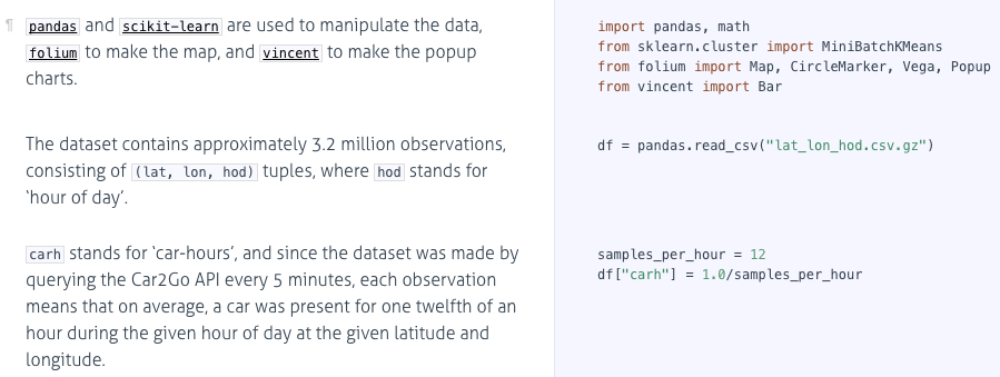
When I was done, it turned out that the Python code required to make such a map, including making the circles pop up an hour-of-day distribution chart when clicked, was only about 30 lines long, which was a pleasant surprise! Most of the heavy lifting is done by the folium library.
The script is up on Github and here is what it looks like in the Literate Programming style courtesy of Docco:
(click to read the code with commentary)
And here it is without comments, in order to appreciate its conciseness:
import pandas, math
from sklearn.cluster import MiniBatchKMeans
from folium import Map, CircleMarker, Vega, Popup
from vincent import Bar

df = pandas.read_csv("lat_lon_hod.csv.gz")
samples_per_hour = 12
df["carh"] = 1.0/samples_per_hour
df["zone"] = MiniBatchKMeans(250).fit_predict(df[["lat", "lon"]].values)

map = Map(zoom_start=12, tiles="cartodbpositron",
             location=list(df[["lat","lon"]].mean().values))

zones = df.groupby("zone").agg(dict(carh='sum', lon='mean', lat='mean'))
for i, zone in zones.iterrows():
    num_days = 30
    carh_by_hod = df.query("zone==@i").groupby("hod").carh.sum()/num_days
    vega = Bar(carh_by_hod, width=450,
               height=150).axis_titles(x='Hour of Day', y='Cars Available')
    chart = Vega(vega.to_json(), width=vega.width+50, height=vega.height+50)

    map.add_child( CircleMarker(
        location = [zone["lat"], zone["lon"]],
        radius = int(6*math.sqrt(zone["carh"])),
        fill_opacity = 0.8, color=None,
        fill_color = ('#274cc9','#274cc9','#274cc9','#274cc9',
            '#274cc9','#3959bf','#647aa6','#909b8c','#bcbc73',
            '#e8dd5a','#f1e455','#f1e455','#f1e455','#f1e455',
            '#f0df56','#ecc45a','#e7a95f','#e28e63','#de7467',
            '#c46576','#9d5f8a','#76599f','#4e52b4','#274cc9'
            )[carh_by_hod.idxmax()],
        popup = Popup(max_width=chart.width[0]).add_child(chart)
    ) )

map.save('map.html')
⁂