Ternary Plots for Election Results
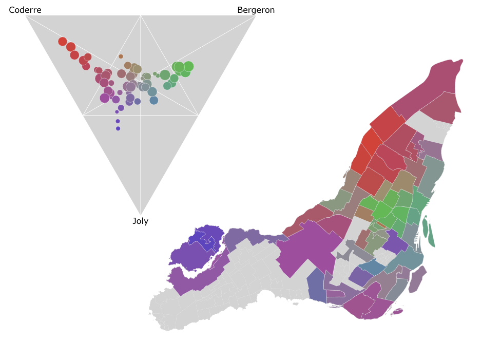
In the Montreal mayoral election last November, nearly 85% of the vote went to one of the top three candidates. A pie chart is a simple way to show the breakdown of votes between candidates for the whole election, say, but what if you wanted to look at the vote breakdown for each of the 52 electoral districts? 52 pie charts is kind of hard to look at and discern any sort of pattern. It turns out that if you only want to look at the top three candidates, you can use a ternary plot to good effect, like I did in the image above. There’s an interactive version as well which helps make the link between the ternary plot and the map via mouse-overs.
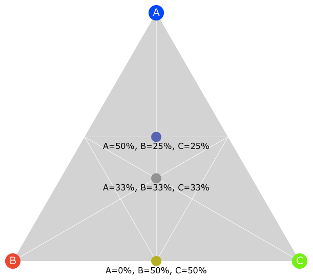
A ternary plot for a three-way vote split is basically just a triangle with a candidate in each corner. Every point within that triangle represents a split of votes: you can think of each point representing one possible three-way pie-chart, and all possible three-way pie-charts mapping to a point in the triangle. The corners represent 100% of the votes going to that corner’s candidate, and the further away the point is from a corner, the smaller the proportion of votes that corner’s candidate got.
As it happens, the way computer monitors display color is by independently varying the amount of red, green and blue light that gets shown, so if you assign those colours to the points of the triangle, then each point in the triangle gets its own shade (even though many of those shades are ugly!), and this is how the points and triangles I’m showing below were coloured.
Here’s a simple example with three candidates A, B and C with some key points mapped out:
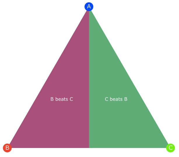
In the example below, the triangle is split in half to show the region where B beats C and vice versa. Any point in the “B beats C” region is closer to B than to C and therefore will have a proportion of B votes higher than the proportion of C votes, regardless how many votes A got.
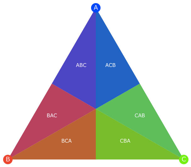
Applying this rule repeatedly and applying basic logic, we can actually split the triangle into six zones, which represent the six possible rankings of who was first, second and third, as in the example below:
Additionally, if we draw lines between the face midpoints, we create three new triangles. Points in the outer triangles represent vote splits with strict, 50%-plus majorities, whereas the inner triangle represents points where the winner didn’t get a strict majority but a rather a plurality:
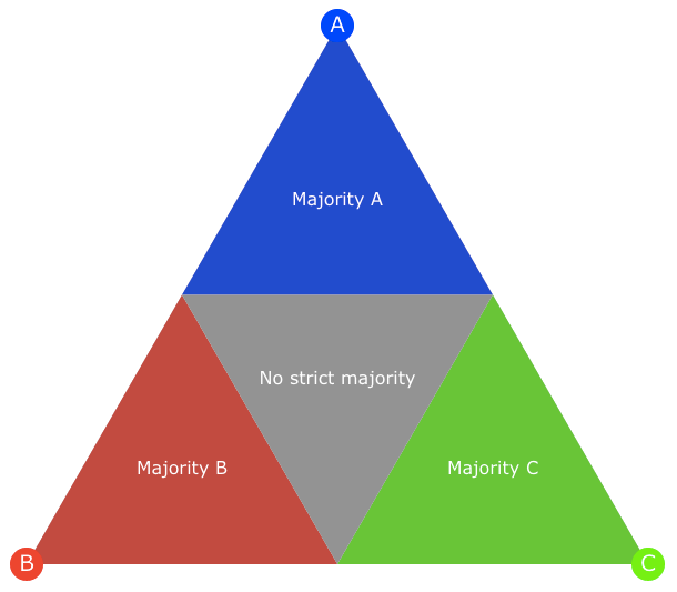
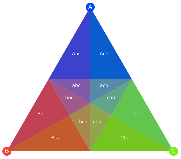
Putting it all together, we can divide the triangle into twelve zones, as below. The labels can be interpreted as follows: “Abc” means that A came in first, with a majority of votes, followed by B then C; “abc” means that A came in first with a plurality of the votes, followed by B then C.
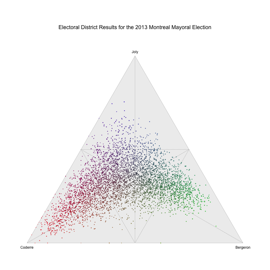
So how does this visualization technique help us understand what happened in the recent Montreal mayoral election? The following visualization shows us each of the 52 electoral districts as points in a ternary plot, and I drew an actual map of Montreal next to it. The interactive version lets you mouse over the points to light up which region it represents. The points in the ternary plot are sized by the number of votes in the district.
My takeaway from the pattern in the ternary plot is that where Coderre won, he won big (i.e. the north end of the island), whereas whereas Bergeron won (in the middle), he didn’t crush it in the same way. Joly did best in the least populated districts (in the west). Furthermore, there aren’t many points deep into the zone between Coderre and Bergeron: either Joly came second or it was a close three-way race.
In conclusion, although I’m a big fan of small multiples, I believe that it’s easier to come to these sorts of conclusion by looking at a ternary plot with 52 dots on it than it would be by looking at 52 pie-charts!
The big drawback to this kind of visualization is, of course, that it only works with mixtures of three components. As a result, it’s important to remember that this visualization ignores all the other candidates including Côté, who got 10% of the vote. I did a quick sanity check, and while Côte did carry one or two districts, he did so by a very small margin and those districts were reasonably close to being four-way ties so they end up in the middle of the triangle and this visualization doesn’t paint too distorted a picture.
I also made a similar plot in R to show the results for the nearly 4,000 ‘sections’ or ballot-boxes in Montreal, which shows off how well this technique scales compared to small multiples of pie-charts. My conclusions from above still hold with respect to rank: Joly came in second to either Bergeron or Coderre (or they came in second to her) in many more places than they came second to each other.
⁂
Follow Nicolas
Code on Github
Code from this post is up on Github at nicolaskruchten/mtlelection2013bydistrict