House Numbers on the Island of Montreal
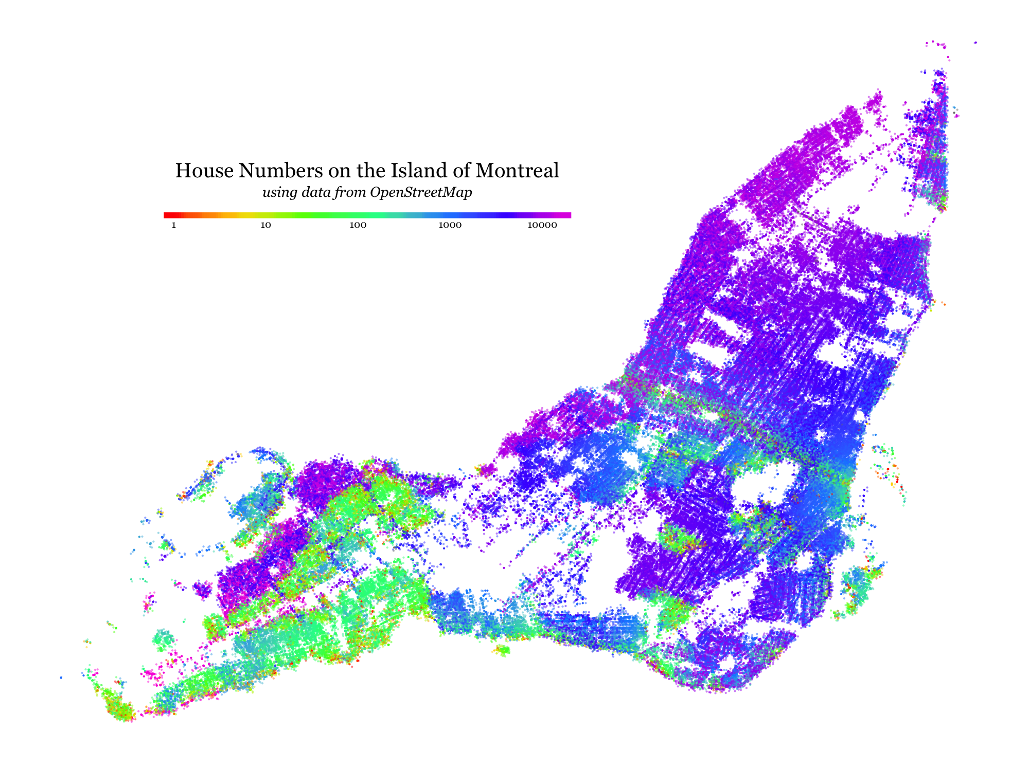
I’ve always been curious to see what kinds of patterns would be visible if one tried to visualize the distribution of house numbers (the number in a street address) across a city like Montreal. This week I took some time to learn enough about the OpenStreetMap system to gather and plot the data.
This map sort of shows a mixture of geographical, historical and political patterns, as house numbering is a municipal concern and different municipal authorities came into being at different times with different allegiances and ideas. The patterns I see are as follows:
- The Saint Lawrence River and Rue Saint-Laurent both act as zero-points: a dominant pattern is that house numbers increase as you move “north” away from the river and “east/west” as you move away from the the Main.
- The above pattern is broken repeatedly for places that were and/or still are independent cities which show up in yellow/green because they have their own zero-points
- In the West-Island, curiously, some of the suburbs like Pierrefonds-Roxboro stick to the dominant pattern and others like Dollards-Des-Ormaux don’t, even though they tend to stick to the twisty-passages-all-alike aesthetic of suburban street layout.
Technical details
The OpenStreetMap database contains “way” record for every side of every block of every street, delimited by “node” records which contain latitude and longitude data. Each of these nodes has addr:housenumber tag containing the limiting house number for its end of the block. This map is essentially just a scatterplot of the positions of these nodes, colour-coded by the house number.
This map was put together using the ggplot2 package and RMarkdown with data from the OpenStreetMap project. The Jekyll engine which powers this website accepts Markdown directly, so the remainder of this post is based on the housenumbers.md file that was auto-generated from the housenumbers.rmd source file.
Step 1: Get the Data
We’ll use the Overpass API to query OpenStreetMap data: we want “nodes” (basically points) within the Island of Montreal which have a non-empty addr:housenumber tag, and we want the output in CSV format so that R can read it smoothly. Here’s an Overpass QL query that gives us just that:
query = paste(
  '[out:csv(::lat, ::lon, "addr:housenumber")];',
  'area ["name"="Montréal (06)"]->.a;',
  'out body qt;',
  '(node(area.a)["addr:housenumber"~"."];);',
  'out body;'
)
Let’s actually run this query on a public Overpass endpoint and shoehorn the output into a data frame which ggplot2 will understand:
overpassURI = 'http://overpass-api.de/api/interpreter'
queryURI = paste(overpassURI, '?data=', URLencode(query), sep='')
mtl <- read.delim(url(queryURI), stringsAsFactors = FALSE)
mtl$addr.housenumber = as.numeric(mtl$addr.housenumber)
mtl = mtl[sample.int(nrow(mtl)),]
head(mtl)
Output:
   X.lat       X.lon    addr.housenumber
45.49771   -73.83123                 139
45.43958   -73.89345                  59
45.52074   -73.56383                1124
45.49366   -73.69993                7000
45.46517   -73.87465               17099
45.48182   -73.62779                4901
Step 2: Make the Graphic
With the data just so, making the basic plot is a straightforward ggplot2 call to map lon/lat to x/y and housenumber to colour:
library(ggplot2)
plot = qplot(data=mtl, x=X.lon, y=X.lat, color=addr.housenumber)
plot
Output:
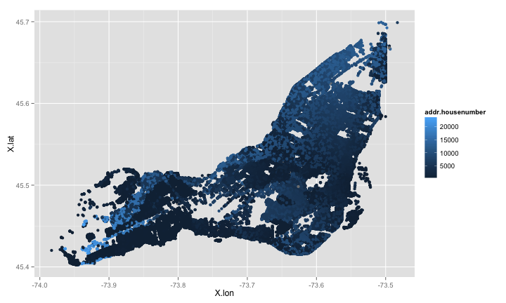
Step 3: Tweak the Graphic
We will dress it up a bit before publication, though, to shake that “defaults” look. We’ll use a colour scale that makes things pop and make a nice legend for it which we’ll move into the empty part of the chart area (where Laval should be!), and then we’ll get rid of all unnecessary elements like the panel, gridlines and x and y axis labels, and we’ll save the result as a high resolution PNG:
png(filename="housenumbers.png", height=1500, width=2000, units="px")
plot +
  geom_jitter(
    position = position_jitter(width=0.002, height=0.002),
    alpha=0.5
  ) +
  scale_colour_gradientn(
    colours = rainbow(7), trans='log10', name = expression(atop(
      "House Numbers on the Island of Montreal",
      atop(italic("using data from OpenStreetMap"), "")
    )),
    breaks=c(1, 10, 100, 1000, 10000),
    guide = guide_colourbar(
      title.position="top", direction = "horizontal",
      title.hjust = 0.5,
      ticks = FALSE, barwidth = 55, barheight = 0.8)
  ) +
  scale_x_continuous(breaks = NULL, name= "") +
  scale_y_continuous(breaks = NULL, name= "") +
  theme(
    legend.position = c(.35, .75),
    legend.title = element_text(size=40),
    legend.text = element_text(size=20),
    text=element_text(family="Georgia"),
    panel.background = element_blank()
  )
dev.off()
And here’s the final output again:
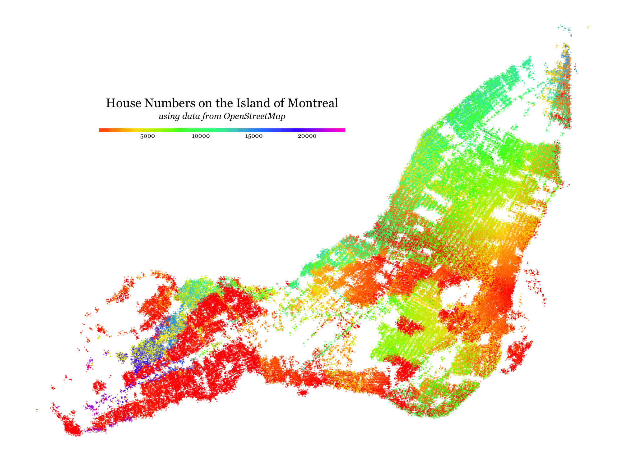
A note on the colour scale
My choice of a log-transformed rainbow colour scale was the most-often critiqued element of this visualization. In the technical development above one can see a simple linear gradient, which I thought was fairly uninteresting and unreadable. I chose a rainbow scale so that the crosssing north-south and east-west gradients would be more visibles, and I chose the log scale to make it clearer where the number systems ‘reset’ to zero.
Here’s a version with a linear (but still rainbow) color scale:
⁂