Machine Learning Meets Economics
The business world is full of streams of items that need to be filtered or evaluated: parts on an assembly line, resumés in an application pile, emails in a delivery queue, transactions awaiting processing. Machine learning techniques are increasingly being used to make such processes more efficient: image processing to flag bad parts, text analysis to surface good candidates, spam filtering to sort email, fraud detection to lower transaction costs etc.
In this article, I show how you can take business factors into account when using machine learning to solve these kinds of problems with binary classifiers. Specifically, I show how the concept of expected utility from the field of economics maps onto the Receiver Operating Characteristic (ROC) space often used by machine learning practitioners to compare and evaluate models for binary classification. I begin with a parable illustrating the dangers of not taking such factors into account. This concrete story is followed by a more formal mathematical look at the use of indifference curves in ROC space to avoid this kind of problem and guide model development. I wrap up with some recommendations for successfully using binary classifiers to solve business problems.
The Case of the Useless Model
Fiona the Factory Manager had a quality problem. Her widget factory was throwing away too many widgets that were overheating due to bad gearboxes. She hadn’t been able to work with her gearbox supplier to increase their quality control, and she didn’t have a non-destructive way to check if a given gearbox will cause problems, so she asked Danielle the Data Scientist to build her a device which could evaluate the quality of a gearbox, to avoid using bad ones to build overheating widgets. Danielle was happy to help, as she would be able to use some fancy machine learning algorithms to solve this problem, and within a month she proudly presented her results.
“This is a quality scanner. Just point the camera at the gearbox and the readout will tell you if it is safe to use the gearbox in a widget,” she told Fiona. “This little knob on the side can be used to tune it if you get too many false positives (bad gearboxes being marked as good) or false negatives (good gearboxes being marked as bad) although I’ve preset it to what should be the most accurate setting.”
A few weeks later, Danielle dropped by to check up on the scanner. “Oh, we stopped using it,” responded Fiona, “it gave us too many false negatives, so we were throwing away too many good gearboxes to make it worthwhile. I lose money when we throw away widgets, but gearboxes aren’t cheap, and I can’t afford to throw away working ones! We tried playing with the little tuning knob but in the end we had to turn it all the way down to stop losing money and it never tells us the gearbox is bad, which is the same as not using the scanner.” Danielle was taken aback, as she had tested her scanner very carefully and it had achieved quite good results in the lab. Danielle started thinking that she herself had a quality problem on her hands.
While she was digging into the problem with Fiona, Emily the Economist poked her head in the door. “I couldn’t help but overhear and I feel like my skills might be applicable to your problem,” she told them, “Mind if I try to help?” Danielle, stumped so far, accepted. “So, how does your scanner work, and what does the knob do?” asked Emily.
“It’s pretty simple, actually,” explained Danielle, “I used a machine learning algorithm to train a model, which is a function that takes an image of a gearbox and assigns it a quality score: the higher the likelihood of the gearbox being good (i.e. a positive result), the higher the score. When you combine a model with a threshold value above which you say the gearbox is good, you get a classifier, so the model defines a family of possible classifiers. The knob on the scanner allows you to choose which classifier you want to use. Like this!” she walked up to the whiteboard and wrote out a simple equation.
\[class(input) = \begin{cases} positive & \text{if $score(input) > threshold$} \\ negative & \text{otherwise} \end{cases}\]“I took all the photos of good and bad gearboxes and split them into two piles, one which I used to train models, and one which I used to test them. I built and tested a whole series of models and used the one with the highest AUC for the scanner.”
Emily, who had been nodding until this point, jumped in, “Wait, what does AUC mean?”
“Oh, right,” replied Danielle, “it’s a measure of how good the model is. Let me explain… Whenever I build a model, I run it on the testing data for each setting of the threshold, and I measure the true positive rate (the percentage of good gearboxes correctly identified as positive) and the false positive rate (the percentage of bad gearboxes incorrectly identified as positive). I’ll draw out a graph for you. Here you can see that when the threshold is low, the resulting classifier correctly identifies most of the good gearboxes, but tends to miss the bad ones, and vice versa when the threshold is high.” [Author’s note on the charts in this story: the model performance data was generated by sampling from realistic simulated class distributions, and the thresholds were scaled to lie between 0 and 100.]
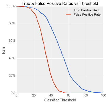
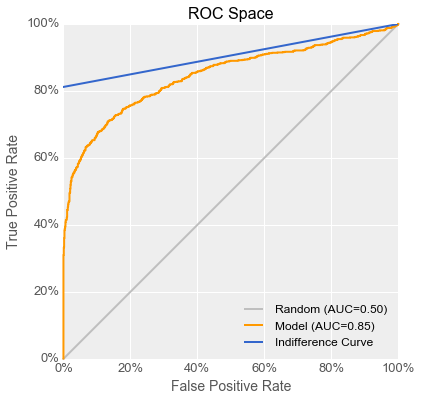
“We data scientists prefer to look at the same data a bit differently, though, so we can see the tradeoffs between the two measures more easily. What we do is we plot the true positive rate on the Y axis versus the false positive rate on the X axis. The resulting curve is called a Receiver Operating Characteristic, or ROC, curve, and this X-Y space is called ROC space. Each point on the ROC curve corresponds to the performance of the classifier at a given threshold. Here’s the curve for the model in the scanner right now.”
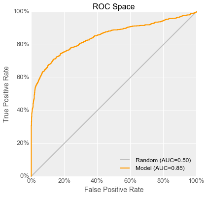
“The ideal classifier is one that makes no mistakes, so the ideal model’s ‘curve’ goes through the point the top left corner, representing a 100% true positive rate with a 0% false positive rate. A model producing classifiers which just randomly assign good and bad labels has a curve that just follows the diagonal line up and to the right.”
“So to get back to your question, we can boil down model goodness to one number with the AUC, which stands for the Area Under the Curve. The closer it is to 1, the better the model is, and anything below 0.5 is worse than random guessing. The model I used in the scanner had an AUC of 0.85, so I’m really puzzled that it didn’t help Fiona! I mean, turning the knob all the way down means that she’s setting the scanner all the way into the upper right corner of the space!”
Fiona was pretty bored by this point in the conversation, so she was glad when Emily turned to her and asked, “What happens when you try to use the scanner with the threshold knob set just a little higher than the minimum?”
“Hmm, at the lowest setting we tried before giving up, it tagged 15 gearboxes as bad, out of a batch of 5000, and when we tested them, only 1 of them actually was,” answered Fiona after glancing at some records. “One overheating widget costs me $300 in wasted parts and labour, but using the scanner I threw away a bunch of gearboxes at $50 each. Unfortunately, testing destroys the gearbox so I can’t use it after testing, which is why I had such high hopes for this scanner’s ability to solve this problem for me.”
Emily thought about this for a minute and finally asked, “OK, a couple more questions: how much do you make per working widget, and on average how many widgets do you have to throw away per batch of gearboxes due to overheating problems right now?”
“We sell widgets for $320, so net $20 of profit per working widget. As to how many bad gearboxes per batch, I’d say 250 is about right,” said Fiona.
Emily went to the whiteboard. “We now have enough information to figure out why this model is useless to Fiona even though it scores high marks in Danielle’s book! What matters to Fiona is money lost or gained, so let’s see if we can work out an equation we can plot that relates Fiona’s utility (the economist’s term for how much money she is making or losing) to the position of the knob in Danielle’s scanner. Fiona told us that 5% of the gearboxes are bad, so we can figure out how many true and false positives and negatives are likely per batch of gearboxes for each point on the ROC curve. True and false negatives are worth -$50, since we throw away the gearbox when the scanner says it’s bad. False positives are worth -$300 each, since we have to throw away the whole widget if we build one with a bad gearbox that the scanner missed. True positives are worth $20 each because we can sell a working widget and make back the cost of the parts with a bit of margin. The overall utility is the sum of the utilities of the various cases, scaled by the rate at which they occur.” She fluidly wrote out the following equation, table and graph on the board as she spoke.
\[utility(t) = ($20 \cdot TPR(t) \cdot 95\%) - ($50\cdot(1-TPR(t)) \cdot 95\%) - \\ ($300 \cdot FPR(t) \cdot 5\%) - ($50 \cdot (1-FPR(t)) \cdot 5\%)\]| Actual condition of gearbox | |||
|---|---|---|---|
| Good | Bad | ||
| Scanner output at threshold = @t@ |
Positive |
True Positive @utility = +$20@ @rate(t) = TPR(t) \cdot 95\%@ |
False Positive @utility = -$300@ @rate(t) = FPR(t) \cdot 5\%@ |
| Negative |
False Negative @utility =-$50@ @rate(t) = (1-TPR(t)) \cdot 95\%@ |
True Negative @utility = -$50@ @rate(t) = (1-FPR(t)) \cdot 5\%@ |
|
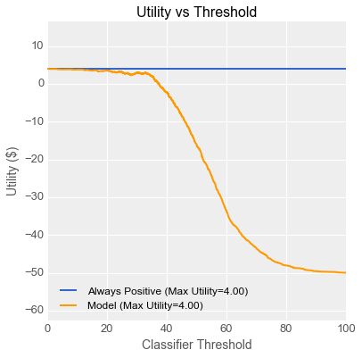
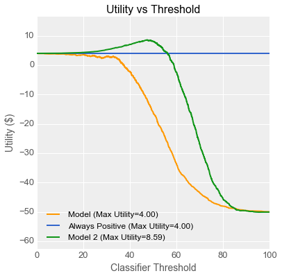
“As you can see, Fiona makes the most money when she sets the threshold knob all the way down to the minimum, which works out to using all the gearboxes and throwing some widgets away every day. Her profit per gearbox is $4 due to all the discarded widgets. Now let’s see if we can relate this to your ROC curve, Danielle. Every point on the utility curve corresponds to a point on your ROC curve like this.” Emily then demonstrated her unbelievable perspective drawing skills and produced the following plot on the whiteboard:
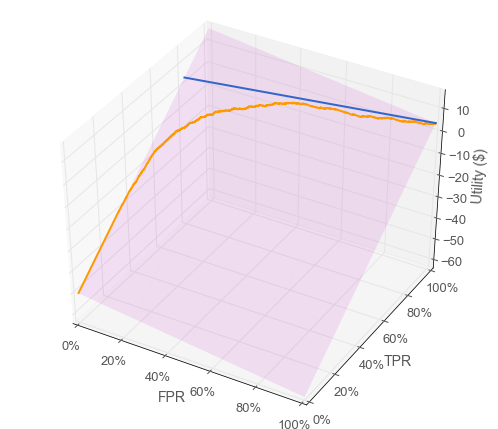
“You can think of utility as being a z-axis coming out of your ROC-space graph. You can see that utility is a linear function of true positive rate and false positive rate, because the utilities of all the classifiers sit on an angled plane above the ROC space. I added a useful line for you on that plane in blue, representing the intersection of the angled plane with the utility associated with simply using every gearbox to build widgets. Let’s see where that line lands in 2-dimensional ROC-space.” Emily added a line to Danielle’s original ROC curve.
Danielle, who had been furrowing her brow until that point, lit up. “I get it! You’re saying that every classifier whose performance sits along that blue line in ROC space will give Fiona $4 per gearbox, which is the same utility as just using every gearbox, which is the same as setting the threshold to its minimum value. So what we need is a model with a ROC curve that crosses above that line.”
“Luckily, I have just the one! While I was working on this project, I kept records of every experiment I did. I generated a model with a curve that looks like this, but I didn’t use it because its AUC wasn’t the highest.” She added a green curve for the new model to the now-crowded ROC graph.
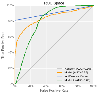
“That’s great!” said Emily, adding a green line to her original utility curve graph. “Because your second model’s ROC curve rises above the indifference curve, its utility curve also rises above the utility of setting the knob to zero.” She punched numbers into her calculator, “With a model like that, you could set the knob to around 45 such that out of a batch of 5000 gearboxes, 171 would be flagged as being bad, of which 62 would be false negatives. That works out to more than twice the profits for Fiona.”
“Hmm,” said Fiona thoughtfully, “So you’re saying that even though I’d be throwing away many more good gearboxes, using this scanner would more than make up for it by finding almost half of the bad ones… That sounds reasonable. I don’t care if this model has a lower area under some curve if it helps me make more money! Danielle, if you can update your scanner, I’ll give it another shot.”
“Of course,” replied Danielle, “and the next time we work together, let’s do this analysis first, so we can avoid this kind of problem in the future.”
A week later Fiona e-mailed Danielle and Emily with the news: the updated scanner had indeed more than doubled her profits for the widget production line!
(Update: Danielle and Emily come back in Machine Learning Meets Economics, Part 2 with The Case of the Augmented Humans!)
Analysis: Indifference Curves in ROC Space
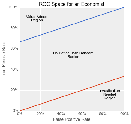
As the story above shows, if the utility of true and false positives and negatives are constants, then the expected utility (or business value) of a binary classifier is a linear function of its true positive rate (@TPR@) and its false positive rate (@FPR@). These four utility values and the class distribution (the proportion of positive and negative classes) together comprise the operating context for a classifier. If the operating context is known, a family of straight lines along which all points have the same expected utility can be plotted in ROC space, which is a plot of @TPR@ vs @FPR@. Such lines are known as indifference curves because someone trying to maximize utility is indifferent to the choice between points on the same curve, because they all have equal utility.
Expected utility is the average of the utilities of the four possible outcomes, weighted by the probability of that outcome occurring. In the equation below, @r_p@ and @r_n@ are the fractions of positive and negative cases, respectively, in the business context:
\[E[u] = u_{tp}r_p{TPR}+u_{fn}r_p (1-{TPR})+u_{fp} r_n {FPR} + u_{tn} r_n (1-{FPR})\]Solving for a line in ROC space that goes through the point @(d,d)@ on the main diagonal yields the following relationship between @TPR@ and @FPR@, where @s@ is the slope of the line:
\[({TPR} - d) = ({FPR} - d) \cdot s \\ s = \frac{r_n(u_{tn}-u_{fp}) }{ r_p(u_{tp}-u_{fn} )}\]The equation for @s@ can be re-expressed to make it easier to reason about. The quantity @-(u_{tn}-u_{fp})@ can be called @c_n@, as it equals the cost of misclassifying a negative example compared to the utility of correctly classifying it. Similarly, @-(u_{tp}-u_{fn})@ can be called @c_p@. The slope @s@ then has the following compact form:
\[s = \frac{r_n c_n}{r_p c_p}\]All lines with slope @s@ are indifference curves in ROC space, so all points along such a line have equal expected utility. This utility is computable by substituting @d@ for @TPR@ and @FPR@ in the utility equation. Every point in ROC spaces is intersected by one indifference curve, and because every classifier occupies a point in ROC space, every classifier is part of a set which all have the same utility. For all values of @d@ from 0 to 1, the indifference curve traces out the classifiers which have the same utility as a positive-with-probability-@d@ classifier. All classifiers along the @d=0@ and @d=1@ curves have the same utility as the “trivial” always-negative and always-positive classifiers, respectively.
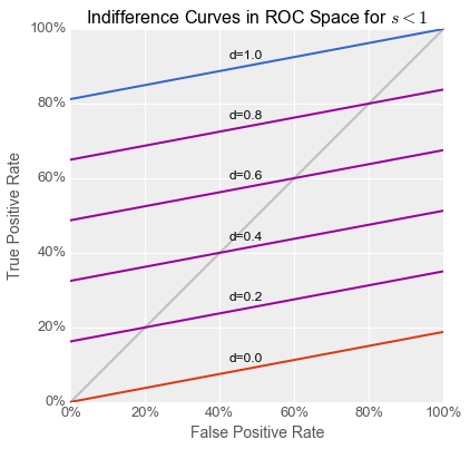
When @s>1@, an always-negative classifier has higher utility than an always-positive one, and vice versa when @s<1@. In order for a classifier to have an expected utility above and beyond that of a trivial one (i.e. for it to have any real business value), it must lie above both the @d=0@ and @d=1@ indifference curves in ROC space. Classifiers lying below both of these curves are somewhat peculiar in that they are so bad at classifying that the inverse of its output has a higher utility than either trivial classifier. Such a situation merits further investigation, as it suggests a problem with either the training or testing procedure (e.g. inverted labels in either the training or testing set) which, once corrected, could yield a valuable classifier.
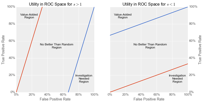
The partition of ROC space above runs counter to an oft-repeated notion about ROC space whereby classifiers above the main diagonal have “good” performance and those below have “poor” performance. From an expected-utility perspective, and assuming no problems with the training and testing procedures, this is only true in the critical case where @s = 1@. This occurs when the ratio of the class proportions is the inverse of the ratio of the misclassification costs:
\[s = 1 \Longleftrightarrow \frac{r_p}{r_n} = \frac{c_n}{c_p}\]For example, when there is 1 positive example for every 5 negative ones, then @s=1@ if and only if the misclassification of a positive example is 5 times more costly the misclassification of a negative one. This relationship holds in the textbook case where the classes are balanced and have equal misclassification costs, but is not generally true of all business problems which can be addressed with binary classifiers. I have never seen a business process which included a step that randomly assigned labels to items in a stream. In most real-world situations, the baseline is either always-positive (e.g. “there are costs but it’s worth it overall”) or always-negative (i.e. “it’s too risky so we don’t do this”), as one of these always has equal or better utility than randomly assigning labels.
The good news is that class-proportion and misclassification-cost ratios should be reasonably easy to estimate for a given business context, giving at least some indication of how close @s@ is to 1. If @s@ is far from 1, a data science process of model development and selection which blindly maximizes the AUC (or many other general-purpose machine learning metrics) and then proceeds to threshold selection runs a real risk of producing a model with an optimal threshold that cannot beat a trivial classifier, and thus has no real business value. If @s@ can be estimated ahead of time, a data science project can increase its chances of business success by focusing on models whose ROC curves rise into the value-added zone of ROC space.
Furthermore, estimating @s@ can be useful even before model selection, during problem selection. The further @s@ is from 1 for a given problem context, the smaller the value-added region in ROC space, and the harder it will be to develop a classifier able to beat a trivial baseline. This type of insight can help prioritize data science projects to focus resources on the projects most likely to succeed.
Of course, such a prioritization approach would necessarily involve an investigation into the existing business-as-usual case: is the incumbent policy in fact a trivial always-positive or always-negative one? Or does the process under consideration already use some form of classifier like a set of hand-maintained rules which outperform trivial classifiers on utility and therefore set the baseline indifference curve even higher? The benefits of using machine learning to solve a problem can be quantified using the expected-utility equation by comparing the utility of the incumbent policy with that of a reasonably-achievable classifier and that of a perfect classifier. Prioritization can then focus on the tradeoff between the magnitude of the payoff and the estimated likelihood of success.
Conclusions & Recommendations
In this article I detailed a fictional situation in which the use of a general-purpose metric during model selection could lead to the deployment of a classifier without any business value. I then showed how the economic concept of expected utility could explain this problem, and in fact could have avoided this problem had it been incorporated into a model selection process. Finally, I showed that by estimating a single quantity (the slope of the indifference curve in ROC space) you can evaluate the difficulty of solving a business problem using a classifier, even before starting model development.
My recommendations, if you are considering the use of a binary classifier to solve a business problem, are as follows:
- When evaluating a potential project, do a basic economic analysis of the problem-space: ask about the relative frequencies and misclassification costs of the various outcomes. This will help you figure out how difficult it is likely to be to beat the current baseline and if you do, how valueable that is likely to be. Potential leading questions are:
- “What does your process do right now and how much are you making or losing?”
- “How much would you make or lose with a perfect classifier that never made a mistake?”
- “How often does your process make a mistake right now, and do they tend to be false negatives or false positives?”
- When executing on a project, if you are able to compute expected utility, consider maximizing that directly instead of AUC or another general-purpose metrics. If you are not confident about computing expected utility, at least estimate the slope of the indifference curve and focus on developing models whose ROC curve rises above the trivial indifference curves.
Related Reading
I have written a follow-up to this post in a similar format, if you enjoyed this one: Machine Learning Meets Economics, Part 2
Much has been written by others on evaluating machine learning models, using various metrics like overall accuracy (ACC), the Area Under the Curve (AUC), the Matthews Correlation Coefficient (MCC) and others. These are general-purpose metrics, and I have found very few articles written for practitioners which focus on the business value of such metrics, or on finding metrics designed to correlate with business value.
I found the following works relevant while researching this article, although none of them quite present the same arguments I do here with respect to problem- and model-selection:
- An Introduction to ROC Analysis - this very solid introduction to ROC analysis covers some of the same ground as the present article when discussing ROC convex hulls.
- The Geometry of ROC Space: Understanding Machine Learning Metrics Through Isometrics - this paper explores families of linear curves which can be drawn through ROC space, without covering indifference curves.
- A principled approach to setting optimal diagnostic thresholds: where ROC and indifference curves meet - this paper discusses the application of indifference curves in ROC space specifically in the context of threshold selection, without reference to model selection or problem selection.
- A Unified View of Performance Metrics: Translating Threshold Choice into Expected Classification Loss - this long and thorough paper explores the relationship between the metric being optimized in model selection (i.e. AUC or others) and the threshold-setting policy, with a focus on situations where the operating context is unknown or unknowable during model development.
- Illustrated Guide to ROC and AUC - this blog post is a gentle introduction to ROC space and mentions utility curves without linking the two with indifference curves.
- Visualizing Machine Learning Thresholds to Make Better Business Decisions - this blog post also touches on some of the same issues without fully exploring the concept of indifference curves.
- Evaluating Machine Learning Models - this free ebook mentions the problem of classifiers with high AUC being unable to beat baselines, but only in the context of unbalanced classes, without reference to misclassification costs.
⁂