NotaScope: my data visualization research-in-progress
Three years ago I had a great time attending IEEE VIS 2019 as a bit of an outsider, eager to learn about what the cutting edge of data visualization research looked like. I “attended” the next two editions remotely like everyone else, and even participated in a panel at the VisInPractice workshop last year. This year, I’m attending VIS (next week!) in person in Oklahoma City as a bona fide graduate student, as I’ve decided to take a break from working in the tool-making industry and pursue a research-focused masters degree, advised by Michael McGuffin at the École de technologie supérieure here in Montreal. At VIS, I’ll be presenting a paper I co-wrote about VegaFusion, but that’s actually not the primary focus of my research. I’ve decided to write up a little mid-masters progress report, both as a personal check on my progress and to increase the likelihood that I’ll have interesting conversations at VIS next week with folks who have related interests!
Motivation
Ever since I found out I could write code to manipulate data and produce data visualizations some 20 years ago, I’ve been fascinated with all the different ways I could do so: Javascript, Python, R, SQL, dplyr, numpy, pandas, SVG, Protovis, D3, ggplot2, matplotlib, Bokeh, Plotly, Seaborn, Observable Plot, Vega(-Lite) and on and on. I’ve also found it interesting how different systems have been framed by their designers: these are variously-described as languages, libraries, domain-specific-languages, APIs, grammars etc. And I’ve not only been an avid user of many tools over the years: I’ve also had some success at designing them as well, for example Plotly Express and PivotTable.js.
There is such variety in this space that it can be really challenging for novices to get started with these tools, to choose one and learn it and then, having succeeded, to keep up with new developments, to get a sense of what tool is good for what, to be able to compare them. When designing new tools, intuition can go a long way but there aren’t that many guidelines or objective measures one can use to help make design decisions. Attending the Special Interest Group on Visualization Grammars at CHI 2021 (virtually!) also underscored for me the need for evaluation methods for grammars within academia. The goal of my research is to tackle these challenges by finding new ways of systematically understanding, evaluating and comparing such programmatic visualization authoring systems.
Now, clearly there are many dimensions along which one can already evaluate and compare such systems and many informal articles (and Twitter debates) of varying quality have been written that do so, comparing how “expressive” a system is, comparing the breadth and variety of visualizations that a system can produce, how terse or verbose the code is, how fast that code runs for large datasets, how interactive the output is, how well-written the documentation is or how many others already use it and answer StackOverflow questions about it etc. And of course more broadly, there has been lots of research in software engineering comparing and evaluating languages (general-purpose or domain-specific), APIs and software libraries outside of the narrow field of data visualization. I’ve chosen to focus my research on the actual code that a user of such systems needs to write – the notation that a specification is written in, as inspired by prior work on the Cognitive Dimensions of Notations – and to work analytically as opposed to empirically, focusing on what I could learn from looking at the code itself rather than by talking to users.
Distances between specifications
My intuition going into this project was that most articles and blog posts out there (including my own!) focus on individual specifications within a given notation, rather than the relationships between these specifications. For example, articles comparing notations might pick a few different examples and talk about how terse they are, or the designer of a notation might write a paper or make a website with a gallery containing a wide variety of example specification/output pairs. As a consumer of such work, I’ve found that I need to constantly flip back and forth between the various examples given to build up a mental model of what’s common between them within and across notations, and what’s different. If a given system can produce both treemaps and geographical maps, how similar are the specifications for those examples? How much does understanding one of them tell me about the other? Once I’ve got a sense of this for one notation, I then need to go up one level of abstraction and compare these similarities across notations, which is even more taxing on memory and concentration! As a notation designer, I’ve certainly made my fair share of galleries for Plotly Express, but I’ve found that over time when I explain the strengths of Plotly Express, I’ve liked to focus on how easy it is (i.e. how few characters need to change!) to move between the specification for a bar chart to a treemap to a geographical map etc.
I’ve been building a research tool which I’ve called NotaScope to help me explore and analyze the the relationships between specifications, with the goal of showing how formalizing such analysis can be useful. I started by looking at ways to quantify the dissimilarity or distance between specifications of visualizations, first by simple approaches like the Levenshtein distance between two tokenized text streams, and then by looking at more-powerful but more-opaque distance measures like compression distance. Compression distance tries to capture directly the notion of mutual information between two specifications by comparing the length of the compressed version of each specification (using a generic compressor like gzip or lzma) with the length of the compressed concatenation of the two specifications. Generic compressors are surprisingly good at “squeezing out” commonalities between text streams, especially when that text is structured, as code is!
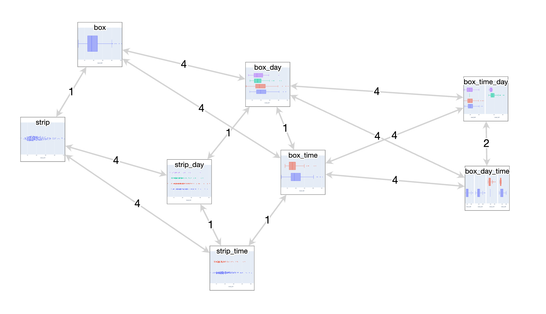
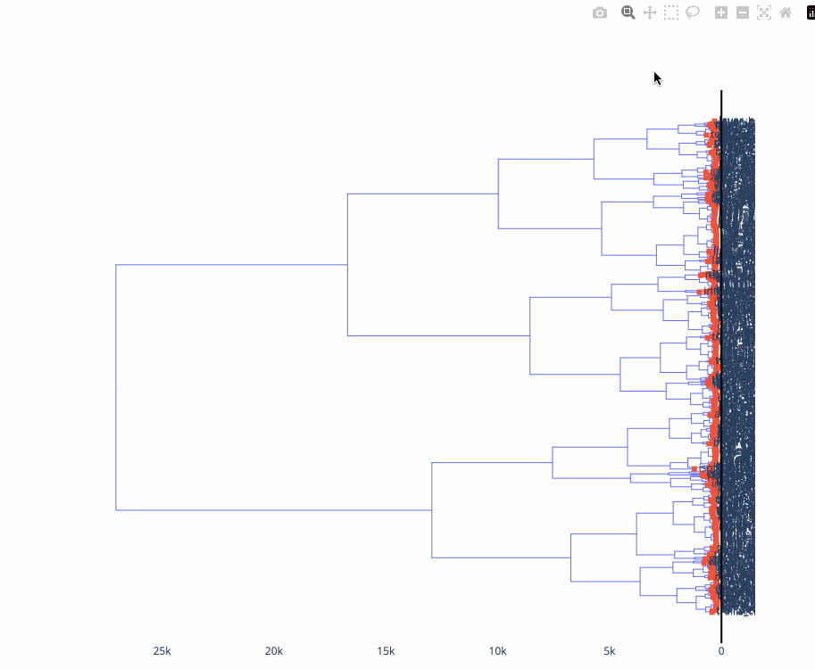
Armed with these distances measures, I can take a corpus of specifications in a given notation and compute the pairwise distances between each of them and visualize these distance matrices. For example, I can visualize them as a network, or a minimum spanning tree, or a dendrogram or plot the output of a UMAP or t-SNE dimensionality reduction (see below). I think this approach can be promising for building tools to help understand individual notations and navigating existing galleries or even documentation: alongside documentation examples, one could automatically generate links to related documentation pages based on the fact that they contain similar specifications. Another idea would be to use these distances to suggest the learning sequence for novices (in general, or for a specific desired visualization) that has the shallowest learning curve, based on the ‘accumulated information’ one has covered.
Here’s a very simple “reduced network” visualization (eliding all edges whose lengths are the lengths of paths composed of other edges) of a token-based distance measure applied to some related visualizations in the Plotly Express notation. Notice the pattern between the ‘strip’ and ‘box’ examples on the left side: both ‘families’ of examples there forms a 4/4/1 triangle and the vertices of the triangles are each offset by a constant factor of 1 between box and strip.
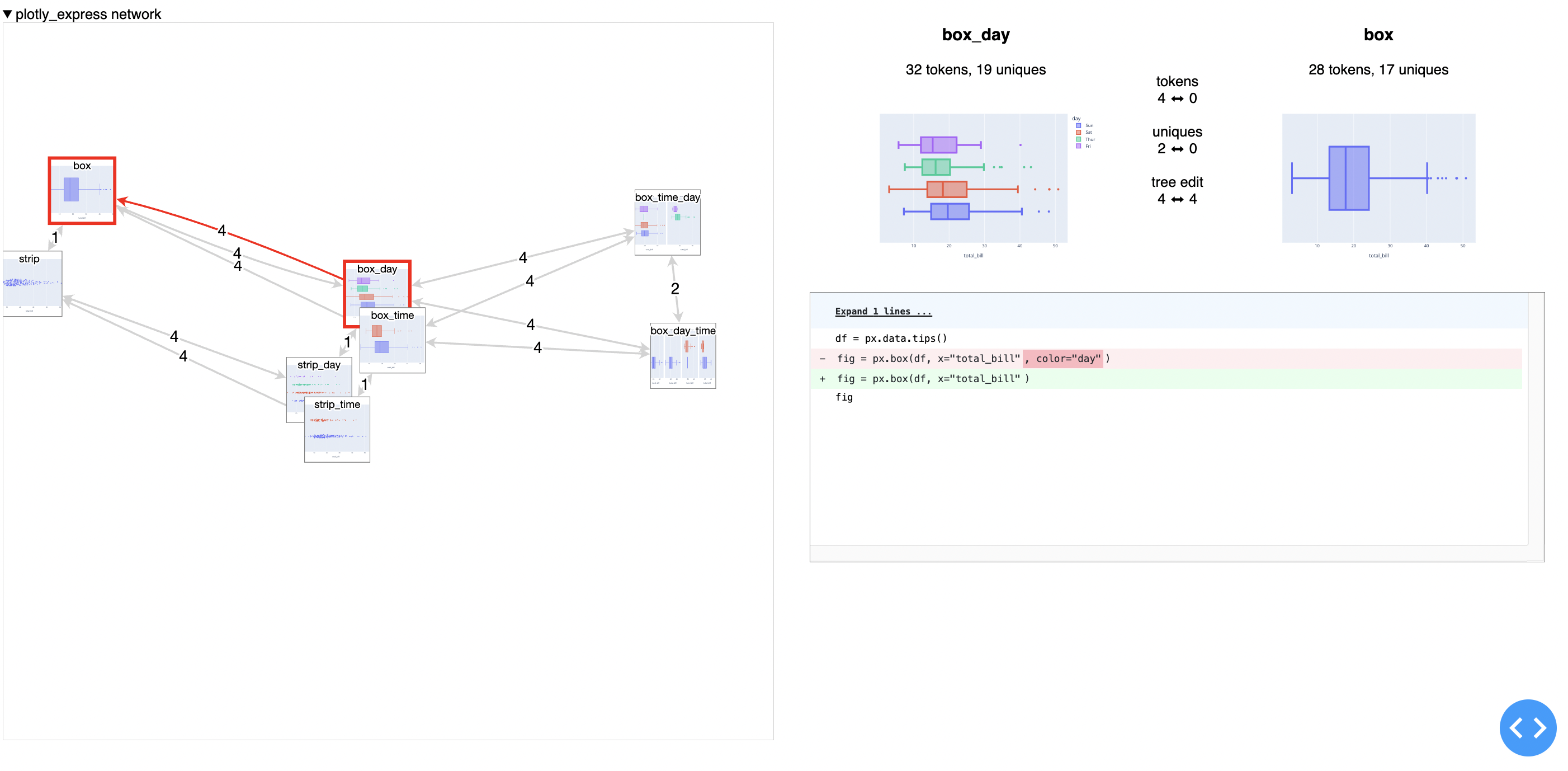
Here’s what it looks like to drill in to one of the links and see the full diff of the specifications:
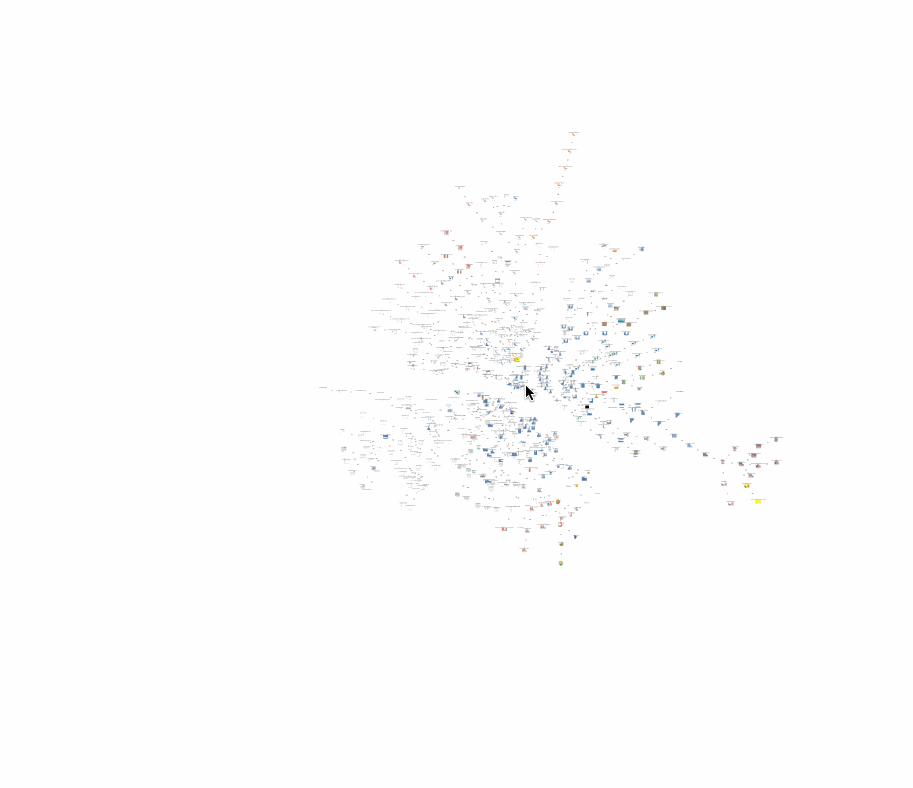
Here’s a minimum-spanning-tree visualization of the test set for Vega-Lite, notice the visual similarities between nearby nodes. What does it mean if visually-dissimilar nodes are near each other?
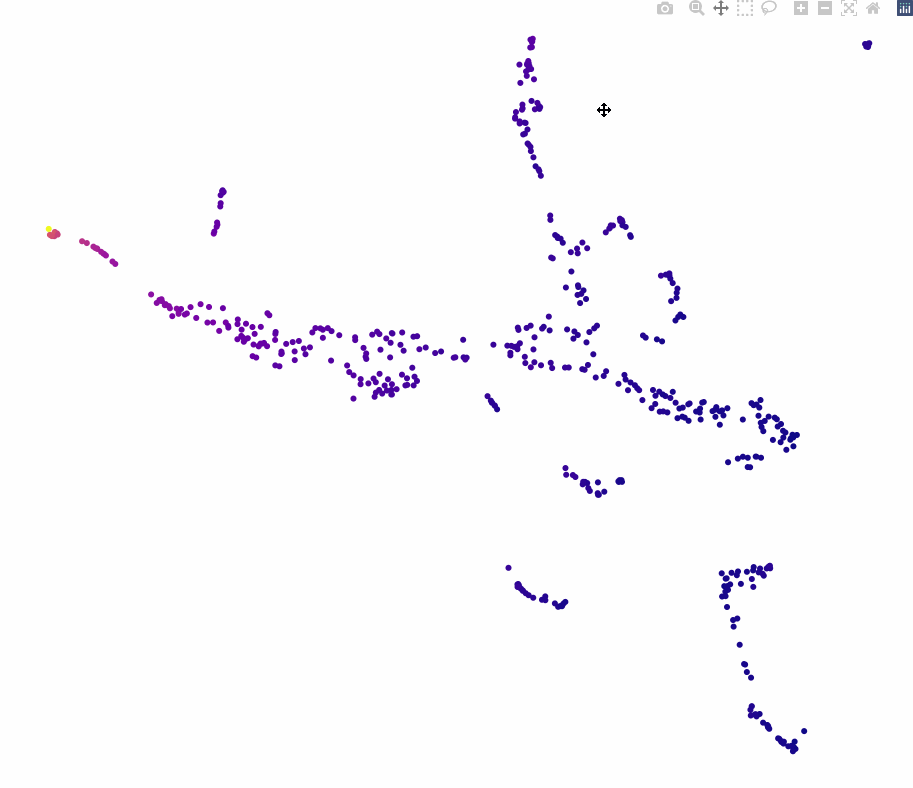
Here’s the same data visualized using dimensionality reduction with UMAP:
Here’s a dendrogram of the same data, using mutual information to do agglomerative clustering:
One key intuition that this approach reconfirms for me is that “expressiveness” – usually formally defined as the breadth of what can be expressed – is maybe too binary a way to evaluate a system. Not all examples that can be expressed in a notation and appear in gallery are equal: some large portion of them often have similar, terse specifications, and then there is often a “long tail” of increasingly verbose, dissimilar specifications that can be used to make more exotic visualizations. Displaying some kind of aggregate distance measures alongside a gallery could be informative for prospective users of a system to understand what is “core functionality” and “technically expressible but not really core functionality”.
Comparing notations
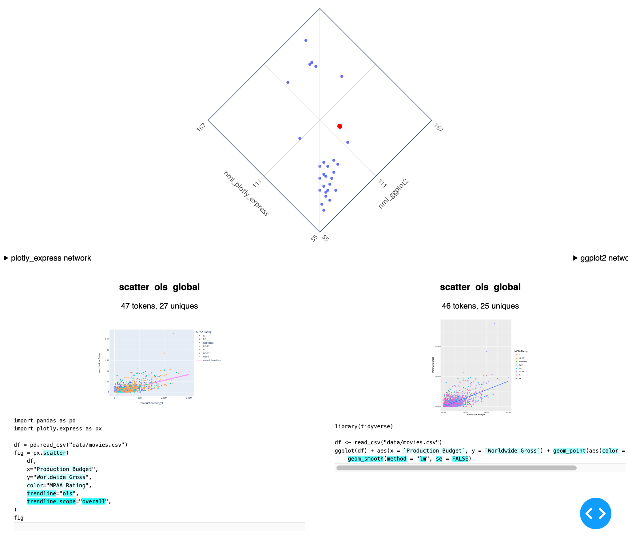
Moving beyond looking at one notation at a time is a little more labour-intensive than computing distance metrics for existing corpora of specifications like galleries or test sets. In order to compare multiple notations, we need a corpus consisting of “the same” visualization implemented once per notation, similar to a Rosetta stone. This approach has been explored at small scale by others with 5-15 visualizations of different datasets. I’ve started building a “benchmark” corpus intended to contain approximately 50 specifications per notation, covering a range of features common to many statistical visualization systems like bar charts (grouped and stacked, vertical and horizontal), line charts, stacked area charts, pie charts, histograms etc and covering coloring, faceting, labelling and styling for categorical, continuous and datetime values etc. 50ish specifications means over a thousand inter-specification distances, and so I’m also building a set of tools to compare these distances across visualizations and understand what drives similarities and differences: where do two notations agree that two visualizations have quite-similar specifications? Where do they disagree and what features of the notations are driving the disagreement?
Here’s the latest version of my tool for comparing two notations on a single corpus (here Plotly Express versus ggplot2), including a view where rare tokens are highlighted, to understand what is unique about the selected example (a scatterplot with an OLS trendline) within the context of the corpus:
Beyond looking strictly at mutual-information-based distances between specifications, I’m also starting to look at corpus-wide statistics for the different notations, specifically around the entropy associated with various tokens. Do different notations differ meaningfully in terms of the number of unique tokens they require to express a given corpus? If we imagine that there is some relationship between the number of “concepts” required to express a visualization and the number of unique tokens in a specification, are there then “small” notations with few primitives cleverly recombined, and “big” notations that achieve expressiveness simply by having a large vocabulary? If so, how does this affect the resulting distances? What tradeoffs have existing notations made in this area and what kinds of different tradeoffs might be possible?
Finally, beyond building a descriptive tool like NotaScope, I’m hoping to be able to extract out some heuristics or guidelines for notation designers to be able to apply to their own work, or at least to help guide them along the various tradeoffs they need to make.
That’s about as far as I’ve gotten in my research so far, and if you’re still reading, maybe you’re interested in this stuff too? I’m always happy to chat with folks with similar interests, so if you’re at VIS this year, let’s try to meet up, and if you’re not, please reach out and we can do a video-call sometime!
⁂