Straightening Great Circles
Many a bored long-haul flight passenger has asked themselves why the flight path on the map is curved, and if it wouldn’t be faster to just fly straight there. In fact, airlines try very hard to keep their flight paths as straight as possible. It’s just that the rectangular world maps we are accustomed to looking at project the 3-dimensional earth onto a 2-dimensional surface such that any long straight line not directly along the equator or perpendicular to it will appear curved. Making the equator special in this way makes some sense as a default way to draw maps, because of the way the earth spins on its axis, but we can just as easily choose any other straight line path for this treatment, and doing so gives us an interesting perspective on the world and on maps.
The shortest path between two points on a sphere is called the Great Circle track. This is because, paradoxical as it may sound, it lies along the biggest circle you can draw that includes those two points. Let’s take a look at a typical map with an equirectangular projection plotting the Great Circle track from Tokyo to São Paulo, with the midpoint highlighted (hint: it’s above the Great Lakes in North America).
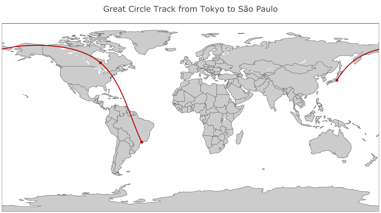
Immediately we notice that this particular map is a terrible fit for this path. To begin with, the path is drawn as a curve, even though it is in reality a straight line, in the sense that if you could walk along it ignoring topography, water and weather, you would never need to turn. Secondly, the true midpoint of this path looks like it’s about two thirds of the way along, so clearly distance isn’t being represented consistently all the way along. And thirdly but perhaps trivially, the path is interrupted by the edge of the map, and wraps around to the other side.
Here is what this map looks like if we change the projection parameters to put our path of interest in prime position, instead of the equator.
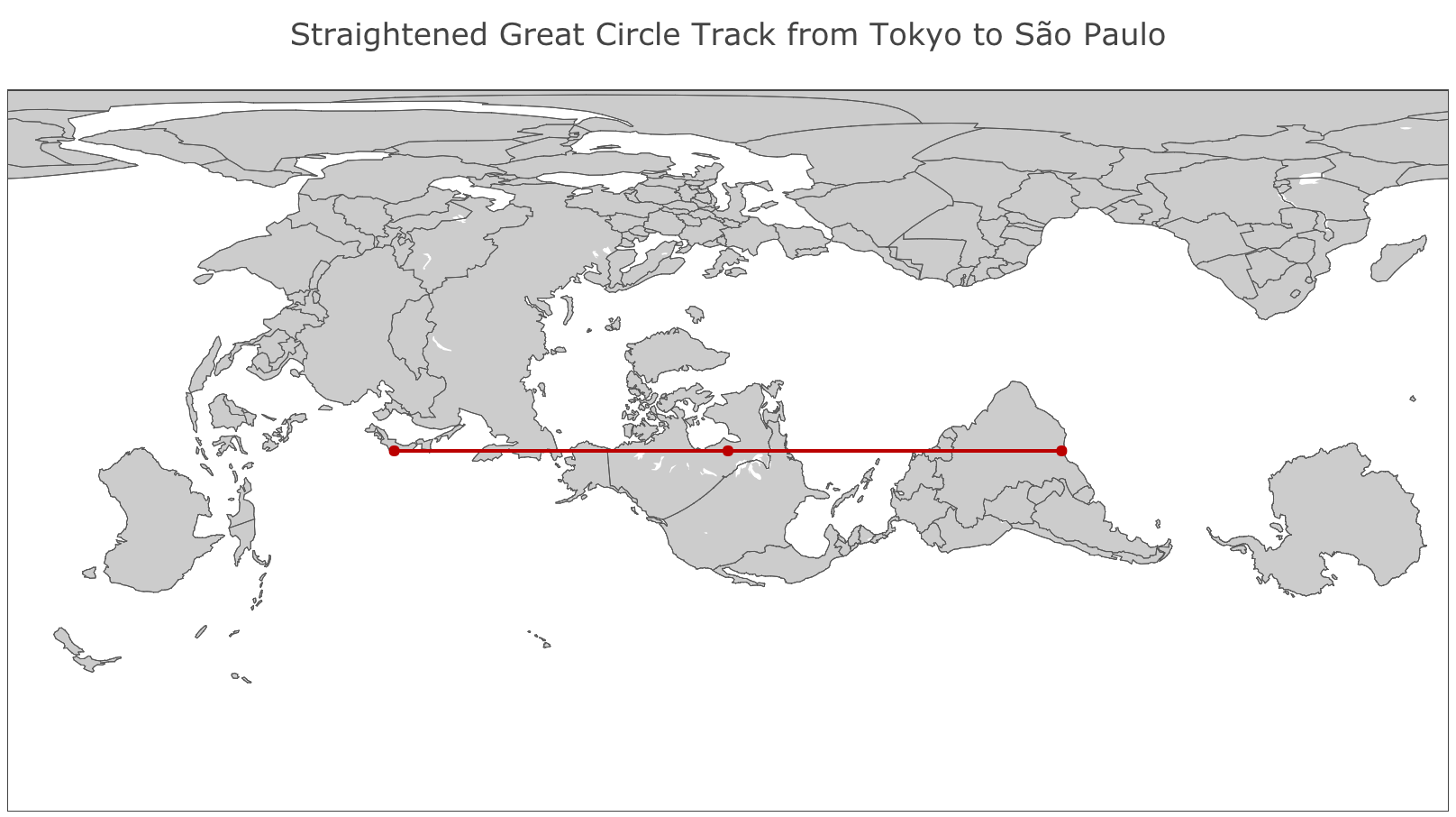
The big issues with the first map have been resolved: the path is straight and distance is consistently represented along the path so the midpoint is in the middle of both the path and the map, and we can trace it uninterrupted from left to right. Other than that, however, everything just looks wrong: Africa and the Middle East are enormous and totally distorted, and the Americas look a bit bent out of shape. This is where this reprojection exercise becomes interesting, because it reminds us that this type of distortion is always present in any map projection, it’s just that it’s usually pushed away to the poles, which are of geographic interest to fewer people. This map embodies a different tradeoff by instead pushing much of the distortion as far away as possible from our path of interest.
This kind of reprojection trick is fairly trivial to do with modern software (the Plotly code I used is available on Github), and yields surprising and interesting maps, but I’m not seriously proposing that it be used in maps on long-haul flights, as I’m sure it wouldn’t result in fewer geography questions than the status quo!
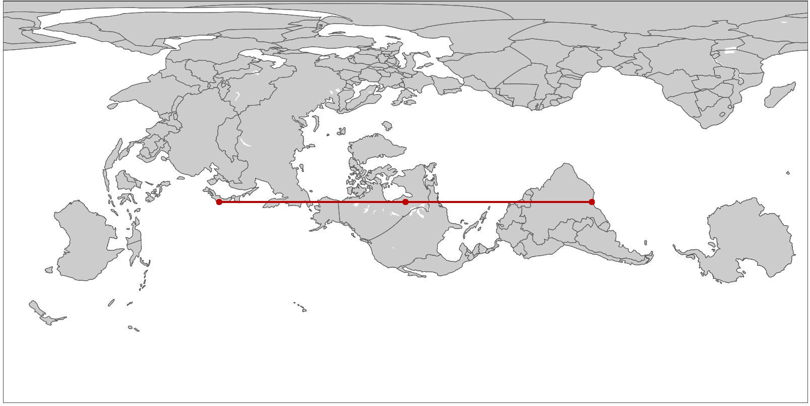
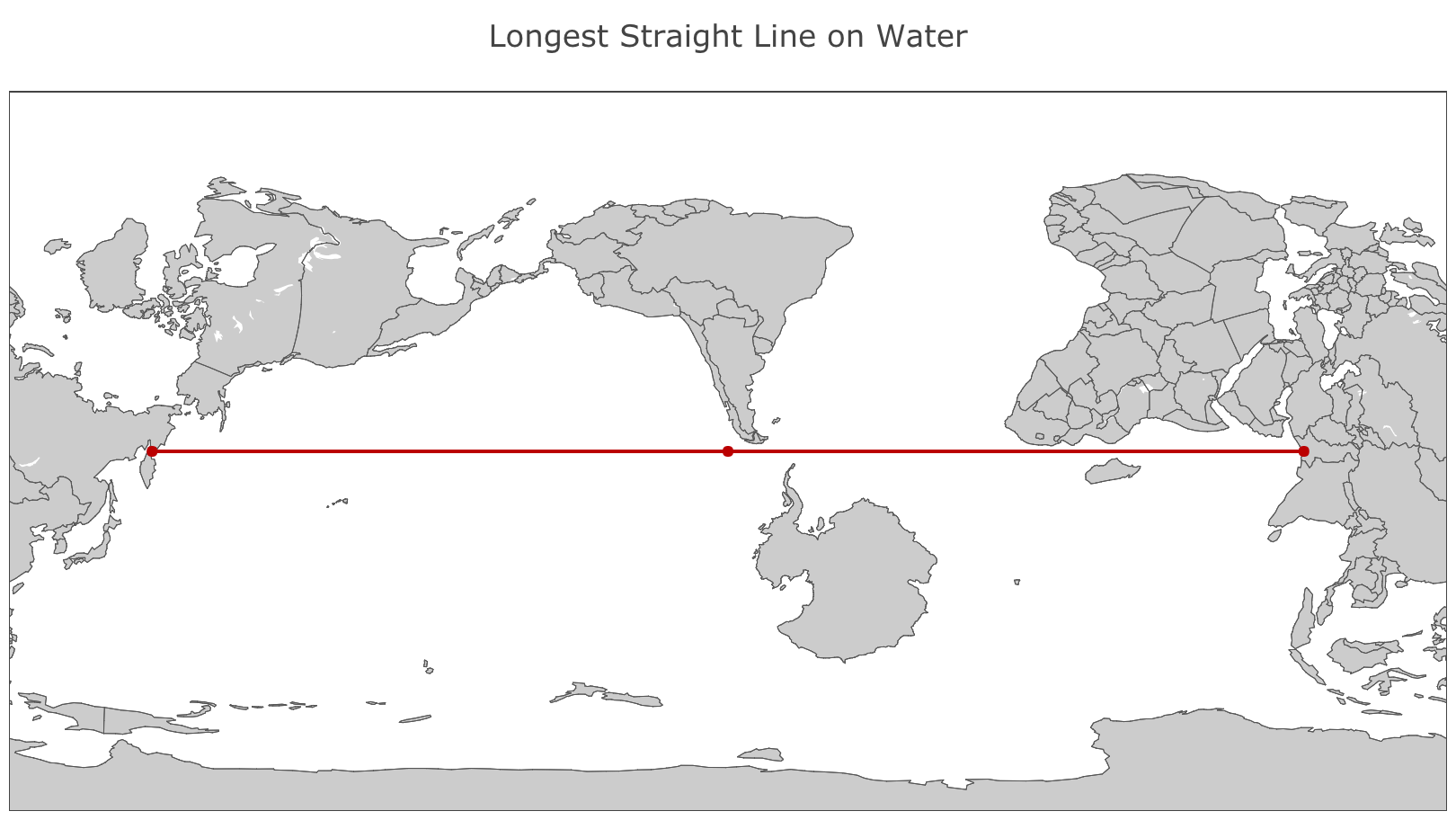
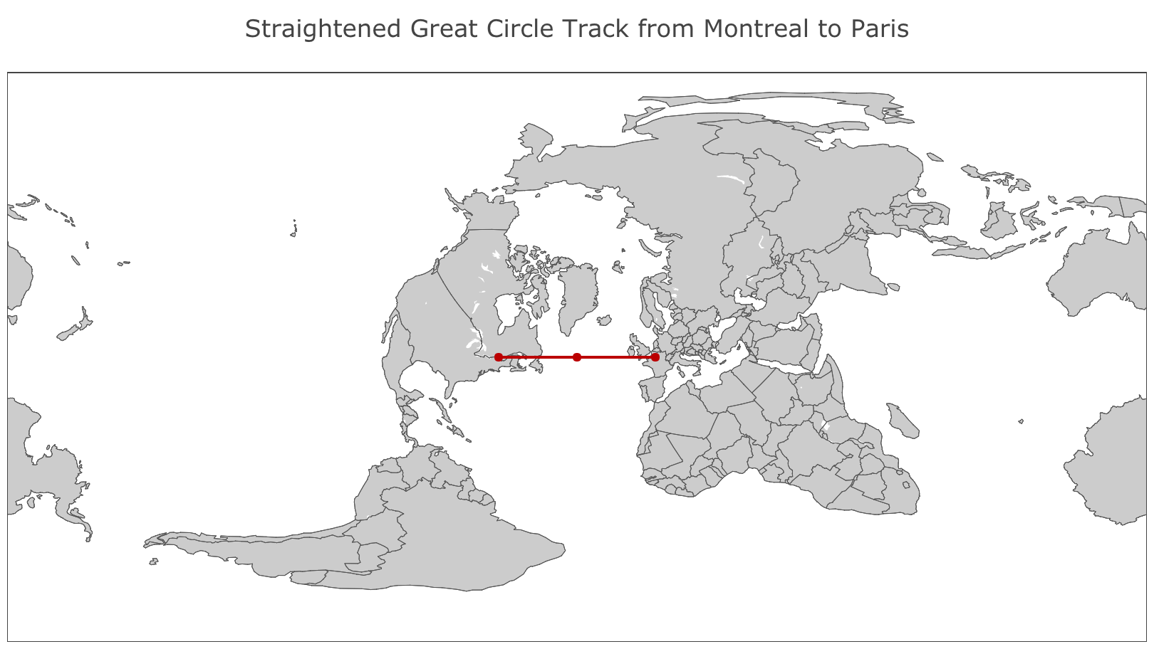
Here are a couple more interesting maps with straightened-out great circles:
Hat tip to Carlos A. Furuti, maker of an excellent site on map projections, and whose page on great circles inspired this post, and thanks to Movable Type Ltd for maintaining a very useful page full of equations for this kind of manipulation.
Update December 2020: while working on my homage to Bertin’s *Semiology of Graphics* this month, I realized that this amazing book basically makes this exact point and some extremely similar maps in an offhanded way. It’s always neat, and humbling, to see one’s ideas anticipated a half century ahead!
⁂
Follow Nicolas
Code on Github
Code from this post is up on Github at nicolaskruchten/straight_circles