Notes on metro platform wayfinding
After my photographic metro platform maps went viral last week, I received a lot of feedback in the form of emails and comments, telling me about the experiences of subway riders in other cities. Here are some interesting vignettes.
Tokyo: Detailed Signage
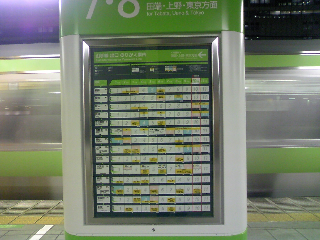
Tokyo’s metro system features “convenient transfer maps” displayed directly on most platforms. They look a bit like my graphic, although they are still train-centric. This works there because there are stickers on the platform which indicate where which car stops. Sometimes important transfers are even indicated directly on the sticker!
The story of how these maps came to be is really interesting: they were hand-assembled by one motivated woman, who ended up building a successful business selling them to the transit authorities. The authorities resisted at first, citing fears of excess congestion in certain cars.
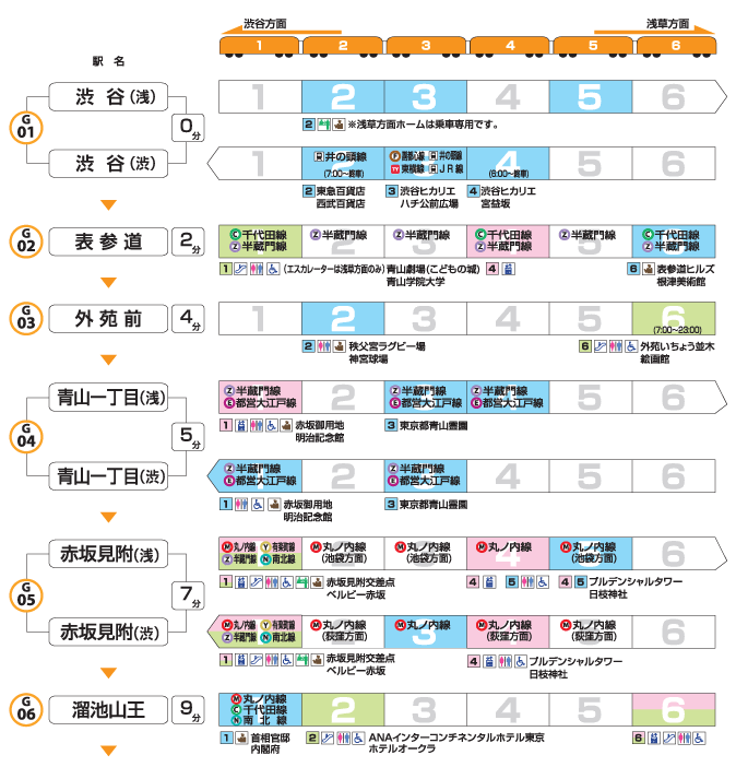
Note the level of detail: toilets, elevators, operators, accessibility etc
New York: Rogue Stickers
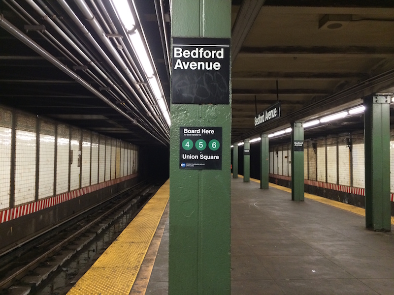
In New York, an anonymous group calling themselves the Efficient Passengers Project placed their own unofficial stickers on subway platforms to indicate where to stand for optimal transfers. The transit authority took them down, again due to congestion concerns. Who knows, perhaps in time they will embrace the idea just like Tokyo did?
Toronto: Unintentional Landmarks
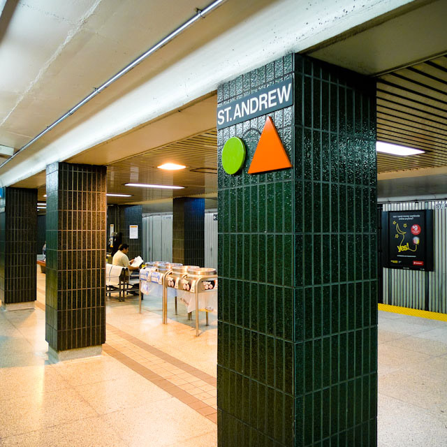
When I lived and commuted in Toronto, I noticed these odd markers on the walls, which appeared to be in the same relative place on every platform. I used them to position myself on the platform while travelling (and told my friends, who still use this method today!) as I had always assumed that’s what they were there for. It turns out they’re actually there to help the train operator position the train on the platform. The operator sits near the middle of the train, and knows that the train is in position when the marker is directly in front of the window. New York has something similar, which people have had fun with. The only other feature of TTC platforms which is in the same place at every stop is the Designated Waiting Area which features special lighting and a safety phone.
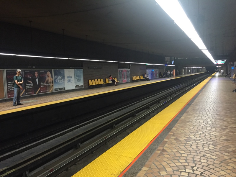
Back to Montreal
What lessons could Montreal draw from these other cities? Perhaps not all that much, actually. Every metro system is unique, and needs locally-appropriate wayfinding signage. For starters, Montreal’s metro system is far, far simpler than Tokyo’s or New York’s: we only have 4 transfer stations, and most platforms have only a single set of stairs leading to the station (note: very few accessible elevators). This means that for other use-cases than commute optimization, platform signage is less important than station signage, which the STM is already modernizing. As far as I can tell, this new signage is being rolled out first where it matters most: in tourist-heavy stations.
The relative simplicity of our system is what makes me doubt that congestion is a real concern here if suddenly all passengers were to have easy access to information about where to stand to come out near certain destinations. Major stations like Peel, McGill etc all have multiple stairwells, and as far as I can tell from my platform map, the distribution of stairwell placement in minor stations is relatively uniform, so there is a natural spreading effect at work. Daily commuters also ride the metro at different times than tourists, and they already likely stand where they are comfortable. Finally, people have different goals: some riders prefer to be in uncongested cars to get a seat, or they may favour waiting where their departure station has a bench.
In terms of standardized platform landmarks, Montreal differs from Toronto in that our train operators sit in the front of the train, so we don’t have or need wall markers with standard positions. Also, our Assistance phones are not in the same place on every platform (again, as visible in my map!), unlike the TTC’s Designated Waiting Areas. What we do have in some stations are stickers on the floor which indicate where the doors will open. These are meant to encourage riders to stand away from the doors to let people out of the cars before entering (with mixed results!). As a result, they don’t include a door or car number for wayfinding. The other major issue with these stickers is that our new Azur trains have 3 doors per car rather than 4, so as long as we have a mix of new and old trains in use, floor stickers will likely be confusing to users of those lines.
![]()
By way of conclusion, it seems to me that the STM is focusing its limited resources on sensible projects: station signage for tourists, rolling out the new trains, bus stop announcements etc. This leaves the field open for people like myself and others to make our own DIY maps and apps for fun and commute optimization. I would personally not favour rogue signage here, though: the STM already has enough cleanup to do with graffiti etc!
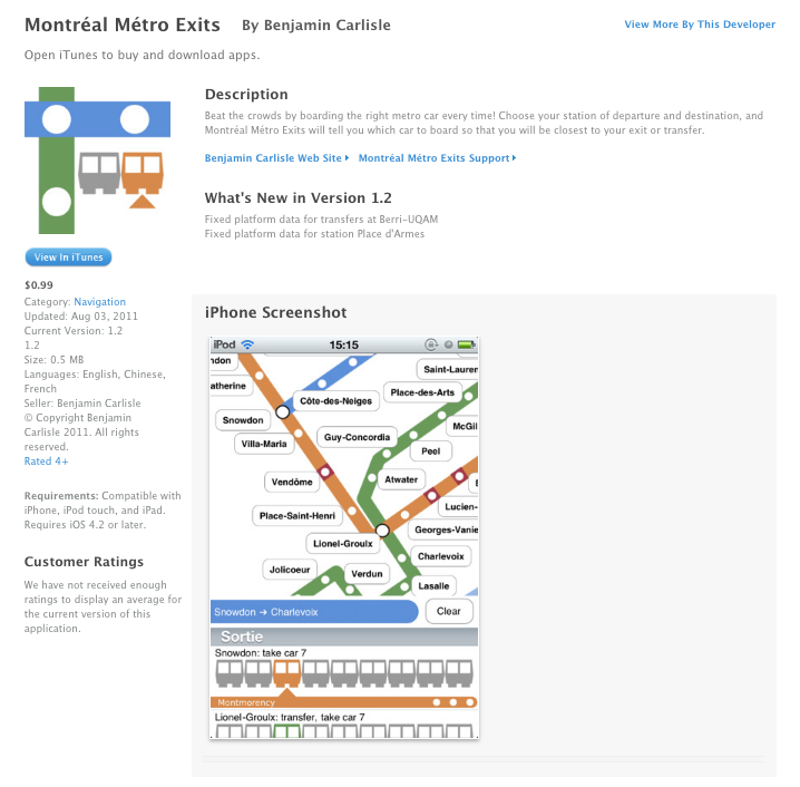
Final factoid: judicious Googling and usage of the Wayback Machine led me to find what I believe is the first local example of this: the Montréal Métro Exits app, from 2011. Please email me if you know of some other project that predates it, I’d love to hear about it!
⁂