Direction Angrignon: a different kind of subway map
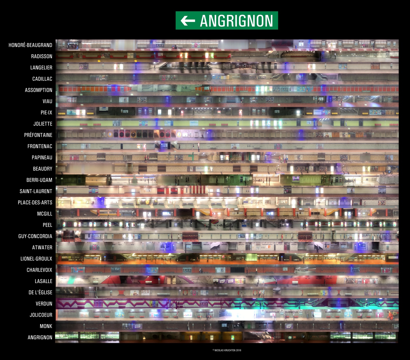
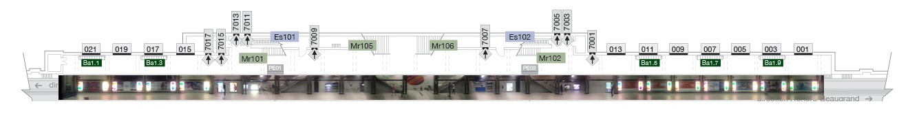
The photo above (click here for a zoomable version) is a collage of panoramic scans of the Angrignon-bound platforms of the Montreal metro’s green line. I used my phone to record videos from the rear-most window of the train and wrote a bit of software to stitch the frames together. My goal was to create a way to figure out where to stand while waiting for the metro so as to get out closest to where you want to go at your destination, and I used these scans to build a little interactive comparison page for just this purpose.
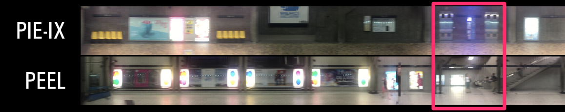
To get out closest to the West-most escalators at Peel,
stand near the West-most Assistance phone at Pie-IX
(compare any two platforms along the green line headed towards Angringon)
Backstory & Inspiration
While travelling by train in Germany, I noticed that the train platforms there have these really neat information displays labelled Wagenstandanzeiger, which Google helpfully translates as “carriage position indicator”. It shows where each car of each scheduled train will stop so you can position yourself accordingly on the platform. Take note of the blue letter-squares and orange “you are here” sticker in the header. Each platform has big hanging signs corresponding to these letters so you can position yourself accordingly.
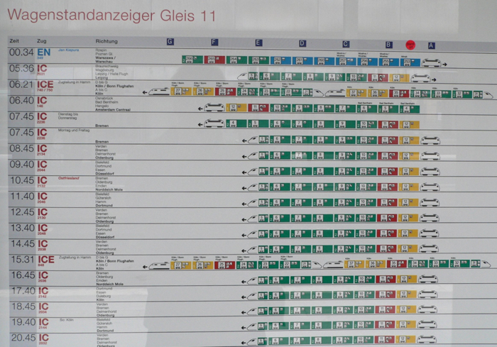
German “carriage position indicator” (photo credit)
It occurred to me that as a daily metro commuter, I know just where to stand on the platform in the morning to get out near the right stairs for the station near where I work, but this is generally not true when I’m out doing errands. That got me thinking about how to make a similar information display for the metro. A bit of Googling showed that this idea had occurred to many people before:
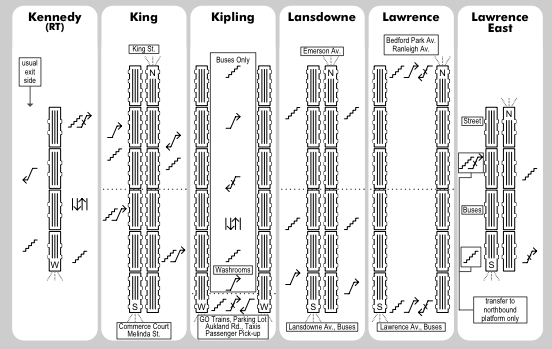
Page from Toronto’s paper TTC Subway Rider Efficiency Guide
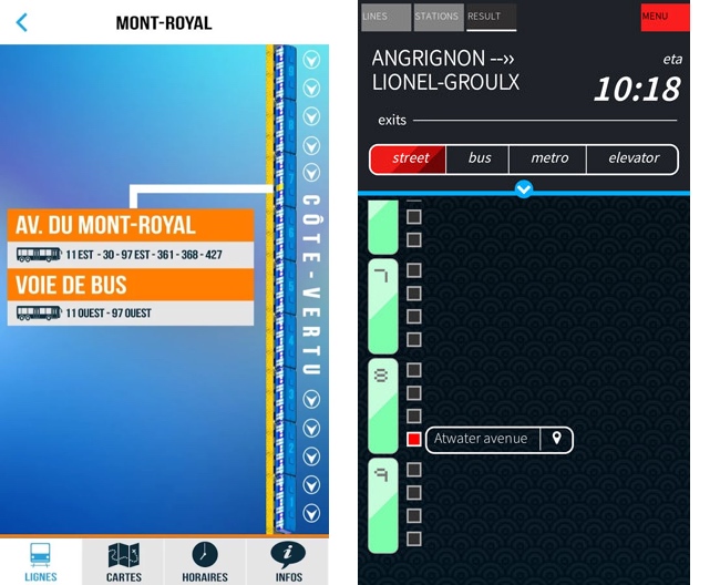
Screenshots from Montreal’s SDMM and MetroExit smartphone apps
The commonality between the above graphics (and similar ones exist for Paris and New York etc) is that they are train-centric, showing you which door of which carriage you should use. The problem is that, in Montreal at least, when you’re standing on the platform, there’s no way to know where the 3rd door of the 2nd carriage will be! (Factoid: the Montreal Metro’s green line currently uses the 150m-long MR-63 train, which has 3 sets of 3 cars with 4 doors each for a total of 36 doors.) There certainly aren’t standardized landmarks on the platforms like the letter squares in Germany. What we do have on every platform are benches, ads, stairs, maps, art and blue-lit Assistance phones. So I figured I would build a platform-centric map that was like an inside-out version of the German display: instead of every train that moved through a station, I would show every station that a train moved through. The final output would look a bit like a building cutaway, with every platform as a floor. In this analogy, the 36 doors on an MR-63 train behave like so many elevators, which kind of makes sense: they even open and close like elevator doors!
Although I was excited about this project, I wasn’t quite motivated enough to manually survey every platform with a measuring wheel and a clipboard. Our metro has 68 stations across 4 lines, which makes for 146 platforms! I asked the STM if I could take a look at the architectural drawings for the stations but they ended up declining (by registered mail) due to vaguely worded security considerations. I also thought about who might have a commercial interest in building and sharing such maps, which led me to think about the advertising on the metro. Sure enough, people who sell the ads, the Astral division of Bell Canada, have some station maps online. Unfortunately they only have the major downtown stations, and they have not responded to my inquiries for the full dataset. (Factoid: the billboard-like ads in the metro are called Panoquai and the lit-up ads are called Lumiquai.)
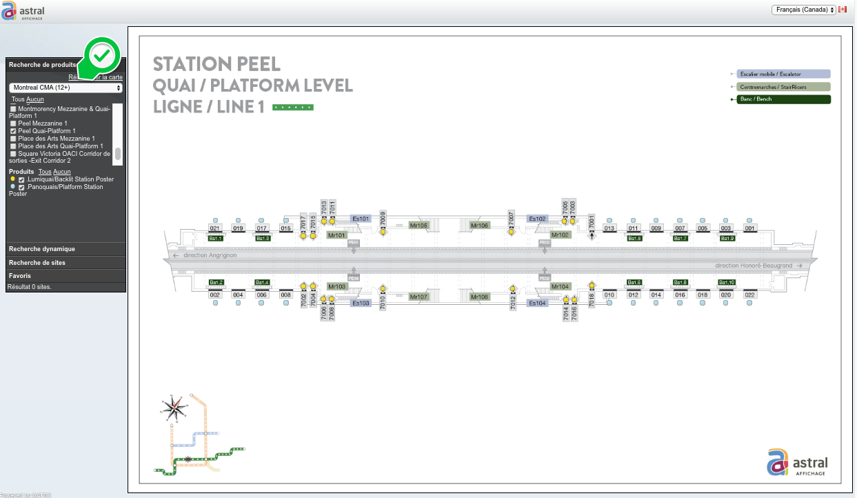
Screenshot from Astral Affichage app to see ad positions on metro platforms
(choose “Montreal CMA 12+” from the “Markets” dropdown)
While I was awaiting answers from the STM and Astral, I thought about how I could efficiently collect the raw data myself in case they wouldn’t help. The fastest way to visit every station on a given line is to just ride the metro: it takes about 35 minutes for a train to travel the length of the green line. If I could just record all the information from inside the train using my trusty iPhone then I could do all the rest of the work from home! After a bit of experimentation, I realized that the best way to do this would be to record video from the rear-most window of the train, and then export the frames and stitch them together as a panorama, kind of how a desktop scanner works. The train accelerates out of the station and ends up going quite fast, so a normal panorama wouldn’t work without clipping or distorting. However, high-school physics taught me that displacement under constant acceleration is proportional to the elapsed time squared, so I could just use that equation to lay out the images. The code I wrote to do this is available on Github. When you compare my scan of Peel station with the plan from Astral, you see that the error is around 2% near the middle. Assuming that the trains accelerate similarly out of every station, though, the scans should be quite comparable to each other.
Max of 3m (2%) positional error between dotted lines on plan and columns in scan
My initial plan had been to measure the position of the benches, ads etc and make a schematic map, but somewhere along the line this turned into a photography collage project instead. Photos capture the richness of what the stations look like in a way that little icons can’t. The current output of my efforts is two-fold: a big graphic that shows every station at once, and a simple interactive version which lets you compare two stations to see what features on your departure platform are “close to” your destination platform’s stairwells. At this point I’ve only done one side of the green line (27 platforms) so more work is required to do all 146 platforms, but that will have to wait for another day!
Frequently-Asked Questions
Hasn’t this been done before? Not as far as I know, but I’d love to hear about it if you want to email me. I received a number of emails about different cities’ approaches to platform wayfinding but nothing about station panorama maps like this. I also found out about Adam Magyar’s train scanning work and Carlos Scheidegger’s Window Seat project.
Wouldn’t it be awesome if there were official posters like this on every platform station with a “you are here” sticker? Yes, yes it would.
Can I get a poster version of the image? I’m playing with various printing options to see how this would look. Shoot me an email if you want a printout!
Are you going to build a mobile app? I might, although that seems like more work than I have time for at the moment. If anyone wants to collaborate, I’d be happy to chat by email.
Shouldn’t you indicate where the stairs are, where they go, which buses are available etc? That’s certainly something I could do for a future version but right now I like the minimalism of the current setup.
What are the blue hazy areas in the images? These are the blue-lit Assistance phones which you can and should use to communicate with STM staff to signal any emergency such as someone being on the tracks, or having a health problem.
Which direction does the train move in? The train moves from right to left, and the scans are looking back at the platform the train stopped at, i.e. not across the tracks.
What about De L’Église station, where the doors open on the other side? If you look closely, the image is flipped with respect to reality, so the stairs show up on the left, near the front of the train, even though if you were standing on the platform looking at the wall, they would be on the right.
What about Angrignon station, where the train turns around and leaves in the other direction? Angrignon’s platforms are symmetrical, so I used a flipped version of the outbound platform on the other side.
Why is the right side of the image cut off? I took the scans from the rear-most seat in the train, which is around 4m from the back wall of the platform.
Are you allowed to do this? I followed the STM’s guidelines for amateur photography, so yes, I believe so. I’m not sure what the security concerns the STM had about giving me access to architectural drawings but I can’t see the harm in this project, and in any case Astral publicly hosts the plans for the highest-traffic stations already.
What have been the reactions to this? This project has been talked about on Breakfast Television, in Journal Métro, on CBC Radio’s Homerun, on CBC.ca, on CTV News, on TransitMap.net and on CityLab. Also, the great Edward Tufte gave it an A+ on Twitter!
⁂
Follow Nicolas
Code on Github
Code from this post is up on Github at nicolaskruchten/direction_angrignon