
Nicolas Kruchten
is a data visualization specialist
based in Montreal, Canada.
Montreal Python: Unsupervised ML with scikit-learn
I gave a talk at Montreal Python on Data Science and Unsupervised Machine Learning with scikit-learn. The video is above and I posted all of my presentation materials online.
Arbitraging an RTB Exchange
Last week, Bloomberg came out with an article on RTB arbitrage, which included a couple of sentences that made it sound a lot like it was possible to front-run an RTB auction: “Some buy from an exchange and sell it right back to that very same exchange” and “Some agencies are poorly connected to exchanges and can’t respond to a first auction in time, allowing middlemen to buy and flip within the same market”. This seemed surprising to me at first, given that all auction participants (as far as I know) get the same opportunity to bid on an impression, so how could you make money buying and selling the same impression on the same exchange? Upon further thought, however, here’s a theory about how it might work.
VisMtl: Maps, Tools, Stories
I gave a talk at Visualization Montréal entitled Maps, Tools, Stories. Check out the synced slides and video!
Visualizing High-Dimensional Data in the Browser with SVD, t-SNE and Three.js
Data visualization, by definition, involves making a two- or three-dimensional picture of data, so when the data being visualized inherently has many more dimensions than two or three, a big component of data visualization is dimensionality reduction. Dimensionality reduction is also often the first step in a big-data machine-learning pipeline, because most machine-learning algorithms suffer from the Curse of Dimensionality: more dimensions in the input means you need exponentially more training data to create a good model. Datacratic’s products operate on billions of data points (big data) in tens of thousands of dimensions (big problem), and in this post, we show off a proof of concept for interactively visualizing this kind of data in a browser, in 3D (of course, the images on the screen are two-dimensional but we use interactivity, motion and perspective to evoke a third dimension).
Big Data Week Montreal: From Big Data to Big Value
Video and slides from my talk at the kickoff of Big Data Week Montreal 2014.
A Modest Proposal for Ethical Ad Blocking

If you’ve ever been browsing the web and been annoyed by those One Weird Trick ads, or by ads for that product you looked at online last month and then bought offline, you’ve probably given a thought to blocking ads altogether. The response to this idea, from people who run websites for a living, ranges from “it’s unethical” to “it’s stealing!”. According to them, the reason you get to use a website without paying for it yourself is that in exchange you see ads and website owners gets paid by the advertisers. That’s a polite summary of the great Ad-Blocking Debate, which has been going on since the early days of the commercial web. I’m not going to take sides here; rather I’ll propose a compromise enabled by a recent development in online advertising technology. I’m going to describe a “weird trick,” if you will: how to use the same system as those ads that follow you around to block ads, all the while ensuring that the websites you frequent have nothing to complain about.
Early Voting in the 2013 Montreal Election
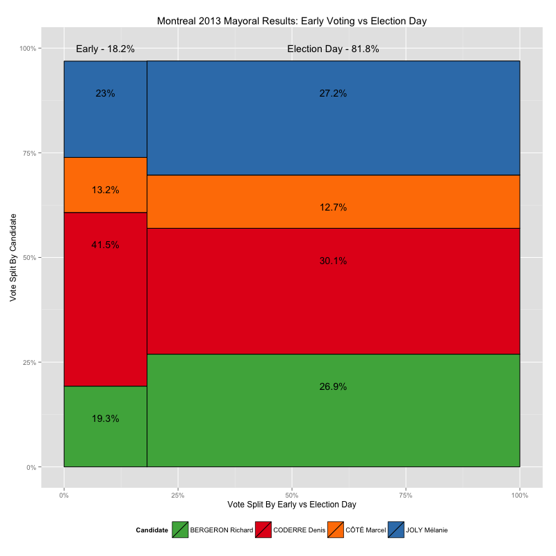
Recently I made some maps of the 2013 Montreal municipal elections, showing voting results down to the ballot-box level, using data from the Montreal Open Data Portal. It turns out, however, that not all of the ballot boxes in that data set are associated with a small geographical area like the ones shown in my by-ballot-box map, and furthermore, those ballot boxes have very different numbering schemes than the ones that do match up with small block-sized areas, numbers like 901 and 601 and 001A instead of small numbers from 1 to 100ish, like the others.
So what gives? These results appear to be from the early-voting polls, which, given that there are fewer of them, cover a larger area per ballot box. In this post I take a look at how leaving this data out of my maps skews the results I present.
Zoomable Map for Montreal Election Results
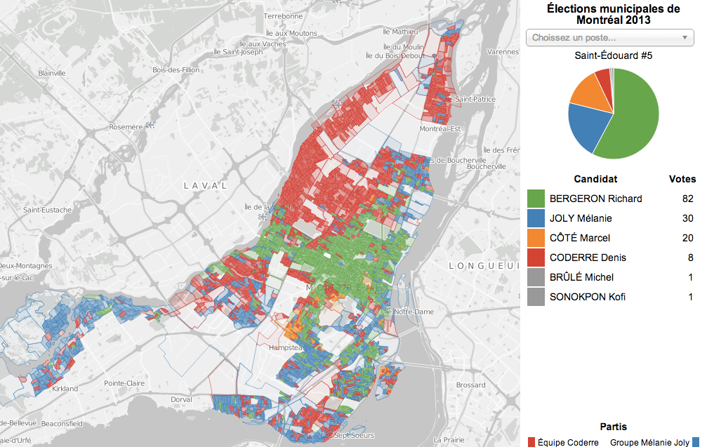
The Montreal municipal elections were just over two months ago but I played with the election results dataset over the holidays anyways as an excuse to play with a type of data I don’t normally have much to do with: geographical data. Without further ado, here is the map I made, and this post explains a bit about the process.
Ternary Plots for Election Results
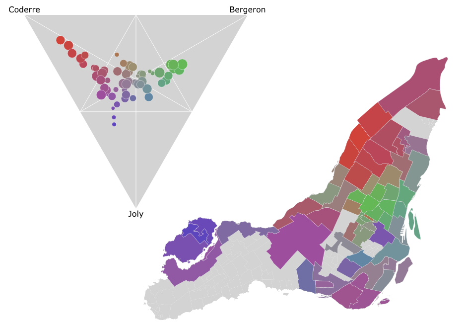
In the Montreal mayoral election last November, nearly 85% of the vote went to one of the top three candidates. A pie chart is a simple way to show the breakdown of votes between candidates for the whole election, say, but what if you wanted to look at the vote breakdown for each of the 52 electoral districts? 52 pie charts is kind of hard to look at and discern any sort of pattern. It turns out that if you only want to look at the top three candidates, you can use a ternary plot to good effect, like I did in the image above. There’s an interactive version as well which helps make the link between the ternary plot and the map via mouse-overs.
Dot Map of 2013 Montreal Election Results
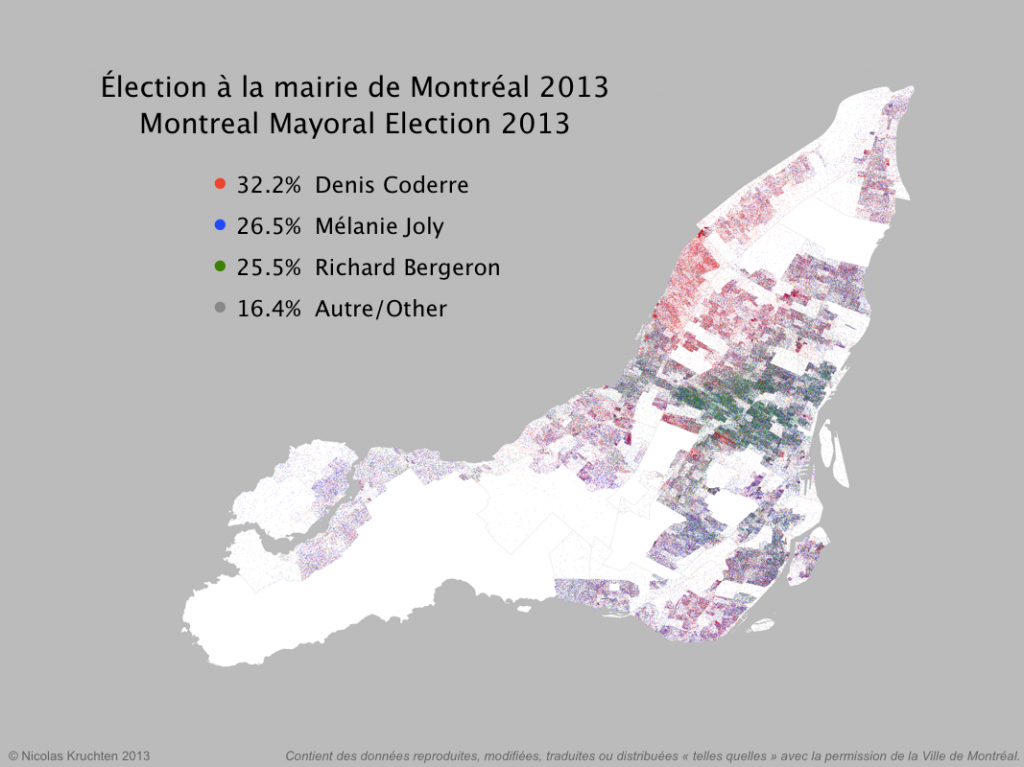
I was inspired by some cool "dot map" visualization projects around the internet (North American Census Dotmap, Toronto Visible Minorities Dot Map) to create a similar visualization of the results for the recent Montreal municipal election. I leveraged data from the Montreal Open Data portal to create the map above. There are coloured dots for (almost) each vote for the mayoralty for the top three candidates, randomly located within the catchment area for the polling booth it came from. What I like about this map is that it shows the results in all their messiness rather than neatly colour-coding entire neighbourhoods like a choropleth map would. People live and vote in arbitrary-looking clusters, not in neat blocks!