
Nicolas Kruchten
is a data visualization specialist
based in Montreal, Canada.
Dot Map of 2013 Montreal Election Results
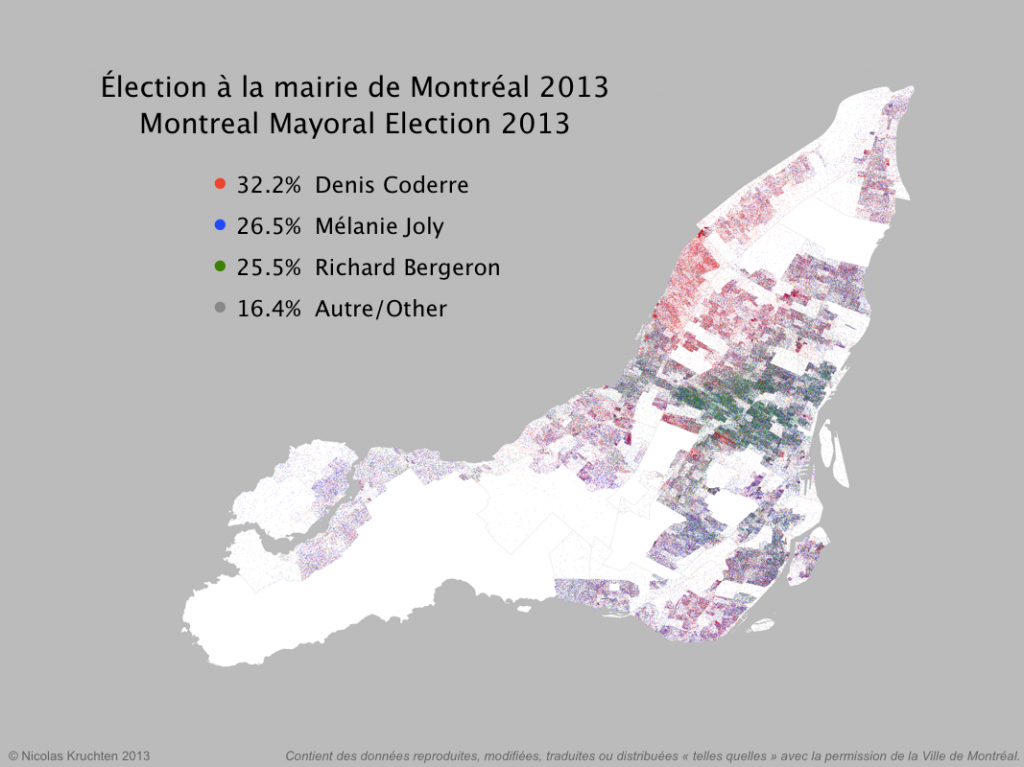
I was inspired by some cool "dot map" visualization projects around the internet (North American Census Dotmap, Toronto Visible Minorities Dot Map) to create a similar visualization of the results for the recent Montreal municipal election. I leveraged data from the Montreal Open Data portal to create the map above. There are coloured dots for (almost) each vote for the mayoralty for the top three candidates, randomly located within the catchment area for the polling booth it came from. What I like about this map is that it shows the results in all their messiness rather than neatly colour-coding entire neighbourhoods like a choropleth map would. People live and vote in arbitrary-looking clusters, not in neat blocks!
Near-Real-Time Election Results Dashboard
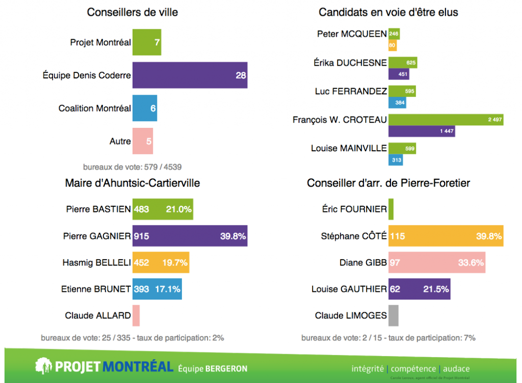
There was a municipal election here in Montreal on November 3, and I had the opportunity to help build an election results dashboard to be projected on the big screen at the election-night party for the political party I support: Projet Montréal. The dashboard is still up with final results. I worked with Nicolas Marchildon, who had put together a similar system for the 2009 election.
Peeking Into the Black Box, Parts 1-5
Between 2011 and 2013 I wrote a popular 5-part series of articles about Datacratic's real-time bidding algorithms, and I've collected them together here for easier reading.
PivotTable.js
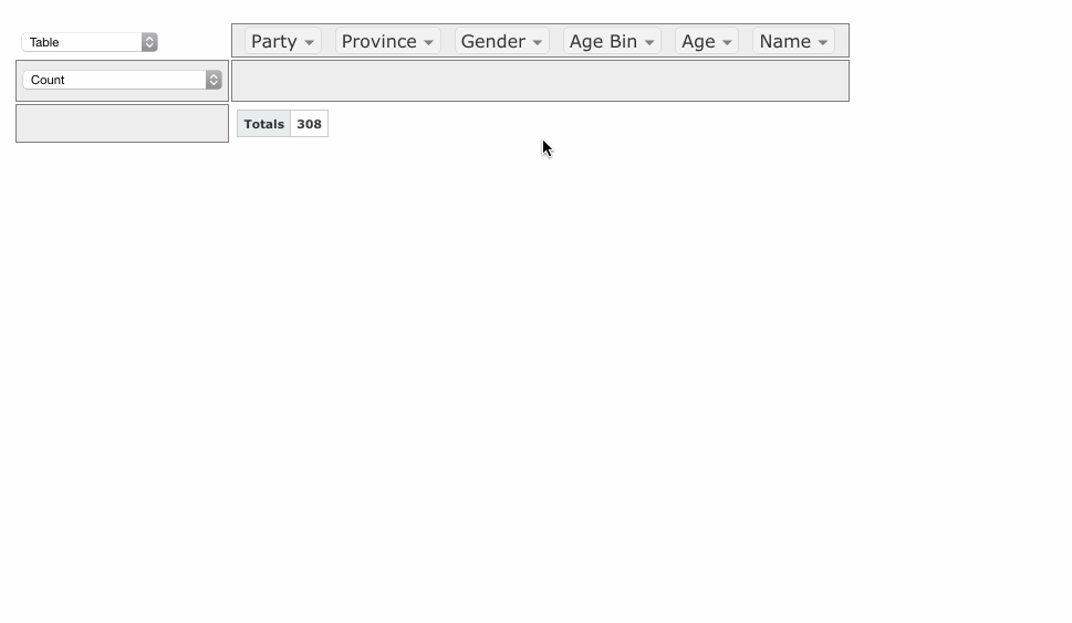
When I wear my 'data scientist hat', one of the tools I reach for most often is a pivot table. When I wanted to build a web-based tool that included a pivot table, I didn't find any Javascript implementations that made sense or didn't have crazy assumptions built-in, so I rolled my own in CoffeeScript, as a jQuery plugin.
It's now up on GitHub under an MIT license with some nice examples. I hope people find it useful!
If you work with data and you don't know what a pivot table is, I encourage you to learn about them, because they are very useful for quick'n'dirty data analysis. My web-based implementation is a decent learning tool but there are other, much-better implementations, such as in Microsoft Excel (although since Office 2003 they've made some changes that were not for the better) and AquaDataStudio.
I posted this on Hacker News and got some nice comments!
Kernel Density Estimation and Analysis Tool
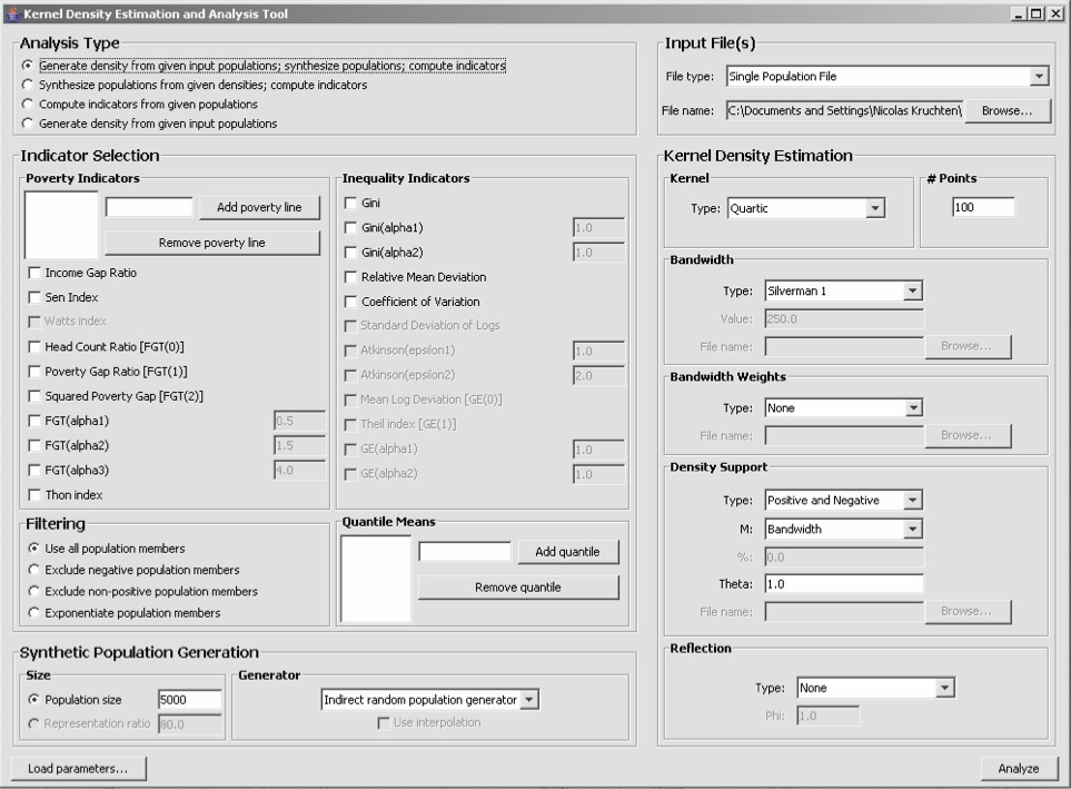
In 2005, I was contracted to create a program to support research into the application of a statistical technique called Kernel Density Estimation to the study of global poverty. The result of this contract (which I worked on with my friend and occasional colleague David de Koning) is the Kernel Density Estimation and Analysis tool which I have just released on Github under an open-source license.
The research (which, to be clear, wasn't done by me) resulted in a very interesting paper called Kernel Density Estimation Based on Grouped Data: The Case of Poverty Assessment.
Galapagos

In 2003, I wrote a neat and powerful piece of software called Galapagos for my 4th-year undergraduate thesis (download PDF). It was a framework for the development of advanced (i.e. distributed, parallel and/or hybrid) evolutionary algorithms, applicable to a wide range of computational challenging optimization problems. I applied it to a variety of transportation-related problems at the University of Toronto.
Rubicon Tech Talk: The Algorithms Automating Advertising
I was invited to speak on a panel at a Rubicon Project product launch, and this is the video of the event.
Volunteer Database for Santropol Roulant
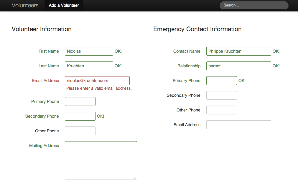
There’s an organization in Montreal I think is awesome called Santropol Roulant which, among other things, has a meals-on-wheels operation. They have hundreds of volunteers and wanted to upgrade the system they used to store their volunteer information, so I helped them out, and I’ve open-sourced the results, in case any other non-profit wants a very simple volunteer-list management system.