Election Pies
For the latest in my series of maps of the results of the 2013 Montreal municipal election, I’ve produced a pair of graduated symbol maps, representing the results as a pie charts overlaid on a base map. It’s interesting to compare this type of visualization to my previous efforts: the dot map, the choropleth, and the ternary plot.
Results by District
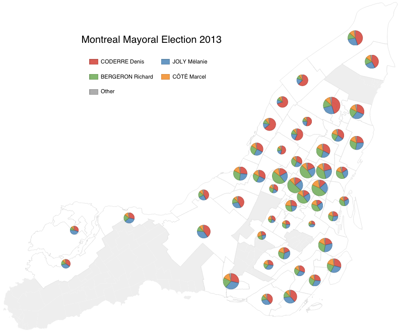
(click to see the interactive version of this map)
Montreal has 19 boroughs, divided up into 58 districts. The map above has one pie chart per district, except for the boroughs with tiny districts (Outremont, Anjou, Lachine, L’Île-Bizard–Sainte-Geneviève), which were recombined into borough-level pie charts. The pie charts are scaled such that their area is proportional to the number of votes each one represents.
It’s interesting to compare the impression one gets of the data with the work I did with ternary plots and blending 3 colours. The map above actually includes all four leading candidates as well as a small “Other” category.
This chart was generated with DimpleJS, using data extracted with a Jupyter notebook, with all sources available on Github.
Results by Ballot Box
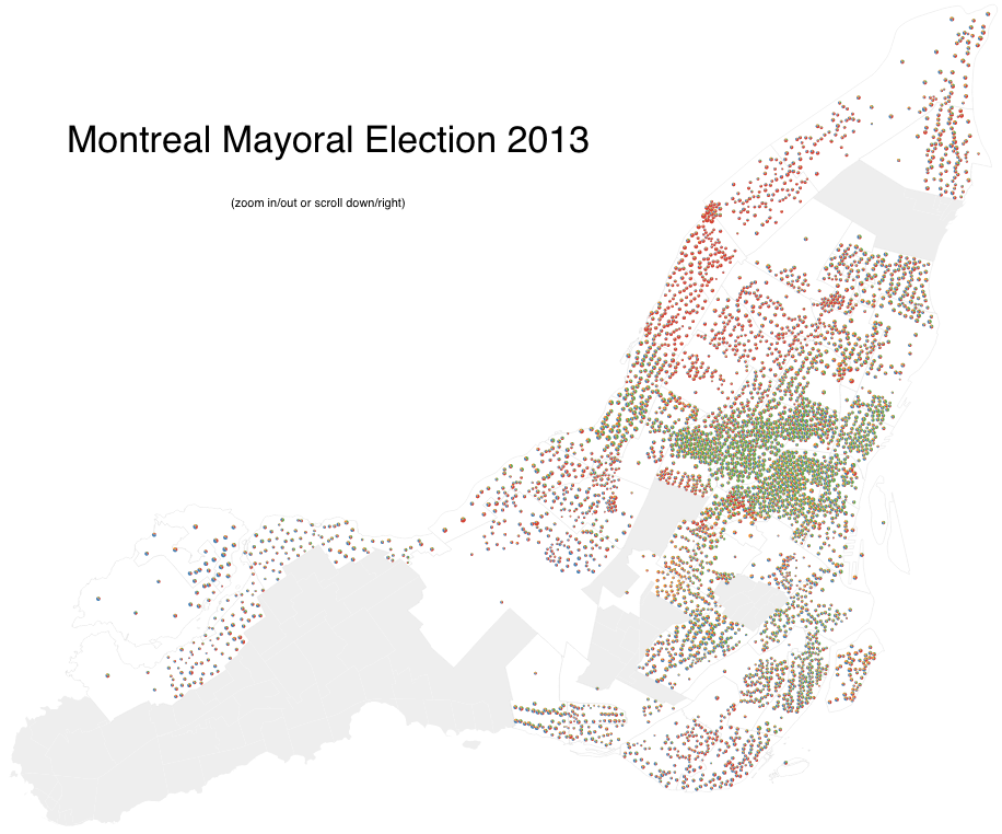
(click to see the full-sized interactive version of this map)
The election data is actually available at the ballot-box level, with each ballot-box holding roughly 120 votes. The map above has more than 3,500 pie charts, one per ballot-box. The pie charts are scaled such that their area is proportional to the number of votes each one represents.
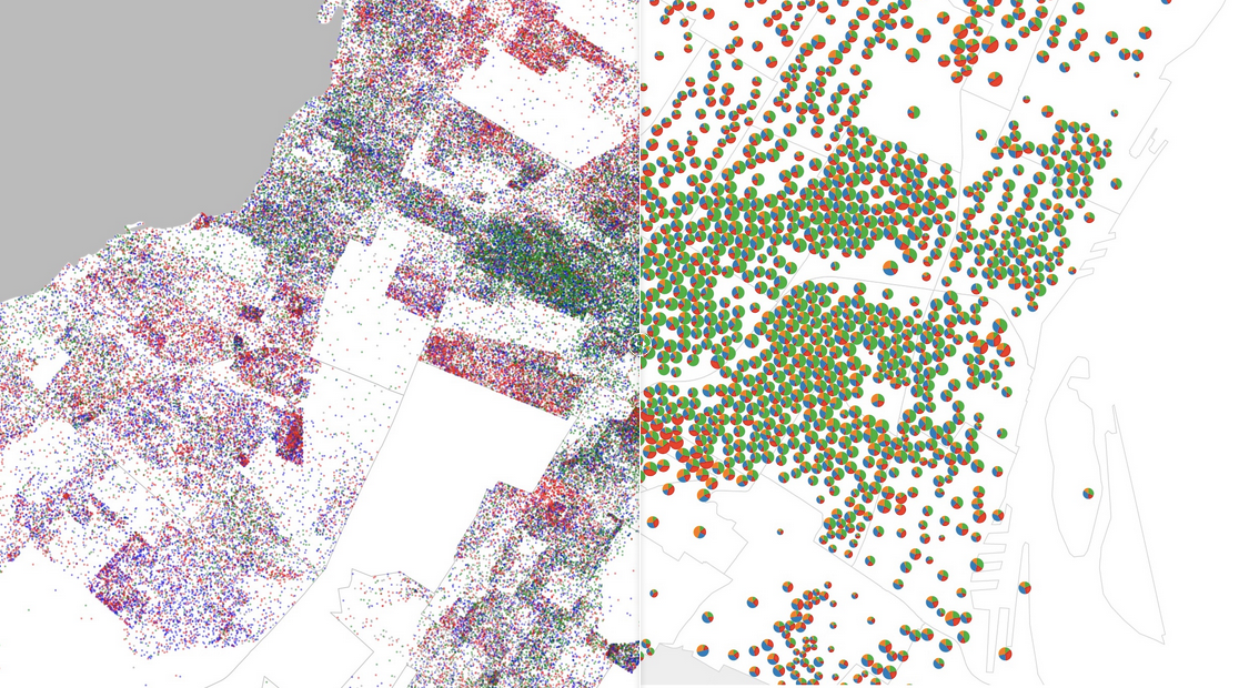
The overall effect is interesting to contrast with my per-ballot-box choropleth (coloured by the “winner” of the ballot box) and with my dot map. I actually built a simple page that can be used to “swipe” back and forth to compare this with the dot-map.
DimpleJS wasn’t able to handle this volume of data so I used raw d3 to make this map, using data extracted with a Jupyter notebook, with all sources available on Github.
⁂