
Nicolas Kruchten
is a data visualization specialist
based in Montreal, Canada.
Montreal
Montreal is the city where I live and work, and I often use it as a subject for my data visualization hobby.
Montreal Election Map, 2021 Edition
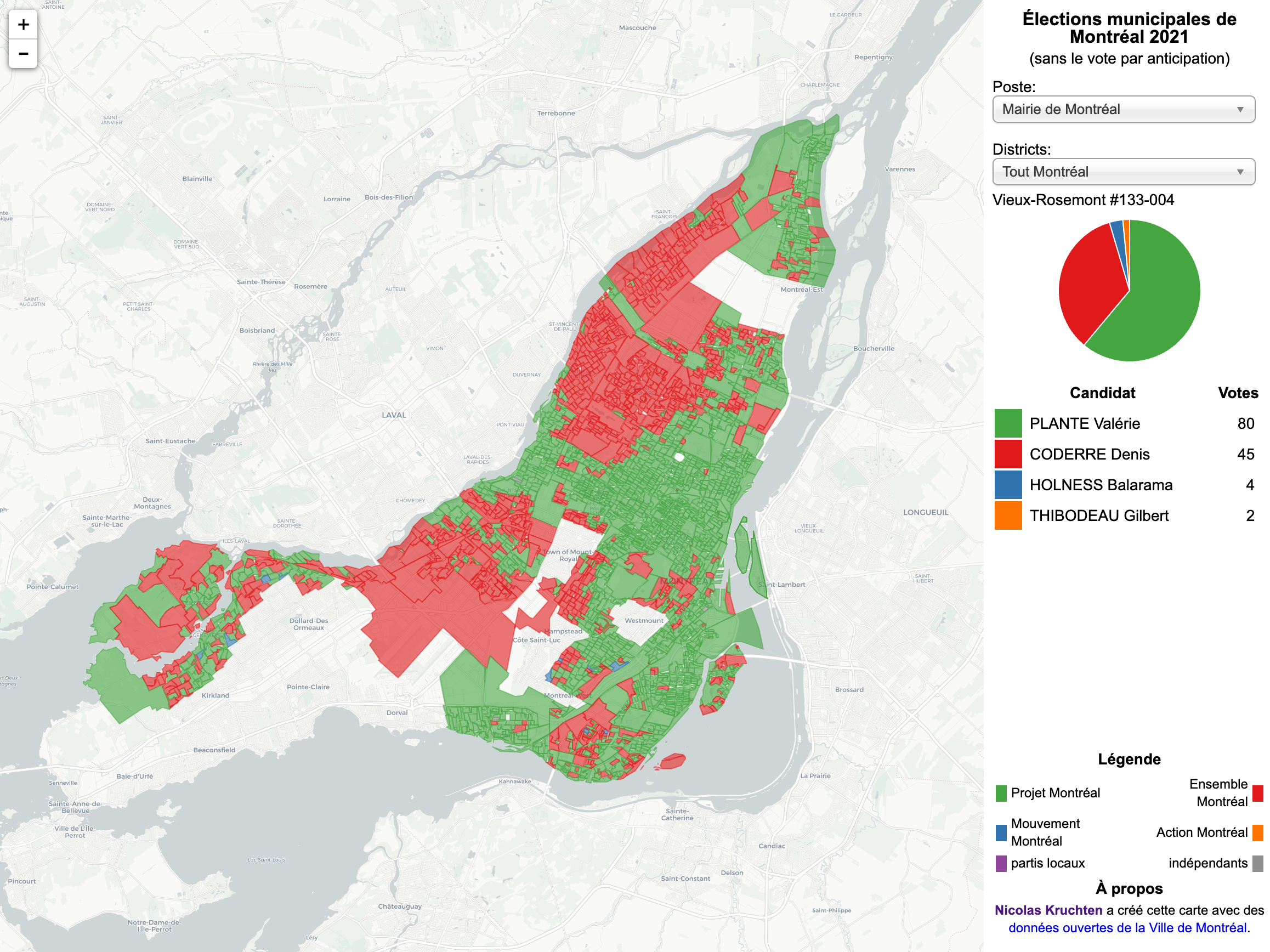
Another four-year cycle, another interactive Montreal municipal election map (see also the 2013 and 2017 editions).
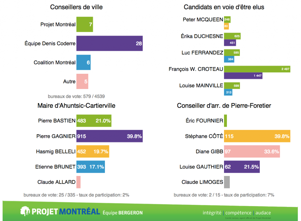
Getting Out the Vote for Valérie Plante

Last November 5th was Municipal Election Day in Montreal and I’m proud to say I was one of the hundreds of volunteers who got out the vote to elect Valérie Plante as Montreal’s first female mayor and the leader of Projet Montréal. However unlike most volunteers who were making phone calls, going door to door or driving electors to polling stations, I was at the campaign headquarters in front of my computer writing SQL queries and interpreting data from a real-time web dashboard I’d built the week before. In this post I’ll explain some of what I learned through this experience about get-out-the-vote (GOTV) efforts, and a bit more about the small role I played.
Pivot Table of All 2017 Montreal Election Results
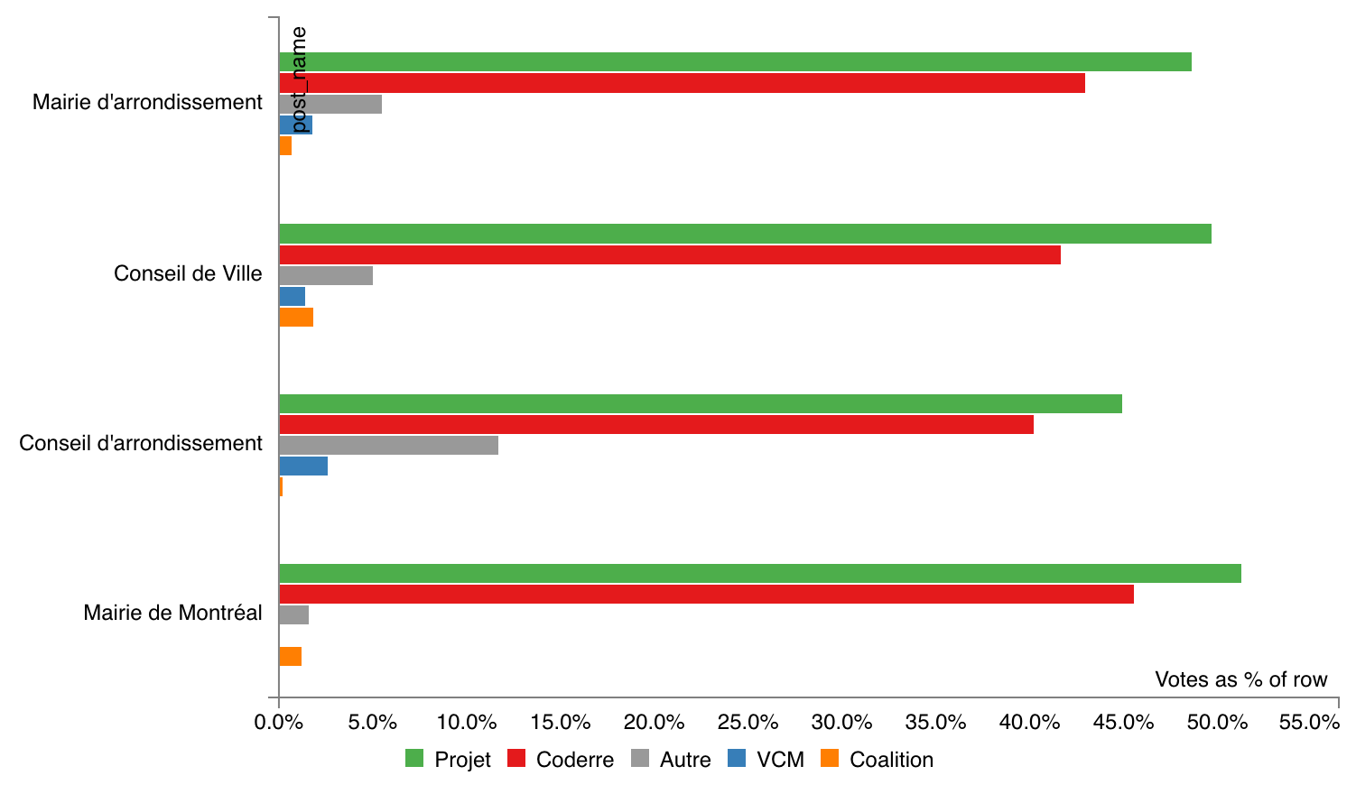
Many people reacted to my my interactive map of Montreal election results with requests for tables of hard numbers, and I’m happy to oblige! I grabbed the official election results from the Montreal open data portal and aggregated them by district to produce an easy-to-use CSV file. I also created a page that preloads a PivotTable.js instance with the data, for interactive data exploration fun!
Map of All 2017 Montreal Election Results
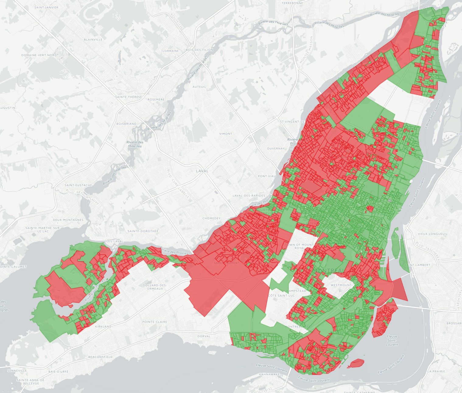
The 2017 edition of my interactive map of Montreal election results is now available, and I’m so pleased about the results it shows! In 2013 I made a map a couple of months after the election and it was considered so unusual it was talked about on the radio. But times have changed: this time the data was available within days, and within hours of that, news outlets had similar maps on their websites. I still like mine better though because it shows data from all 103 races, rather than just the mayoralty. The 2013 map is still around, for reference.
Mapping Car2Go Vehicle Availability in Montreal
As part of my second collaboration with data journalist Roberto Rocha, I made an interactive map for his recent piece on where and when Car2Go vehicles park in Montreal (shorter english version). Earlier in the year, Roberto told me about people in certain neighbourhoods complaining about Car2Go vehicles causing parking problems. He and I hit upon the idea of querying Car2Go’s API every few minutes to find out where all their available cars were parked in Montreal, to take a look at some real data on this issue. I’m a huge fan and user of car-sharing services and in my neighbourhood of Rosemont I feel they prevent parking problems by enabling lower car ownership. As my map makes clear, however, this is not the case in areas like the Mile End. In any case, the CBC articles do a great job of reporting on the situation, and I wanted to share some of the thinking and code that went into making the map.
Notes on metro platform wayfinding
After my photographic metro platform maps went viral last week, I received a lot of feedback in the form of emails and comments, telling me about the experiences of subway riders in other cities. Here are some interesting vignettes.
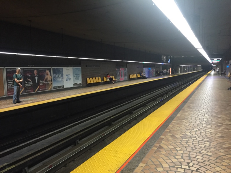
Direction Angrignon: a different kind of subway map
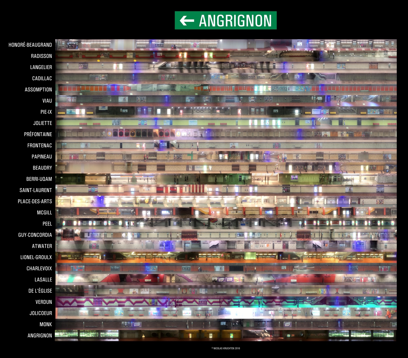
The photo above (click here for a zoomable version) is a collage of panoramic scans of the Angrignon-bound platforms of the Montreal metro’s green line. I used my phone to record videos from the rear-most window of the train and wrote a bit of software to stitch the frames together. My goal was to create a way to figure out where to stand while waiting for the metro so as to get out closest to where you want to go at your destination, and I used these scans to build a little interactive comparison page for just this purpose.
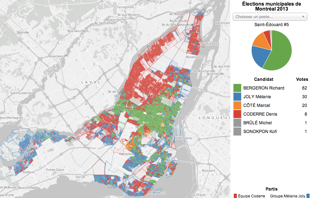
Election Pies
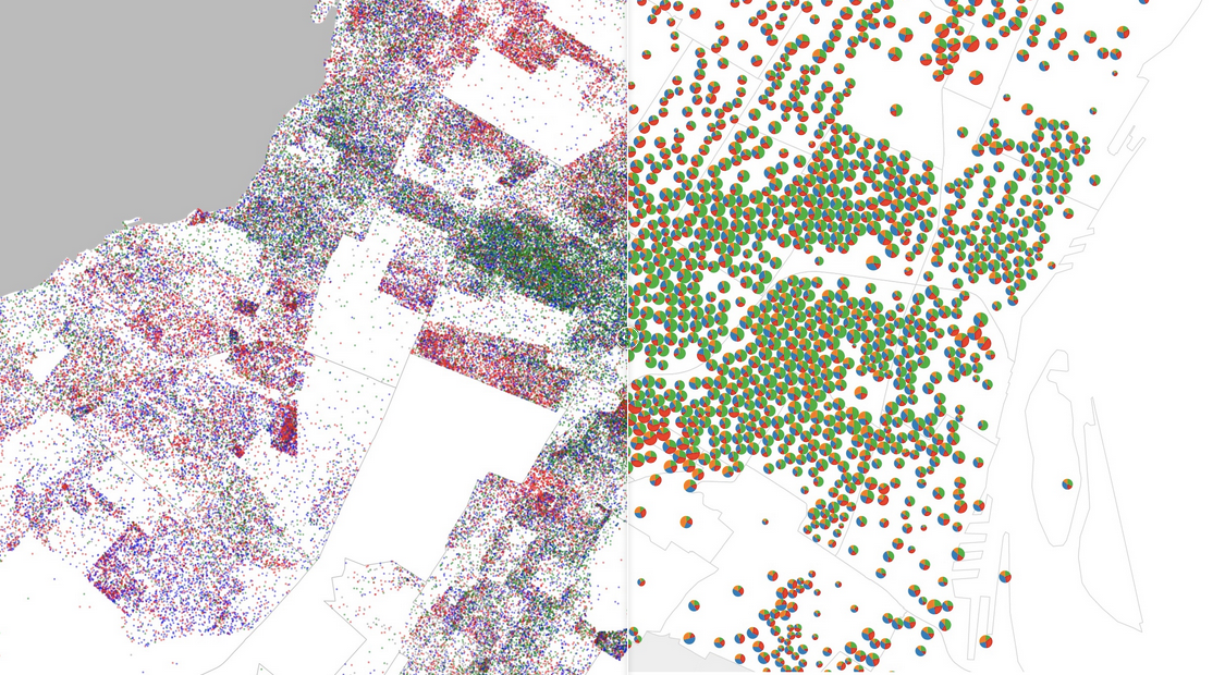
For the latest in my series of maps of the results of the 2013 Montreal municipal election, I’ve produced a pair of graduated symbol maps, representing the results as a pie charts overlaid on a base map. It’s interesting to compare this type of visualization to my previous efforts: the dot map, the choropleth, and the ternary plot.
MTL Data: Montreal 311 Service Requests, an Analysis
Earlier this year, I collaborated with a reporter from the Montreal Gazette to analyze a dataset containing information about 1.4 million service requests received by the City of Montreal from its citizens. The resulting article was entitled "Montreal's 311 records shed light on residents' concerns — to a point" and credits me at the bottom. I have also published my own interactive analysis of the dataset here: Montreal 311 Service Requests, an Analysis. The dataset, obtained from the city's Gestion des demandes clients (GDC) system via an Access to Information request, covered the five years from 2008 to 2012 and contained the date and a very short description for each request, and in most cases, an address. The service requests were received by the city through its 311 phone line or at service counters throughout the city.
House Numbers on the Island of Montreal
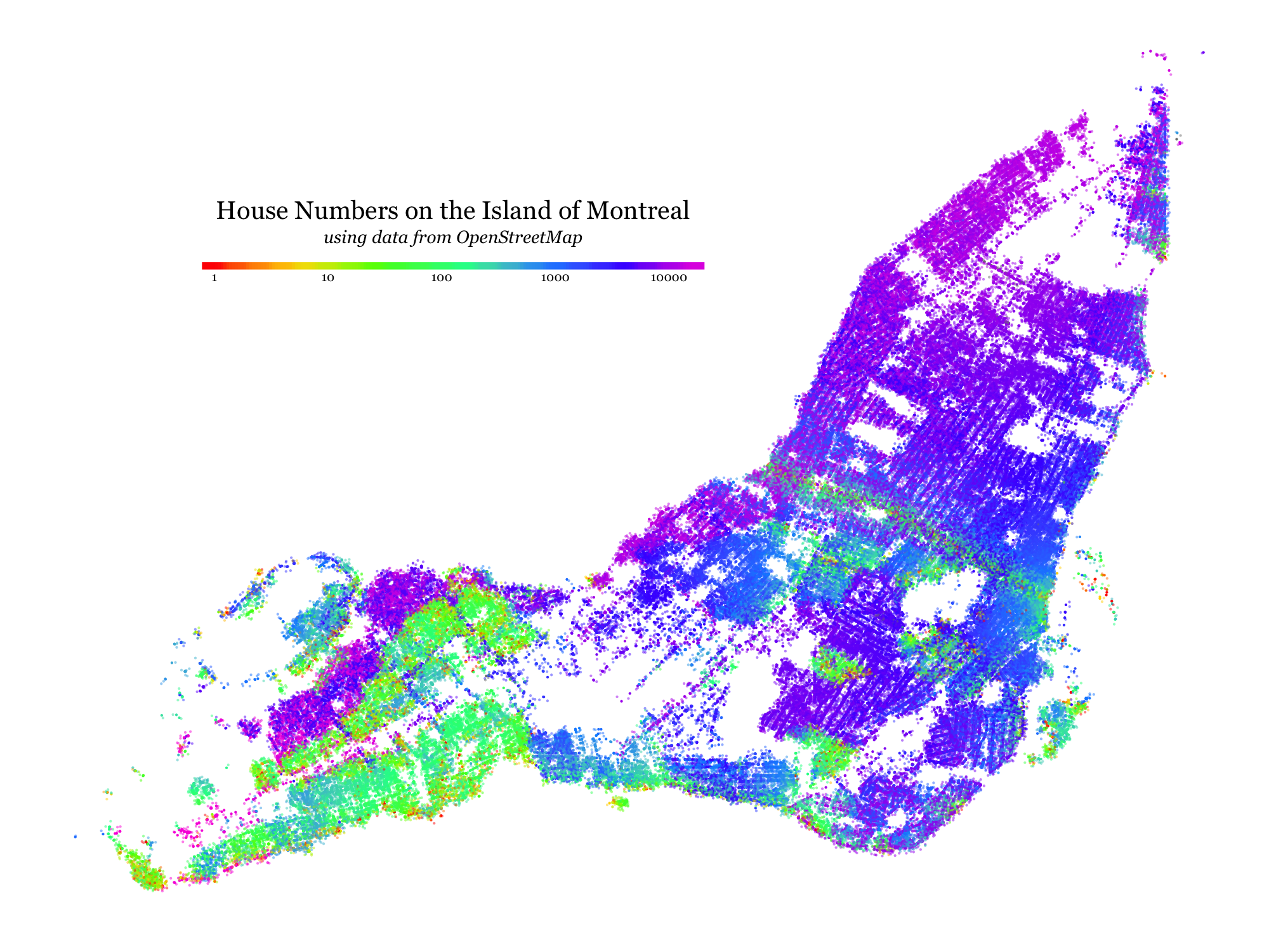
I’ve always been curious to see what kinds of patterns would be visible if one tried to visualize the distribution of house numbers (the number in a street address) across a city like Montreal. This week I took some time to learn enough about the OpenStreetMap system to gather and plot the data.
Early Voting in the 2013 Montreal Election
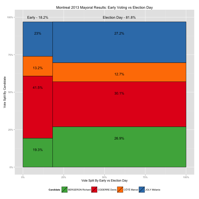
Recently I made some maps of the 2013 Montreal municipal elections, showing voting results down to the ballot-box level, using data from the Montreal Open Data Portal. It turns out, however, that not all of the ballot boxes in that data set are associated with a small geographical area like the ones shown in my by-ballot-box map, and furthermore, those ballot boxes have very different numbering schemes than the ones that do match up with small block-sized areas, numbers like 901 and 601 and 001A instead of small numbers from 1 to 100ish, like the others.
So what gives? These results appear to be from the early-voting polls, which, given that there are fewer of them, cover a larger area per ballot box. In this post I take a look at how leaving this data out of my maps skews the results I present.
Zoomable Map for Montreal Election Results
The Montreal municipal elections were just over two months ago but I played with the election results dataset over the holidays anyways as an excuse to play with a type of data I don’t normally have much to do with: geographical data. Without further ado, here is the map I made, and this post explains a bit about the process.
Ternary Plots for Election Results
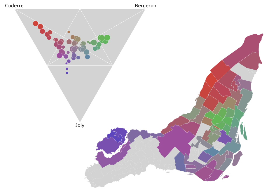
In the Montreal mayoral election last November, nearly 85% of the vote went to one of the top three candidates. A pie chart is a simple way to show the breakdown of votes between candidates for the whole election, say, but what if you wanted to look at the vote breakdown for each of the 52 electoral districts? 52 pie charts is kind of hard to look at and discern any sort of pattern. It turns out that if you only want to look at the top three candidates, you can use a ternary plot to good effect, like I did in the image above. There’s an interactive version as well which helps make the link between the ternary plot and the map via mouse-overs.
Dot Map of 2013 Montreal Election Results
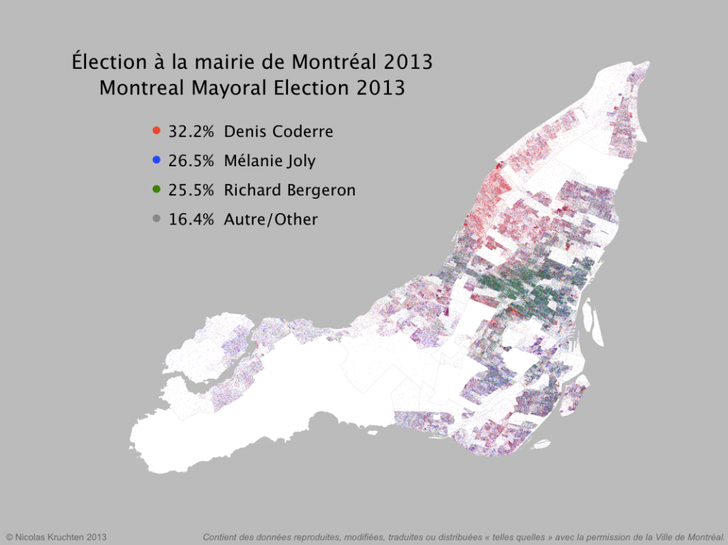
I was inspired by some cool "dot map" visualization projects around the internet (North American Census Dotmap, Toronto Visible Minorities Dot Map) to create a similar visualization of the results for the recent Montreal municipal election. I leveraged data from the Montreal Open Data portal to create the map above. There are coloured dots for (almost) each vote for the mayoralty for the top three candidates, randomly located within the catchment area for the polling booth it came from. What I like about this map is that it shows the results in all their messiness rather than neatly colour-coding entire neighbourhoods like a choropleth map would. People live and vote in arbitrary-looking clusters, not in neat blocks!
Near-Real-Time Election Results Dashboard
There was a municipal election here in Montreal on November 3, and I had the opportunity to help build an election results dashboard to be projected on the big screen at the election-night party for the political party I support: Projet Montréal. The dashboard is still up with final results. I worked with Nicolas Marchildon, who had put together a similar system for the 2009 election.