
Nicolas Kruchten
is a data visualization specialist
based in Montreal, Canada.
Polytechnique Montréal: Intro to Plotly
I was happy to be invited to talk about Plotly during Professor Thomas Hurtut's data visualization class at Polytechnique Montréal (in French).
DSDT MTL: Intro to Dash
I gave a talk at the Data Science, Design and Technology Montreal meetup which was a lot of fun, especially when other members of the community presented the apps that they'd created with Dash!
Software Product and/or Professional Services Organizations
I recently did a guest talk at the Arup Montreal office regarding the differences between Software Product Organizations and Professional Services Organizations.
Data Visualization for Artificial Intelligence, and Vice Versa
Data visualization uses algorithms to create images from data so humans can understand and respond to that data more effectively. Artificial intelligence development is the quest for algorithms that can “understand” and respond to data the same was as a human can – or better. It might be tempting to think that the relationship between the two is that to the extent that AI development succeeds, datavis will become irrelevant. After all, will we need a speedometer to visualize how fast a car is going when it’s driving itself? Perhaps in some distant future, it might be the case that we delegate so much to AI systems that we lose the desire to understand the world for ourselves, but we are far from that dystopia today. As it stands, despite the name, AI development is still very much a human endeavour and AI developers make heavy use of data visualization, and on the other hand, AI techniques have the potential to transform how data visualization is done.
Make Patterns Pop Out of Heatmaps with Seriation
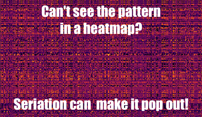
One of the easiest ways to start visualizing data is to turn a table into a heatmap: every cell gets a colour, the higher the number the brighter the colour. Unfortunately, this is often a fairly unrewarding exercise, yielding graphics that look like plaid or tartan fabric. Part of the problem is that the rows and columns of a dataset often have no natural ordering, such as time, and are instead shown in alphabetical order, or else the dataset is sorted by one of the rows or columns, rather than in an order which makes patterns pop out visually. My goal in this article is to clearly demonstrate this problem and show that there exist neat solutions to this problem using a set of techniques collectively called seriation. I’ll do this by automatically reordering the rows and columns in the following noisy-looking heatmap to make the underlying pattern very clear.
Straightening Great Circles
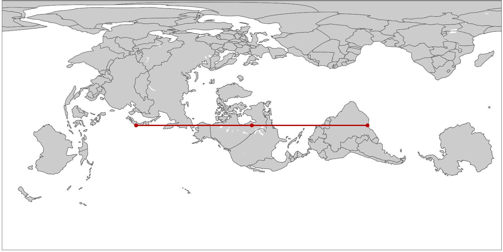
Many a bored long-haul flight passenger has asked themselves why the flight path on the map is curved, and if it wouldn’t be faster to just fly straight there. In fact, airlines try very hard to keep their flight paths as straight as possible. It’s just that the rectangular world maps we are accustomed to looking at project the 3-dimensional earth onto a 2-dimensional surface such that any long straight line not directly along the equator or perpendicular to it will appear curved. Making the equator special in this way makes some sense as a default way to draw maps, because of the way the earth spins on its axis, but we can just as easily choose any other straight line path for this treatment, and doing so gives us an interesting perspective on the world and on maps.
Data Visualization: it's a lot like Photography
I have recently read some though-provoking articles that discussed data visualization by analogy to photography. I really like this analogy, both from a process perspective – photography and data visualization – and a people perspective – photographers and data visualizers. Anyone who takes a picture with a camera is a photographer in that moment, and anyone who makes a chart, diagram or map based on data is a data visualizer while they’re doing that. Both photographers and data visualizers produce images of information emanating from their subjects, to make a point, to record, to inform, to delight. Photographers choose the lighting of their subject and framing of their shots, then use cameras to capture their image. Data visualizers choose the data they use about their subject and the mapping of data attributes to visual attributes, then use algorithms to produce graphics. Both can post-process their images to exert even finer control over their products.
Introducing react-pivottable
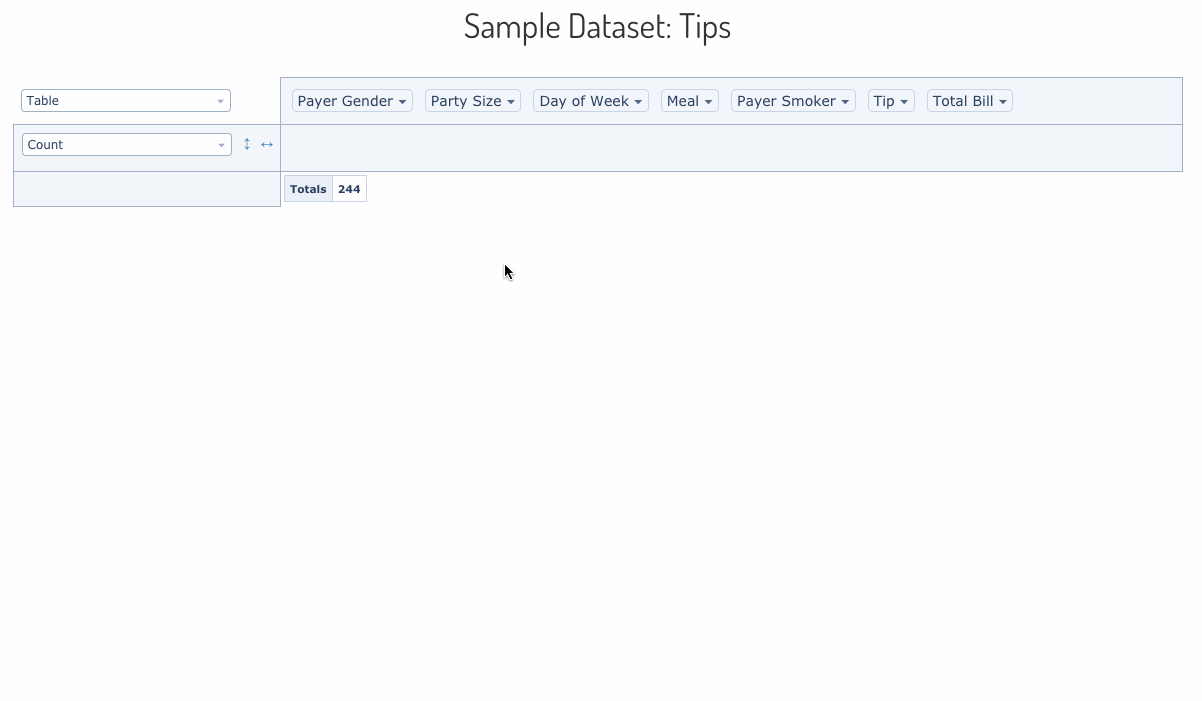
Pivot tables are interactive data exploration and summarization tools which have been a critical part of data analysts’ toolkits for the past 25 years, especially in spreadsheets like Excel. Five years ago I built PivotTable.js, which has since become one of the most popular Javascript pivot table implementations. I initially wrote it in CoffeeScript and packaged it up as a jQuery plugin, but the front-end world has evolved a lot since then so today I’m excited to announce a new-and-improved version of PivotTable.js for the modern web: react-pivottable.
Getting Out the Vote for Valérie Plante
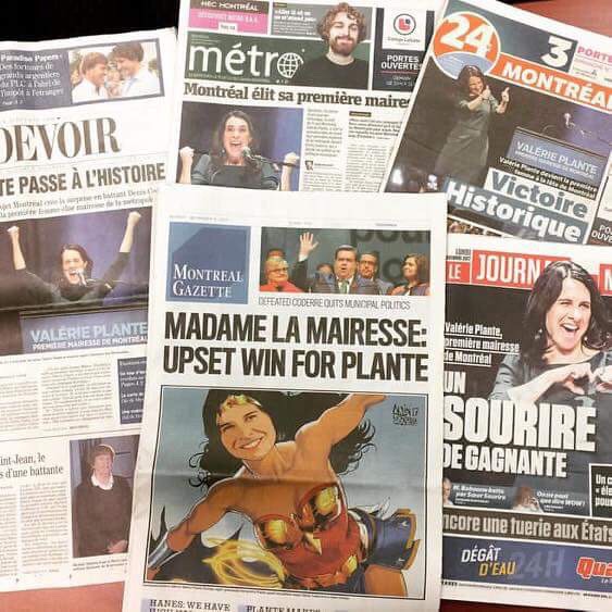
Last November 5th was Municipal Election Day in Montreal and I’m proud to say I was one of the hundreds of volunteers who got out the vote to elect Valérie Plante as Montreal’s first female mayor and the leader of Projet Montréal. However unlike most volunteers who were making phone calls, going door to door or driving electors to polling stations, I was at the campaign headquarters in front of my computer writing SQL queries and interpreting data from a real-time web dashboard I’d built the week before. In this post I’ll explain some of what I learned through this experience about get-out-the-vote (GOTV) efforts, and a bit more about the small role I played.
Plotly.js and Crossfilter.js
I recently put together a simple example of Plotly.js and Crossfilter.js working together to produce a set of linked data visualizations.