
Nicolas Kruchten
is a data visualization specialist
based in Montreal, Canada.
Introducing Dashboard Engine
I was very proud to introduce Dashboard Engine to the world, as part of the Dash Enterprise 5.0 announcement webinar. I’ve been the product manager and team leader for this project for 18 months and it’s really gratifying to see it come to fruition.
SciPy 2021: Data Visualization as the First and Last Mile of Data Science
I was proud to be able to give a talk at SciPy 2021 this year, about Plotly Express and Dash!
Remaking Figures from Bertin's Semiology of Graphics
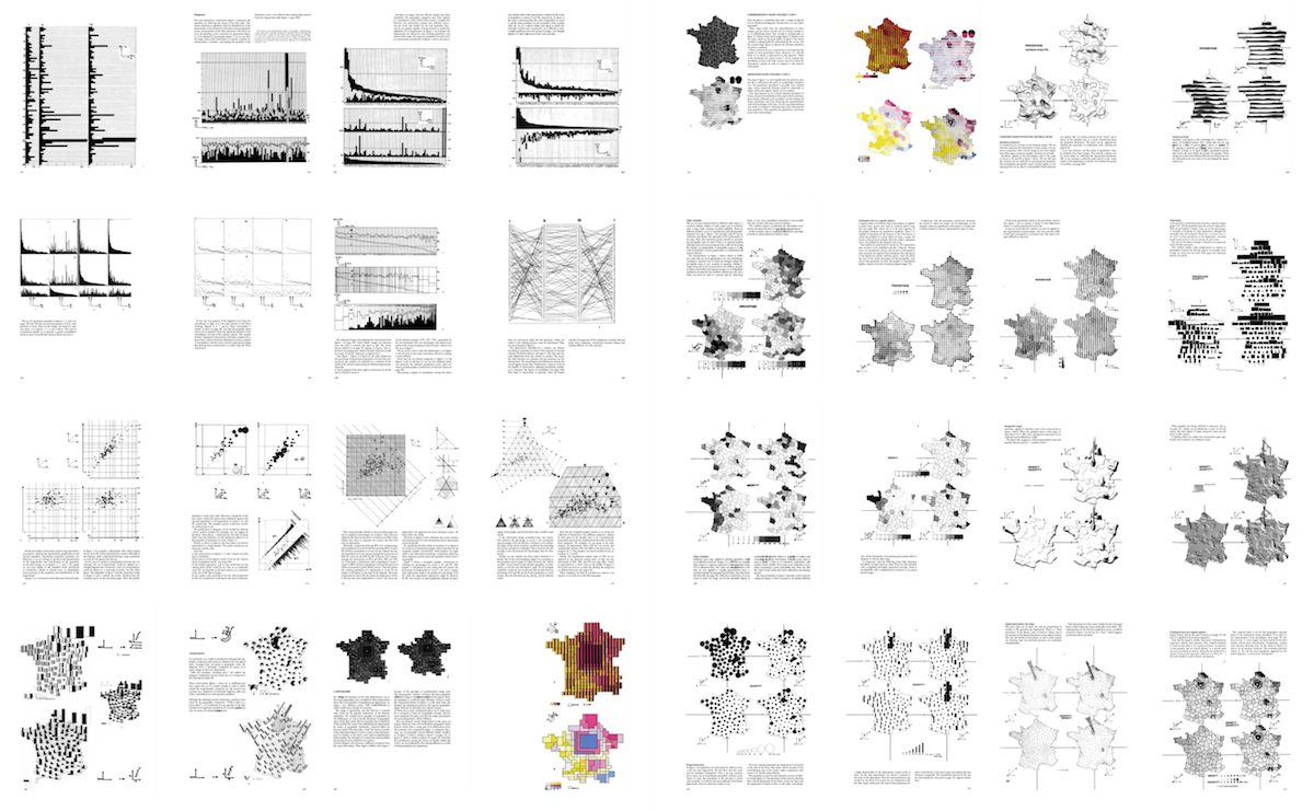
I’ve just published a personal project I’ve been thinking about doing for a few years now: revisiting figures from a 1967 book which has had a big influence on how I (and others!) think about data visualization, Jacques Bertin’s Semiology of Graphics.
Interview on IQT Podcast
I was recently interviewed on the IQT Podcast about Visualizing Data During a Pandemic, and how Plotly is contributing to COVID-19 response.
SciPy 2020: Tools Plenary Session
I was pleased to give a three-minute rundown at SciPy 2020 about what the Plotly.py team has been up to! My bit is at timecode 8:25.
Polytechnique Montréal: Plotly Express & Dash
I was happy to be invited back for a third time to talk about Plotly during Professor Thomas Hurtut's data visualization class at Polytechnique Montréal (in English this time!).
Beyond “tidy”: Plotly Express now accepts wide-form and mixed-form data
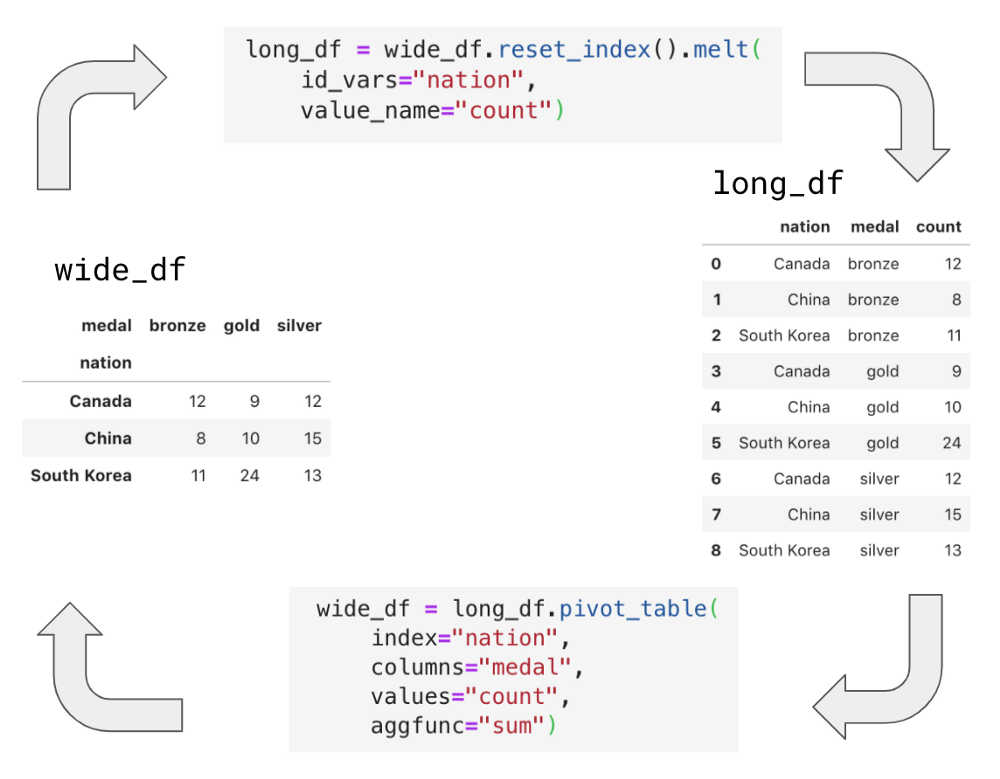
Plotly Express is the built-in high-level data visualization interface for Plotly.py, a leading interactive data visualization library for Python. With today’s release of Plotly.py 4.8, Plotly Express now gracefully operates on wide-form and mixed-form data – not just “tidy” long-form data. These new capabilities dramatically expand Plotly Express’ promise of ‘interactive data visualization in a single Python statement’, by removing the need to wrangle your data into a particular form before plotting.
Polytechnique Montréal: Plotly Express & Dash (en français)
I was happy to be invited back to talk about Plotly during Professor Thomas Hurtut's data visualization class at Polytechnique Montréal (in French).
Montreal Python: Plotly Express and Dash
I recently gave a talk about Plotly Express and Dash at Montreal Python. The description of the talk was, "You start the morning exploring some data in a Jupyter notebook with Plotly Express and after lunch you whip up a web application to give your non-programmer colleagues access to those same insights with Dash, all in under a 100 lines of Python, no Javascript required. This talk will show you how Plotly's open-source libraries fit together to make this possible."
Introducing Plotly Express
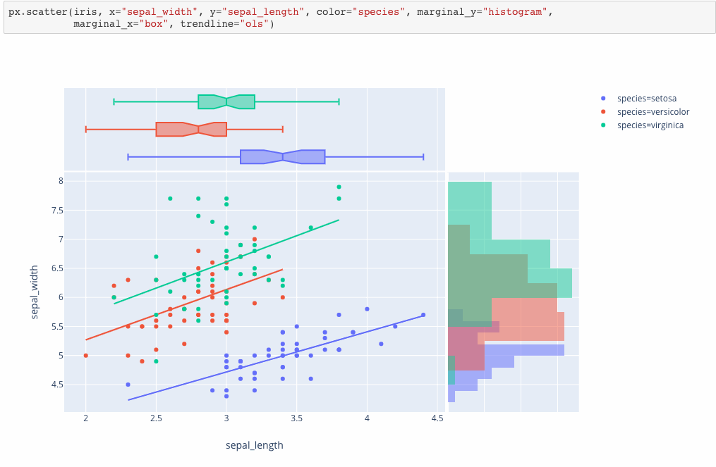
Plotly Express is a new high-level Python visualization library: it’s a wrapper for Plotly.py that exposes a simple syntax for complex charts. Inspired by Seaborn and ggplot2, it was specifically designed to have a terse, consistent and easy-to-learn API: with just a single import, you can make richly interactive plots in just a single function call, including faceting, maps, animations, and trendlines. It comes with on-board datasets, color scales and themes, and just like Plotly.py, Plotly Express is totally free: with its permissive open-source MIT license, you can use it however you like (yes, even in commercial products!). Best of all, Plotly Express is fully compatible with the rest of Plotly ecosystem: use it in your Dash apps, export your figures to almost any file format using Orca, or edit them in a GUI with the JupyterLab Chart Editor!