Make Patterns Pop Out of Heatmaps with Seriation
One of the easiest ways to start visualizing data is to turn a table into a heatmap: every cell gets a colour, the higher the number the brighter the colour. Unfortunately, this is often a fairly unrewarding exercise, yielding graphics that look like plaid or tartan fabric. Part of the problem is that the rows and columns of a dataset often have no natural ordering, such as time, and are instead shown in alphabetical order, or else the dataset is sorted by one of the rows or columns, rather than in an order which makes patterns pop out visually. My goal in this article is to clearly demonstrate this problem and show that there exist neat solutions to this problem using a set of techniques collectively called seriation. I’ll do this by automatically reordering the rows and columns in the following noisy-looking heatmap to make the underlying pattern very clear.
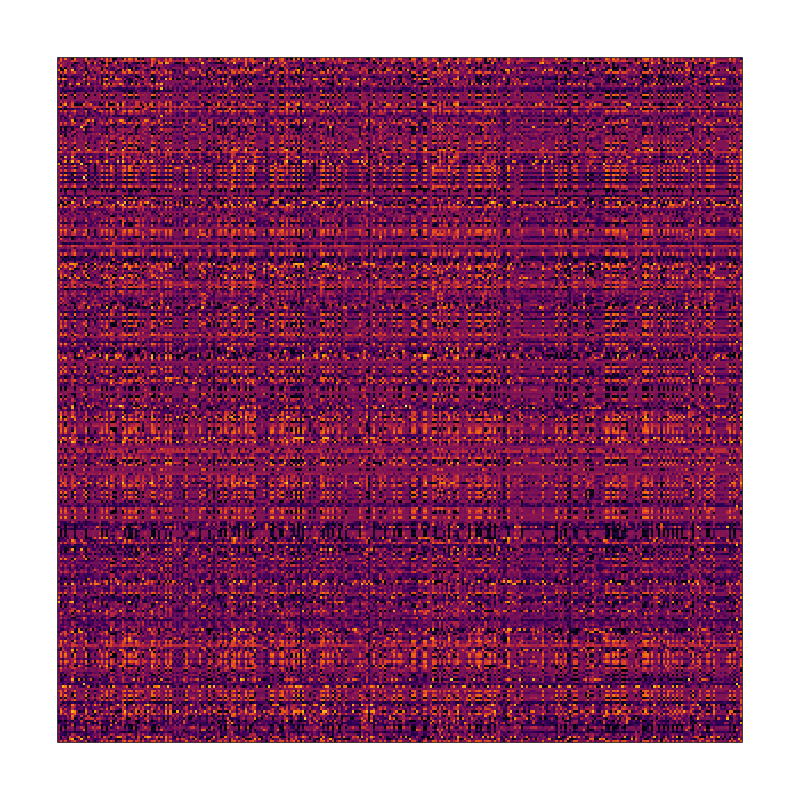
It seems like there might be a pattern here but it’s definitely not obvious what it is
I know for a fact that there’s a pattern here because I put it there myself before independently shuffling the rows and columns to obscure it. Critically, this means that any cells that were in the same row in the original dataset are still in the same row, and likewise for columns.
The techniques I demonstrate below come out of a branch of research called seriation, which is the study of ways to place sets of items in an order that reveals structural information about that set, and which has a rich history. I was not involved in writing any of the software demonstrated below, which comes from an R package appropriately called seriation, although parts of it could have just as easily been done in Python or Javascript. The tiny amount of code I wrote for this article can be found on Github.
Clustering
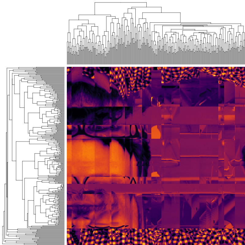
If you look at the heatmap above, it certainly seems like there is a pattern, in that some columns look similar to each other and the same for rows, leading to the plaid effect. A natural reaction to seeing this is to want to group together similar-looking rows and columns. This type of reordering is often done by agglomerative clustering, which in the case of rows would start by placing each row in its own cluster, and then iteratively merging the most similar clusters together until only one remains. The result of such a clustering of items can be visualized as a dendrogram. Here is the result of agglomerative clustering on the heatmap above, with row and column dendrograms, as it is frequently done in bioinformatics:

Agglomerative clustering
We get what we asked for: certainly it looks like things have been grouped together and the image feels less chaotic than the original, but the clear pattern I promised isn’t exactly jumping out at us.
Optimal Leaf Ordering
One of the problems with agglomerative clustering is that it doesn’t actually place the rows in a definite order, it merely constrains the space of possible orderings. Take three items A, B and C. If you ignore reflections, there are three possible orderings: ABC, ACB, BAC. If clustering them gives you ((A+B)+C) as a tree, you know that C can’t end up between A and B, but it doesn’t tell you which way to flip the A+B cluster. It doesn’t tell you if the ABC ordering will lead to a clearer-looking heatmap than the BAC ordering. The clustered heatmap above was placed in the default order for the R heatmap.2 function, which is ordering by the mean value of the row/column, within the constraints of the tree.
Here we meet our first seriation algorithm: Optimal Leaf Ordering (OLO). This algorithm starts with the output of an agglomerative clustering algorithm and produces a unique ordering, one that flips the various branches of the dendrogram around so as to minimize the sum of dissimilarities between adjacent leaves. Here is the result of applying Optimal Leaf Ordering to the same clustering result as the heatmap above:
Agglomerative clustering with Optimal Leaf Ordering
The effect is quite dramatic: much of the jagginess of the original clustered heatmap is gone, and the perceptive reader is likely able to guess what the underlying pattern of the dataset is. It’s not exactly crystal clear yet, but it’s a big improvement over arbitrarily ordering clustered rows and columns, just like the latter was an improvement over arbitrarily-ordered rows and columns.
Travelling Salespeople
We started with clustering just because it seemed to make intuitive sense to group similar rows together, and then we ordered the tree branches to minimize the sum of dissimilarities between adjacent rows (and the same for columns, independently). But what if we didn’t care about clustering? We could just find the order of the rows that minimizes the sum of dissimilarities, unconstrained by the clustering tree. This is similar to the well-known Travelling Salesperson Problem (TSP), wherein one wants to find the shortest path that visits every city in a set and comes back to its starting point. In the case of seriation, though, we explicitly don’t care about coming back to the starting point: it doesn’t matter how dissimilar the first and last rows are in the heatmap. Thankfully, this problem can be reduced to a TSP by the addition of a dummy row with 0 distance to all the others, and then cutting the result at that point. Here is the result of seriation by independently applying a TSP solver to the rows and columns of our heatmap:

Seriation via a TSP solver
The pattern is now quite clear: the dataset in question was composed of the pixel intensity values for a photograph of yours truly. When you compare it to the original heatmap above, it’s quite surprising that it’s literally the same table with rows and columns shuffled.
A note on using TSP-based seriation: the TSP is famously thought to be impossible to solve efficiently, so it’s usually not feasible to find the absolute best ordering. Instead, heuristics are used to find a “good” ordering within a “reasonable” amount of time. For the 400-row dataset above, the TSP solver ran in well under a second, but I should note that it is not deterministic, so it’s not capable of producing the original image on every run. OLO seriation, on the other hand, scales better than TSP seriation and is deterministic.
Conclusions and Caveats
To me this is a powerful illustration of the need to take into account the strengths and weaknesses of the human visual system when visualizing data. It’s not enough to just mechanically turn the numbers into graphics — both the shuffled and seriated heatmaps visually represented the same underlying data — we have to find ways to structure the image so that the human eye can actually see the patterns. In the case of heatmaps, the core insight is that we can only really see patterns when they are reasonably continuous in space, we cannot easily assemble distant data points into a coherent image on our own: order and proximity matter.
My intention in writing this article was to provide a dramatic and easy to see example of the importance of the row and column orders in a heatmap and the benefits of seriation. To do so, I chose a dataset which is actually particularly amenable to seriation via the TSP approach: adjacent rows and columns in an image are extremely similar to each other, far more so than in most other kinds of datasets. Clearly, applying seriation techniques to most datasets will not generally yield photographs of me, or indeed anything nearly as easy to interpret, but it’s still more likely to reveal interesting patterns in data than sorting by row or column name, or by any single row or column, which are the defaults for most tools. Instead, using seriation one can in effect “sort by row similarity” and I encourage anyone who has given up on heatmaps as a useful data visualization technique for exploration or communication to try the seriation R package (or Optimal Leaf Ordering in Python or Javascript) to see if can help make patterns pop out of plaid.
Further Reading
The documentation for the R seriation package is extensive (it contains much more than just OLO and TSP) and contains a number of small examples of seriation on real-world datasets, although none that are as arresting as the synthetic one I’ve put together, in my opinion. The original Optimal Leaf Ordering paper is also an interesting read.
The late, great Jacques Bertin, author of the magisterial Sémiologie Graphique, pioneered the use of reorderable matrices to physically seriate datasets by moving around rows and columns of datasets represented by tiles on rods. A number of striking examples are included in his lesser-known work La Graphique, which has recently been reprinted, albeit not in english as far as I know. Some fellow enthusiasts of Bertin’s work recreated some of these physical devices and have also created a browser-based tool for interactive seriation called the Bertifier.
After reading La Graphique, I researched modern methods to do what Bertin advocated, and learned that his approach was actually but one step in a much longer history of seriation, which is documented in this interesting review of the history of the field.
⁂
Follow Nicolas
Code on Github
Code from this post is up on Github at nicolaskruchten/seriation