Visualizing Family Trees
I had the pleasure of visiting with many members of my wife’s family this summer, some of whom are genealogy enthusiasts. I made a pair of visualizations of the data they had collected: one in the run-up to a family reunion and one to find my way around the large family we visited in Saskatchewan.
Fisher-Crawford Descendancy
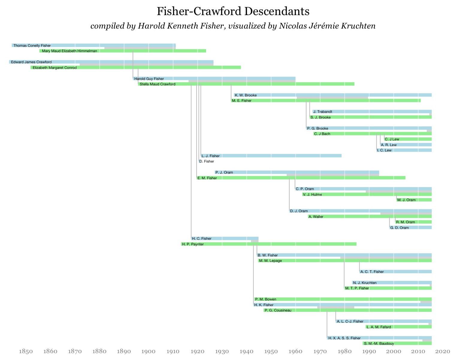
My father-in-law’s brother, Kenneth Fisher, organized a reunion for the descendants of his grandparents, and I wanted to make a nice graphic showing the relationships between attendees that could fit on a single printed page. I was inspired by a paper on a technique called TimeNets, which shows a timeline of the lives of various family members, laid out such that marriages and parent-child relationships are easy to visualize. With a small data set such as the one I had to work with, I was able to do the layout by hand, and I opted to replace the curved lines indicating marriages with some grey bars, due to the limitations of the tools I was using. The end result is also somewhat reminiscent of one of my very first visualizations: Context.
I built this using the ggplot library and the final output is available here in PDF with the source on Github. I coloured the bars according to gender to make it visually more interesting, and although I replaced given names with initials in the version above, the real version had full names.
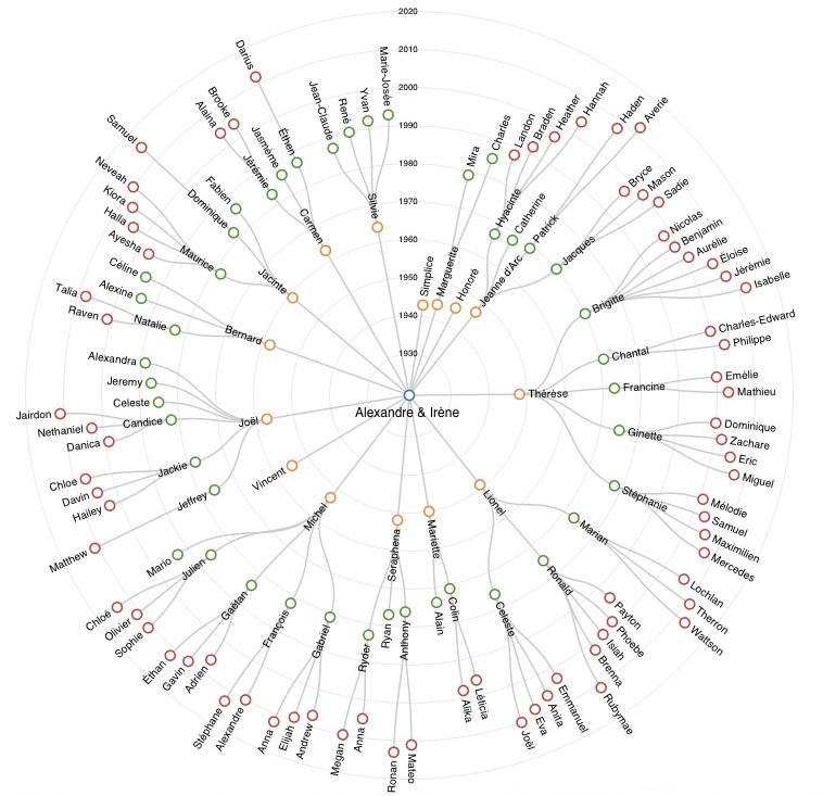
Lepage-Bandet Descendancy
(click for full-resolution version)
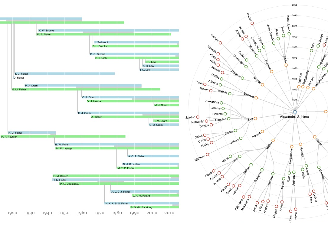
My mother-in-law’s parents lived in Saskatchewan and had 15 children, so when we went to visit some of them, it was easy to get confused about who was who! Luckily my mother-in-law’s sister, Jeanne d’Arc Gaudet, had a nicely-organized Word doc I could use to build a compact graphic that would show all of their descendants. This kind of chart is traditionally laid out linearly and fans out extremely widely so I tried a radial approach instead. I represented the time dimension as well by laying out nodes according to their year of birth. I later found a paper describing a similar approach, although my layout was computed differently.
I built this using the d3 library and the final output is available here with the source on Github. I coloured the nodes according to their generation, to add some visual diversity and to help the eye track across the circle, and I limited the labels to first names, in order to keep things compact. I also limited the individuals to just the descendants: no spouses.
Thoughts
The impulse to visualize family trees is an old and common one, and there many techniques and pre-existing software for doing it. There are even businesses which specialize in printing huge charts for family reunions. All the same, I had fun making these graphics and thinking through the visualization choices myself.
I also learned that just like map-making, genealogy and the subsequent production of graphics can be kind of political. Who should be included in the graphic? How should the names be written? These can be fluid (people marry and split up, or have kids without marrying) and capturing a static image can be tricky and subjective. I sidestepped most of these issues by deferring to the judgement of those who collected the data, but it was interesting to think about nonetheless.
⁂
Follow Nicolas
Code on Github
Code from this post is up on Github at nicolaskruchten/genealogy