Zoomable Map for Montreal Election Results
The Montreal municipal elections were just over two months ago but I played with the election results dataset over the holidays anyways as an excuse to play with a type of data I don’t normally have much to do with: geographical data. Without further ado, here is the map I made, and this post explains a bit about the process.
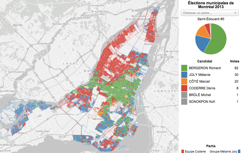
Before diving into the technical details though, I should mention that I wanted to make a choropleth map, in contrast to my previous dot map, at a ballot-box level (called ‘section’ level in the original data-set), and to display it on top of an actual Montreal street map. The dot map was neat but didn’t really for much interactivity and actually made it pretty hard to read the results accurately or, ironically, mentally map the data onto Montreal itself, for lack of landmarks. I wanted to be able to mouse over a specific city block (i.e. mine!) and see the underlying numbers displayed in a pie chart. After playing with the notion of colouring the polygons in a blended red-green-blue colour scheme for the top 3 candidates like in my dot-map, I decided to colour the polygons by the ‘winner’ of each little area, which exposes the fact that even though he only got 10% of the overall vote, the fourth-place candidate Marcel Côté actually carried some neighbourhoods. The intensity of the colour of each polygon is proportional to the ‘vote density’, or the number of votes over the area of the polygon, so that large, unpopulated areas don’t visually dominate the map.
The election results data comes from the Montreal Open Data Portal in the form of per-ballot-box results (number of votes per candidate) in a CSV file and per-ballot-box polygons in GeoJSON format: the catchment area for the households whose votes go into the box. I turned to a library called Leaflet.js as a base framework for displaying a zoomable street map, Google Maps style, and then I just needed to draw some coloured polygons on top. The big challenge was that the actual results CSV file is 9 megs and the polygons GeoJSON file is 13 megs.
As it happens, Mike Bostock, who created Protovis and its more-popular younger brother D3, clearly works with a lot of geographical data and so has made available a tool called TopoJSON, which is a way to compress GeoJSON-formatted contiguous polygons by representing them as a mesh rather than as a bunch of polygons. This tool also allows you to very simply add data to your polygons from a CSV file via a command-line argument.
So I wrote a simple R script which uses the fantastic reshape2 library from another source of great visualization libraries Hadley Wickam to extract the subset of the CSV that I wanted: results for the top 4 mayoral candidates. I then ran it and the GeoJSON file through the TopoJSON tool and voila: a hefty but managable 2.3 meg JSON file, from which I was able to draw coloured polygons onto my Leaflet.js base map. I used D3 to make a pie-chart show up in the corner on mouse-over, and I wrote all the code in CoffeeScript. The colours I used are from one of the recommended mapping palettes from ColorBrewer
My R code, the TopoJSON command and the CoffeeScript code are all available on Github.
Edit: this map was made using only data from election day, and does not include data from the advance polling days, as it is not available down to the ballot-box level. See my analysis of early voting for more details on how this impacts the map.
Edit: the explanation above applies to version 1.0 of this map, which only included results for the election for the Mayor of Montreal. Version 2.0 of the map, which is the one that’s live now, includes results for all 103 races, with various data compression tricks to achieve a further reduction in the size of the data being downloaded to less than 1 meg (JSON plus CSV).
⁂
Follow Nicolas
Code on Github
Code from this post is up on Github at nicolaskruchten/mtlelection2013bysection