Datacratic's Dataviz System
At Datacratic, working with data often means data visualization (or dataviz): making pretty pictures with data. This is usually more like making fully machine-generated images than carefully laying out "infographics" of the Information Is Beautiful school but I find they usually end up looking pretty good. There are lots of good tools for graphing data, like matplotlib or R or just plain old Excel-clone spreadsheets but what we use most often is Protovis, the Javascript library for generating SVG, coupled with CoffeeScript, which is a concise and expressive language that compiles down to Javascript.
The appeal of this combination for me is that it's a very data-centric, declarative way of writing code to generate graphics. If you read the code for some of the very pretty examples on the Protovis site, you'll see that they basically all have the same structure: a JSON-friendly object (usually an array) with all of the data to be visualized, and some small amount of code that declares how each element in that data object should be drawn. To me, the relationship between data and Protovis code is very similar to the relationship between semantic HTML and CSS: a separation of content and presentation. When we first started using Protovis to make pretty pictures, we'd do something similar to the Protovis examples: make an HTML file which contained a bit of markup and a script block with the Javascript code to call Protovis, plus a script tag in the header, which would load an external file which contained our JSON data, preceded by something like "this.data=". This suited us just fine, because the data to be visualized was usually the output of some Python or NodeJS or C++ process, and writing JSON to disk is really easy from pretty much any language.
The thing is, once you've written a bunch of similar dataviz code a few times, you look for a way to reduce the repetitive work, and so you pull your code out into an external file and you end up creating a whole bunch of very small HTML files to combine code and data. Say you've settled on a nice way of graphing a certain type of data, for example the output of a per-partition Click-Through-Rate vs Cost-Per-Click analysis script. You'll probably want to view the same graph for various partitions: per site, per vertical, per day of week, per time of day, whatever. So you generate a data file per partition, and you use the same code file, applied to each data file to generate each graph. And automating this task is just what the dataviz system that François and I built does.
At its core, it's just a very small PHP file which generates an page with script tags that include a data file on the one hand and a code file on the other, based on GET parameters. This allowed us to create a few reusable Javascript or CoffeeScript files which specified how to visualize certain types of data, and use this script to quickly pull up a page for a given combination of data and code to have the browser show us the resulting SVG. Of course we don't want to type GET parameters into the URL bar, so we wrapped this up in a little web-app that draws a file-tree based on what's on disk and lets you click on the file you want and loads up our core PHP file in an iframe. No sweat. But then things get interesting.
Because Protovis is so data-centric and declarative, each code file implicitly requires a certain format in its data: some scripts work on arrays of arrays, others on dictionaries. We decided to create a simple convention for how we name our files on disk so our web-app would know which data files went with which code files. For example, a file in the 'data' directory called 'stats-daily.js' could be visualized with a code file in the 'viz' directory called 'stats.js'. And then at some point we decided that some data formats could be visualized in more than one way, so we extended the code-file naming scheme to enable mixing and matching, say, data files named 'stats-daily.js' or 'stats-hourly.js' with code files called 'bargraph-stats.js' or 'scattergraph-stats.js' (see campaign example below). Essentially for a given data-type X, we have a one-to-many relationship with data files X-F1.js, X-F2.php etc and a one to many relationship with code files C1-X.js, C2-X.coffee etc. You'll notice from the file extensions in the examples just given that the data files don't have to be static on disk, they can be dynamically-generated with PHP. The code files can also be written in either Javascript or, my favoured option, CoffeeScript.

The next thing we noticed after having used this system for a while is that sometimes you want to compare or otherwise look at 2 datasets of the same format, side by side. So we added generalized support for "multi" visualizations, where you can check off which data files you want to pass to the multi-data-set visualization code.
So now whenever someone at the office wants to visualize some data, it's just a matter of having whatever code is generating this data output a JSON file to our 'data' directory with the appropriate name for the format, and our app will display links to visualize the file with whatever appropriate code files exist. And if the desired visualization doesn't exist yet, it's just a matter of creating an appropriately-named file in the 'viz' directory, which can then be reused to look at other data files in the same format. This makes for some nice collaborative workflows where we're all working on trying to build models that do the same thing and we can compare results really easily (see classifier example below).
Code & Demo
The code for our app is available on GitHub at https://github.com/recoset/visualize and a demo install of this code is available at http://visualize.recoset.com/ where you can see some sample data-sets and play with the UI. Google Chrome is the recommended browser for these visualizations as they're pretty memory and CPU intensive so Firefox has trouble with them, and they're SVG-based so IE has some trouble with that!
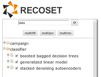
Classifier Example
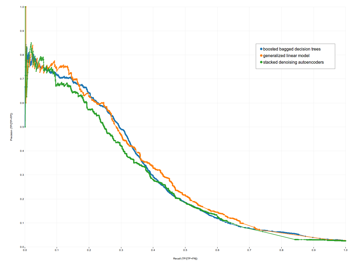
If you go look at our demo, in the 'classifier' folder, you'll see 3 data sets. Each data set is the result of training and testing a different type of classifier to predict a certain type of conversion. The data set is an array of objects, each of which contains the results of running the classifier at a specific probability threshold. We can use this data to plot Receiver Operating Characteristic (ROC) curves, as well as Precision-Recall (PVR) curves and Lift curves. In the screenshot below, you can see the 'multi' option in action, plotting the results of our Boosted Bagged Decision Trees, Generalized Linear Model and Stacked Denoising Autoencoders against each other (they seem to perform about the same for this task).
Campaign Example
In the 'campaign' folder of our demo, you can see 2 datasets generated by our campaign-analysis system (note: this data has been obfuscated, and should not be interpreted as actual performance data!). The '50 top hosts' data is a good example of how we can visualize the same dataset in 4 different ways. In this case, the dataset is the performance of the 50 top hosts where we bought impressions over the course of this campaign. We can look at Click-Through Rate or Cost Per Click by host, (including confidence intervals!) or we can look at the relationship between these two quantities in a scatterplot. We can also look at a pie-chart of where we bought impressions. Same data, 4 views.

- Click-Through Rate with Confidence Intervals


- Cost Per Click with Confidence Intervals


- CTR vs CPM scatterplot with CPC iso-curves

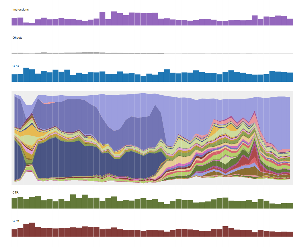
The second dataset in this folder allows us to draw what we call a campaign stream-graph. This is a visual representation of the progression of a campaign over time (day by day in this case, although we look at hourly versions as well). This graph shows various quantities of interest for each day of the campaign: impressions, total spend, CPC, CTR, CPM, site-mix etc. I encourage anyone interested in this visualization to go to our demo page and mouse over the various pieces of the graph.
⁂